

Don’t forget that you can easily use Displayr’s heatmap maker to create your free heatmap!
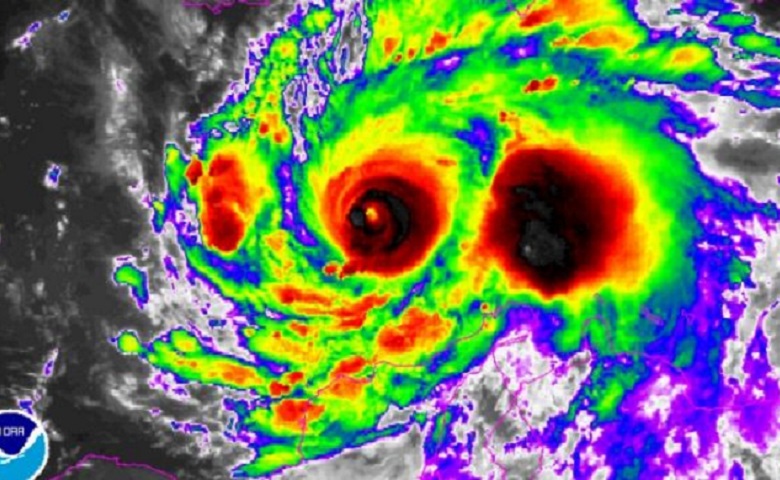
The other day, my local paper showed what it called a “photo” of Hurricane Matthew. This heatmap achieves one of the core jobs of visualization: it attracts attention. However, it does so at too high a cost for me because of its poor use of color.
When I first looked at this visualization, I assumed that the gray was clouds and the blue was sea. After a bit more of a look, I realized that could not be the case. My brain then started to view the image as a whirlpool that turns into two tunnels. However, this led me to a serious misinterpretation: seeing a light at the end of the tunnel on the left. This is a problem, because my brain is making exactly the wrong conclusion. The correct read is, I suspect, that this is the eye of the storm and a lot stiller than the surrounding areas.
The visualization above is, no doubt, great if you have been trained to read it. But how many people have received such training? I sure struggle to figure out what it means without a lot of effort. This is because it is not using the rainbow color scheme, but black, grey, blue, green, yellow, red, and black again. This is not a natural ordering of colors in nature, which makes it hard for our brains to automatically decode it. To explore this issue a bit better, we will look at a simpler visualization task: a heatmap of a volcano.
The 3D perspective plot above shows a volcano. It is attractive and we see many of the volcano’s attributes, but not its far side nor the depth of the caldera.
The heatmap below uses a yellow-blue scale. It allows us to get some idea of the far side of the volcano and the depth of the caldera. Depending on when I look at this heatmap, I draw quite different conclusions. Sometimes, I see a supernova. As I do not really understand supernovae, this comparison confuses rather than helps me. Most of the time my brain views blue as the sea, green as the vegetation, and yellow as the volcano. Thus, my brain deduces that there is water in the caldera of the volcano. Sure, the legend tells me that my interpretation is wrong. The basic problem, though, is that the qualitative aspect of the heatmap—the blue, green, and red colors—leads me astray.
The next heatmap shows how a little less creates something a little better. I have removed the yellow. Due to the way that color works, this means that the green is also taken off the heatmap. Now the heatmap shows the type of gradation that appears in nature (e.g., clouds against a blue sky, water depth). Our brains are already attuned to reading the visualization. Perhaps this and the previous visualization look equally interpretable to you; stay with me, as the point will become a lot clearer with the next couple of examples.
Rules for using color in heatmaps
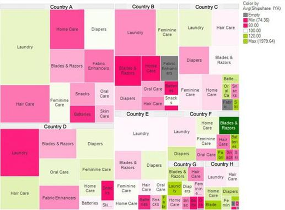
The treemap with heatmap shading below is from the Harvard Business Review. The color-scheme it uses involves grays, reds, greens, and yellows. As with the earlier enhanced satellite image of the hurricane, if trained, I am sure you can read it. However, reading it is hard work, as discussed in The 5 second rule and the need to create instantly recognizable visualization.
Contrast it to the [simple_tooltip content=’Thomas Porostocky and the Institute for Health Metrics and Evaluation’]one below, [/simple_tooltip] which shows much more data. It uses almost the same color scheme. But it is a vastly better visualization. The reason is the way that the color is used. Color demarcates the three causes of death. Intensity within the colors communicates change in rates of death over time.
The above examples can be summarized as two rules:
- Represent degrees in heatmaps by shading, using a single color blended with either white, black, or grey.
- Use colors to represent qualitative differences.
Using colors to represent high vs low scores
A special type of qualitative difference is whether results are above or below average. The example below shows how preference for different brands of cola (the columns) relate to the degree of liking the brands. White is used to indicate an average relationship, blue indicates above average, and coral indicates below average. The degrees of the shading indicate the strength of the relationship. This color scheme allows us to quickly confirm an obvious pattern. The blue cells in the main diagonal of the table show that people, on average, give the highest ratings for the brands they prefer. And it quickly draws our attention to other patterns. Coca-Cola drinkers give below-average ratings for all other brands, while Pepsi-Max drinkers are positively disposed to all brands except Coca-Cola.
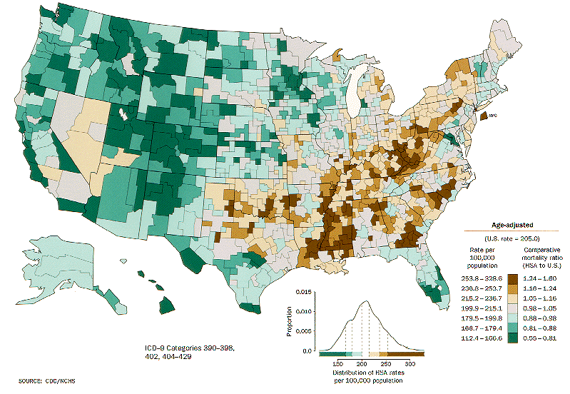
This same principle is used in the CDC’s wonderful maps. The map below shows heart disease for males. Here, green is used to show below average and brown above average. This is a natural continuum in nature, so our brain has some in-built mechanisms for understanding the scale. Furthermore, the colors have an obvious meaning in the context of the data: green is healthy; brown is dying. And the authors have provided two legends, to maximize the chance that people will draw the correct inferences from the coloring.
To play around with some of these examples in Displayr, click here.
Acknowledgments
Other than the map, all the visualizations in this post were created using plotly, from within Displayr.