Moonplots are a better way to visualize brand maps than standard correspondence analysis outputs, which are often difficult to read correctly. The Moonplot resolves the key interpretation issues of correspondence analysis and is usually a better alternative.
A correspondence analysis is the standard tool for creating brand maps. It shows which brands compete with which other brands and the basis for that competition.
A standard brand map is easily misread
The example of a correspondence analysis plot below is pretty standard. It shows data using row principal normalization, which is the best normalization for brand mapping data. To an expert in correspondence analysis, this map is easy to read. Furthermore, to a novice, it is also easy to read. Unfortunately, the novice generally misreads such a map, as the map encourages the less-expert viewer to draw incorrect conclusions.
A novice will look at this map and draw conclusions based on the distance between points. This is how a scatterplot is almost always read, as such an interpretation is an obvious one (the plot below is a scatterplot). As a result, this interpretation will lead to conclusions such as Diet Coke is associated with Beautiful, and Pepsi with Urban. Unfortunately, these conclusions are wrong.
The correct interpretation
The correct interpretation of the map above is that Diet Coke is strongly associated with Innocent, Sleepy, Feminine, Weight-conscious, and Health-conscious. In fact, the strength of association between an attribute and a brand is not determined by their distance on a map. It is instead computed using the following steps (please read How to Interpret Correspondence Analysis Plots (It Probably Isn’t the Way You Think) for a more detailed explanation):
- Drawing a line from the brand of interest to the origin.
- Drawing a line from the attribute of interest to the origin.
- Calculating the angle of the line.
- Computing the cosine of the angle.
- Measuring the distance of the first line.
- Measuring the distance of the second line.
- Multiplying together the cosine of the angle with the two distances.
This is, by any yardstick, a complicated set of instructions for reading a visualization. Consequently, it is hard to believe that even people that understand the correct interpretation will take the time to diligently apply it.
The difficulties of interpretation have a few possible solutions. One is training. Sure this is a good idea, but the point of this visualization is that taps into our intuitive visual interpretation skills. So if training is required the purpose of visualization is undermined. Another solution is to draw lines from the origin of the map to the brands (or the attributes). Yet this still requires training (how else will people know the meaning of the lines?), so it is not a sufficient solution.
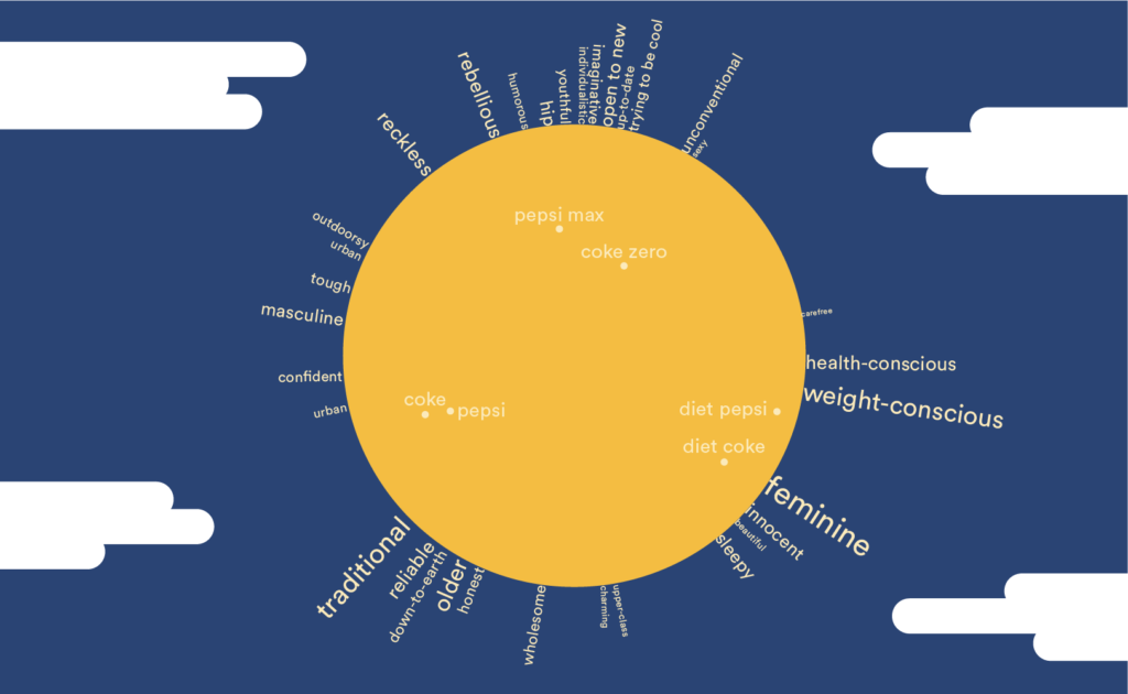
The solution is a moonplot
Illustrated below is an example of a moonplot. The key difference between the moonplot and brand maps relates to the display of attributes. The scatterplot above plots the attributes in the same space as the brands. While the moonplot plots all attributes equidistance from the center of the visualization. The font sizes, on the map below, contain the same information conveyed in the earlier brand map by the distance of the attributes to the origins.
Advantages of the moonplot over traditional brand maps
This moonplot visualization has some big advantages over the traditional brand map display:
- First, it is tidier.
- Next, the tidiness makes it easier to understand the extent to which brands’ positions are strong. Coke Zero, and (to a lesser extent), Pepsi Max, are closer to the center of the map than Diet Pepsi and Diet Coke. This means they are less differentiated than the other brands based on the attributes in the study. While an expert can obtain the same conclusion from the traditional map, with the moonplot it is obvious to everyone (novice to expert).
- The varying font sizes make it clear that all attributes are not equal. For example, the small font for Beautiful makes it clear that in some sense the attribute is unimportant. To deduce this from the traditional map requires expertise.
- Most importantly, the obvious interpretation of this map is correct in terms of the brand associations. For example, it is clear on this map that Diet Pepsi is associated with Feminine, Innocent, Sleepy, Weight-conscious, and Health-conscious. The user can work this out by glancing at the map, with no need for rulers, protractors, nor an understanding of the dot product.
To create a moonplot using your own data
- Click here to create your own moonplot, by signing into the Displayr document used to create the visualizations in this post.
- Click on the moonplot (on the third page), and change the Data source (far right), to Type or paste data. (Or, import a new data set, create a new table, and select the new table as the data.)
- Press Edit data, and paste in your data and press OK.