


In this post I describe how to quickly create a quad map in Displayr. The example uses a Shapley Regression to work out the relative importance, but the basic process described in this post can be used with any type of data.
What is a quad map?
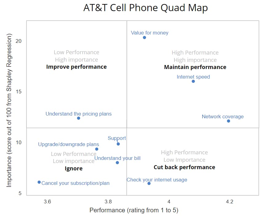
A quad map is market research jargon for a scatterplot which shows a series of attributes in terms of their importance to the market and the performance of one or more brands on these attributes. The example below is for AT&T in the US Cell Phone market. The horizontal axis shows the performance of AT&T, based on ratings out of 5 by its customers. The vertical axis shows the importance of these attributes, computed using driver analysis (Shapley Regression). The term “quad” comes from the two-by-two matrix placed over the scatterplot, which explains the implication of of quad map. You may also be familiar with these types of charts being called a matrix diagram.
How to create a performance – importance quad map in Displayr
Step 1: Create a table showing performance
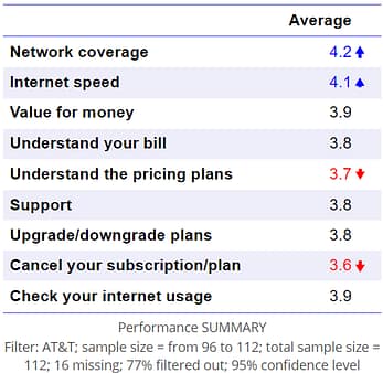
The first step is to create a table that shows the performance by attribute, such as the table shown below. In this example, I simply dragged the Performance variable set (structured as a Numeric-Multi) from the Data Sources tree to the page to create a summary table automatically. I then filtered it by those respondents whose phone carrier is AT&T. You can also paste or import a table of data similar to below in Displayr directly.
Step 2: Create a table showing importance
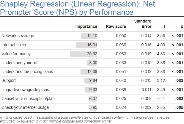
The next step is to create a table showing the importance of the drivers. This table can either be a traditional table, or, the results of a regression or driver analysis. The example below is from a Shapley Regression, see How to Run and Interpret Shapley Regression in the Displayr Help Center for more detail. You can also paste or import a table similar to Step 1 above directly into Displayr, but this time showing the importance scores.
Step 3: Create a scatterplot
- From the toolbar, select Visualization > Scatter > Scatter.
- In the object inspector, Data > Data Source > X coordinates select the performance table (or, select the importance table; either one is fine).
- In Y coordinates select the model showing the importance table.
- Check Chart > Quadrants > Show Quadrants to divide your visualization into quadrants. You can use other settings in this section to configure the lines for the quadrants.
- You can use the Top/Bottom Left/Right Quadrant sections to format the area of the respective quadrant and add labels.
- To add the additional grey labels above, I overlaid a text box onto the chart.
- See How to Create a Quad Chart for more detail on customizations.
For other examples and more detailed information on creating scatterplots and quad charts in Displayr, please refer to the Displayr Help Center.
Like what you see? Sign up for a Displayr Trial today.