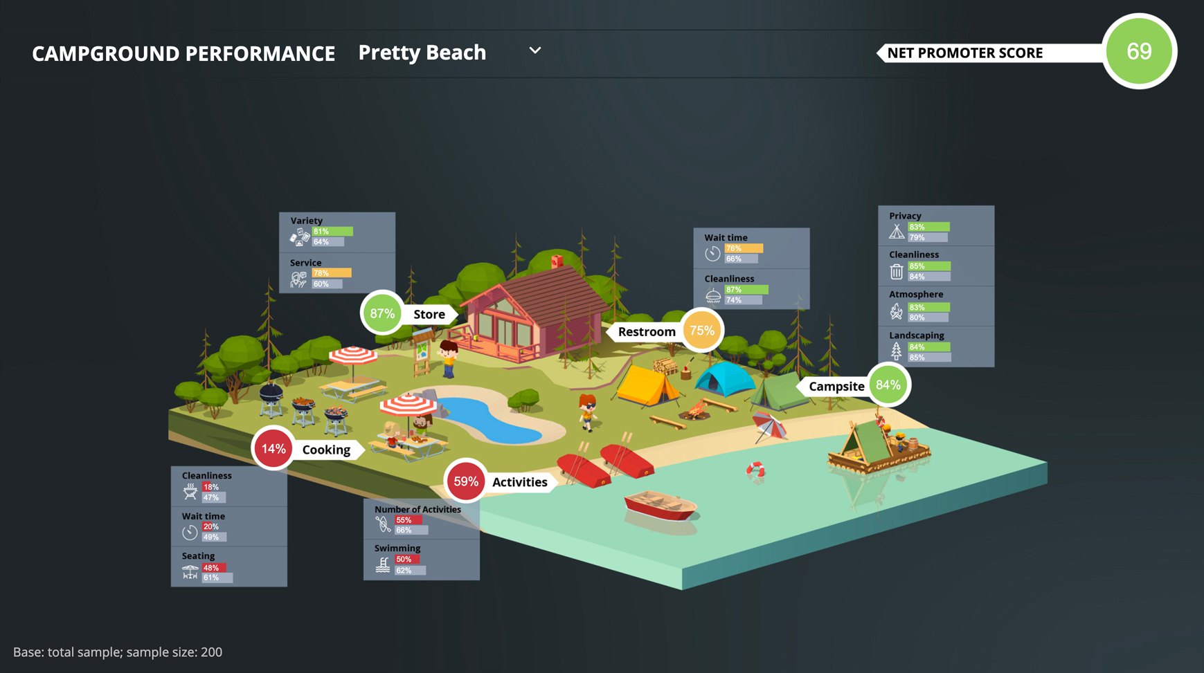
Welcome to the ultimate tool for exploring and comparing the performance using NPS and satisfaction scores. This interactive campground dashboard uses a traffic light color-coded system to highlight areas performing well (green) and poorly (red), making it easy to see which campgrounds are thriving and which need improvement.
This dashboard is designed to be both informative and easy to use. With a simple filter dropdown in the top right corner, viewers can select different campgrounds and apply additional filters to see how they compare. And as they make their selections, the colors and numbers on the dashboard will update in real-time, providing a dynamic and engaging user experience.
But what really sets this dashboard apart is how easy it is to create. With Displayr’s user-friendly platform, anyone can create a dashboard like this in just a few simple steps. No coding or technical expertise required – just drag and drop your data and start exploring!
So whether you’re a market researchers looking to improve the way you share your performance data, or marketer interested in exploring your company insights, come and explore this interactive dashboard and discover the power of interactive, data-driven dashboards.