This classic dashboard is designed to report key performance indicators (KPIs). Typically, these dashboards are live and show the latest numbers, often showing trends. A very simple example of a KPI Dashboard is below (this one only takes a couple of minutes to create). KPI dashboards often have lots of different numbers and visualizations and are a handy way of looking at all manner of operational and strategic data.
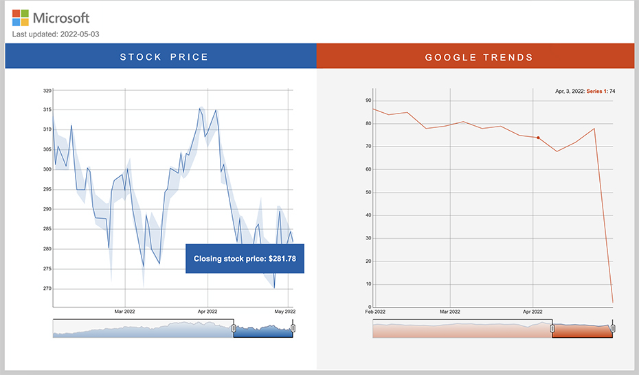
Below is a one-page dashboard showing the stock price and Google Trends data for Microsoft. It is automatically updated every 24 hours, pulling in data from Yahoo Finance and Google Trends.
This dashboard just uses a time series visualization (Displayr > Insert > Visualization > Time Series Graph) that is connected to a live feed of stock prices feed and Google Trends data (easily added via Displayr > Insert > More > Data > Google Trends).