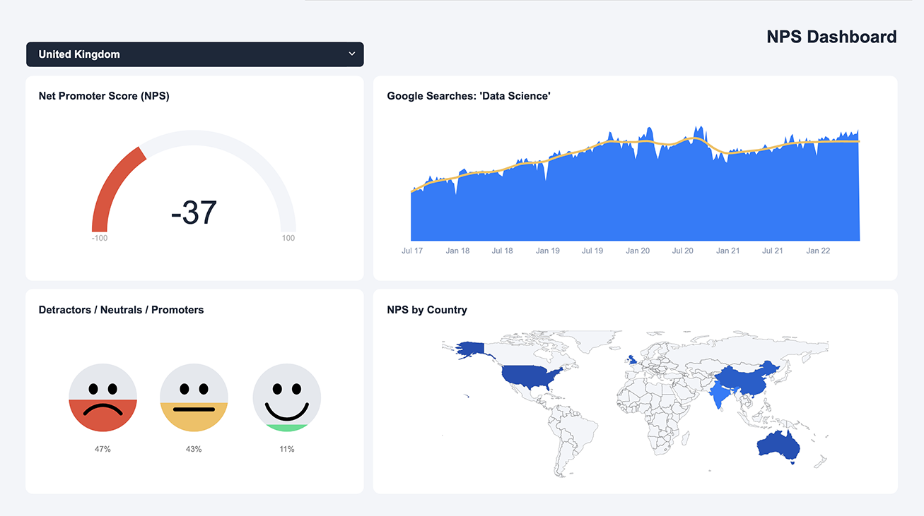
This interactive dashboard allows you to explore Net Promoter Score (NPS) data across various countries. With the help of an interactive filter, you can easily select the country you want to analyze. The dashboard provides an overall rating for each country, presented in a visually appealing gauge. In addition, user satisfaction scores are presented using pictographs, allowing you to quickly grasp the satisfaction level among users.
To make it even easier to understand, a “traffic light” system is used to indicate each entity’s performance level. This highly intuitive system makes it simple to interpret the data at a glance.
The dashboard also includes real-time Google Trends data on searches for “Data Science.” This provides valuable insight into this topic’s popularity and can help inform your decisions regarding future data science initiatives.
All elements of this dashboard were created within Displayr, making it easy to customize and use for your analysis. To get started, simply click on “make a copy” and start exploring.
TRUSTED BY THOUSANDS OF CUSTOMERS
Displayr is at least 50% faster than just creating a PowerPoint presentation. In some cases, I think it’s even higher than 50%.