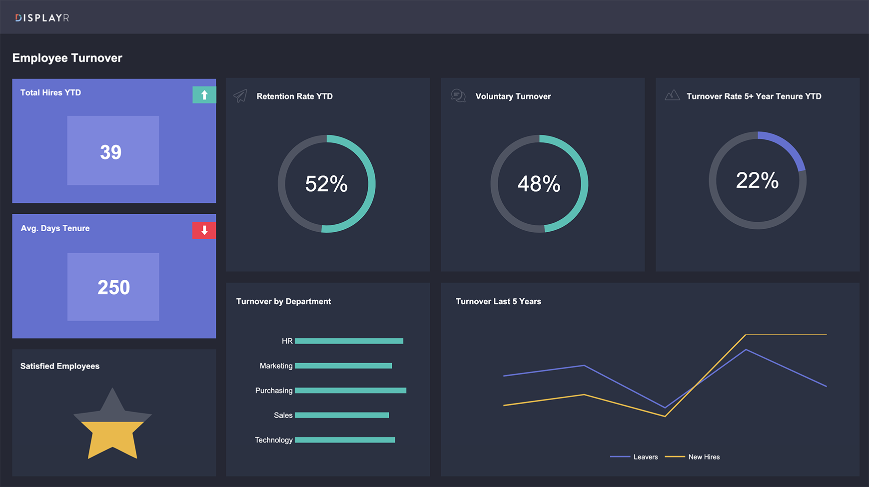
Welcome to our KPI dashboard! Here, you can quickly and easily see the story of our company’s employee turnover rate. We’ve kept things simple and clean, so you can focus on what really matters.
We’re proud to say that all the charts and pictographs you see on this dashboard were created natively in Displayr. Plus, we’ve added some fun icons in the header of each section to make things a little more engaging. We sourced these icons from stock graphic sites like Icons8, so you know they’re high-quality and reliable.
To help you stay focused on the big picture, we’ve removed the X and Y axis from our standard bar and line graphs. But don’t worry, you can still get all the details you need by hovering over each section. It’s a simple and effective way to dive deeper into the data.
So, take a look around and explore our employee turnover rate. We hope you find our dashboard both useful and fun to use!