Explore how US eating habits are changing in an interactive dashboard that combines hands-on analysis with AI-generated insights and built-in chat.
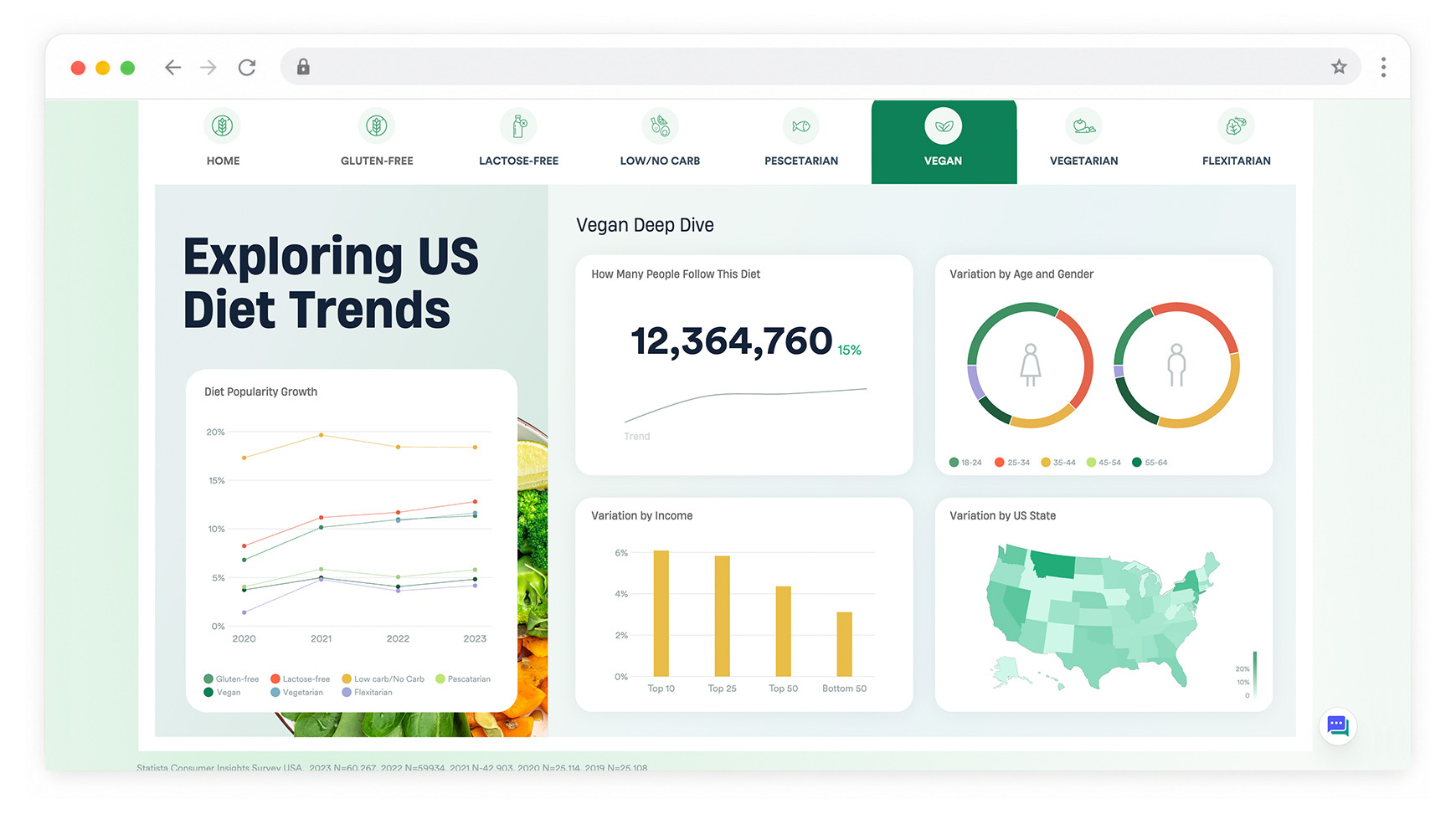
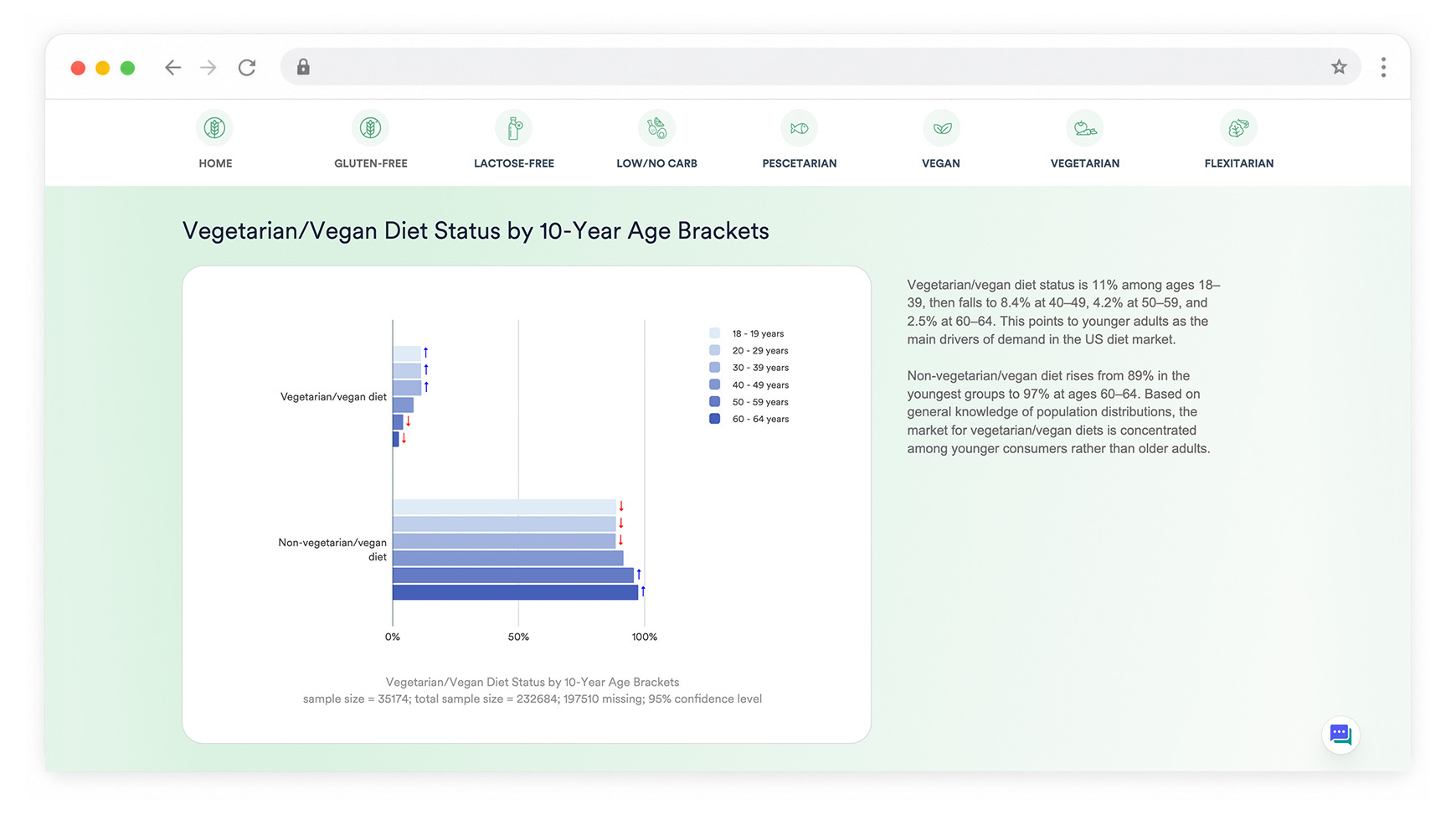
This started as a hyperlinked Displayr dashboard designed to make a large amount of analysis easy to explore. Each diet has its own page, with interactive charts and filters for digging into the trends.
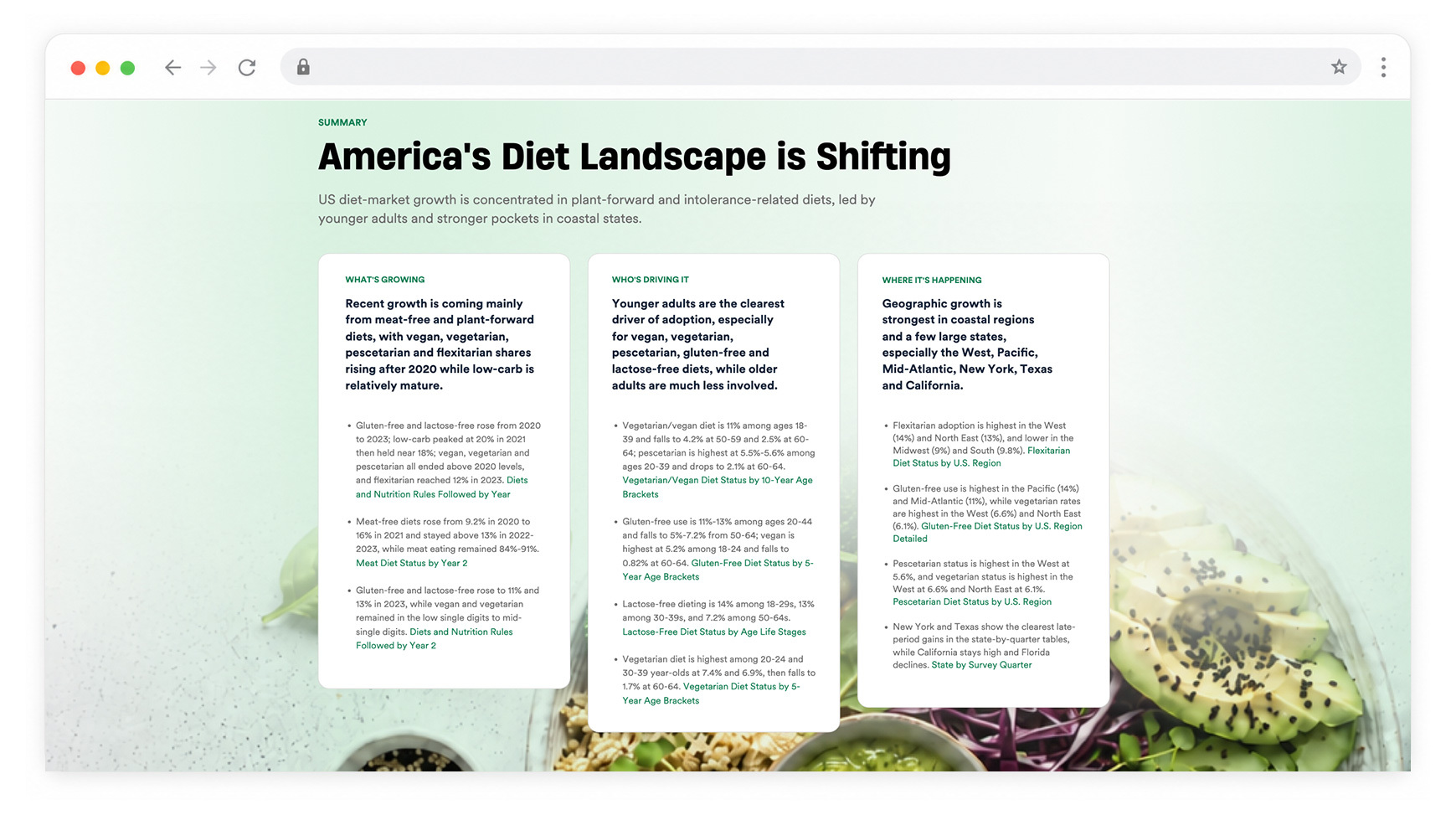
We then used Displayr’s Research Agent to build on that hands-on analysis. It created a more detailed report with additional analysis, key findings and commentary, giving the AI much more context to work with.
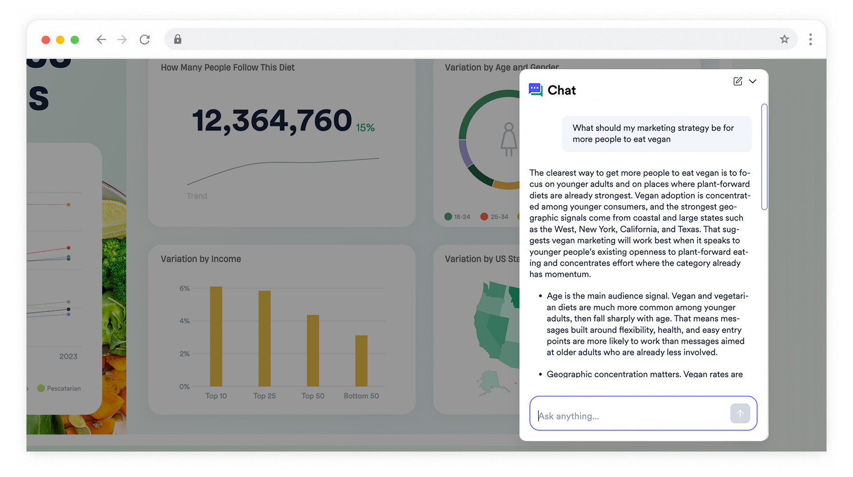
The result brings both approaches together. You can explore the dashboard yourself, follow the key findings, trace the analysis behind them, or use the built-in chat to ask questions that go beyond what’s shown on the page.
Try it for yourself
Open the report and use the built-in chat to explore the data in your own way. For example:
- “Who should we be targeting if we want more people going vegan?”
- “Is flexitarian actually worth chasing as a growth opportunity, or is it overhyped?”
You can also move between diet types using the dashboard navigation and explore differences by age, income, location and other demographics.
Data source
Data sourced from Statista Consumer Insights, covering more than 60,000 surveys from 2023, alongside historical data for tracking how diet preferences have changed over time.
Key features
- Interactive, hyperlinked dashboard across seven diet categories
- Hands-on analysis extended with Displayr’s Research Agent
- AI-generated findings and commentary supported by deeper underlying analysis
- Built-in chat for asking questions across the report
- Interactive filters for exploring different audiences and trends
- Automatic updates when new survey data is added
What this example shows
You can combine the analysis you want to do yourself with the speed and depth of AI.
Displayr’s Research Agent can build on the work already in your report, adding deeper analysis and commentary that also gives the built-in chat more context to answer detailed questions about your data.
Create reports like this in Displayr
Want to see what Displayr can do with your own survey data?
Try Displayr free, or book a demo and we’ll show you how Displayr can help you clean your data, generate insights and create client-ready reports faster.