
Do you despise data cleaning? You’re not alone. Too many researchers find data cleaning to be time-consuming, tedious, and tiring. However, starting your analysis with a clean dataset that has rich metadata can make a world of difference. After all, you don’t want to be that researcher that finds out that their conclusions and insights were almost entirely based on errors during the data cleaning process, do you? Yikes.
We’re here to help – here is your guide to data cleaning! We’re going to cover:
- identifying problems and bad data by checking sample sizes, screening criteria, routing and filtering instructions, duplicates
- cleaning your data from recording and rebasing values to fixing metadata to deleting dodgy respondents and more!
So, let’s channel the queen of keeping things tidy, Marie Kondo, and get started. We might even spark some joy along the way.

It all starts with a clean data file
What do we mean when we say we want a clean data file? It sounds obvious, right?! Well, you might be surprised by the number of researchers working with unstructured files, or more frequently, metadata-poor datafiles (shudder). We want the data to high quality.
Some common culprits of being metadata-poor are fixed column text files, comma-delimited text files, Excel files, CSV files, SQL databases, XML files, JSON text files, and HTML. Did you catch yourself using any of these files?
Then you’ll definitely want to consider switching to using metadata-rich data files. Rewind the clock and gain back your time by having variable metadata in your data files. After all, imagine all the time you’ll save not having to look-up and cross-reference information. The best metadata-rich files to use are SPSS .sav files and Q packs.
Then we need to inspect the data
Survey data cleaning involves identifying and removing responses from individuals who either don’t match your target audience criteria or didn’t answer your questions thoughtfully. It’s time to don our detective caps. Like all good detectives, we need to check a lot of our information and sources.
Sample sizes
Step one is to check our sample size. If your sample size is bigger than expected, then you probably have respondents with incomplete data polluting your survey.
Screening criteria
The next is to check your screening criteria worked as intended, and the fastest way to do so is with a Sankey Diagram.
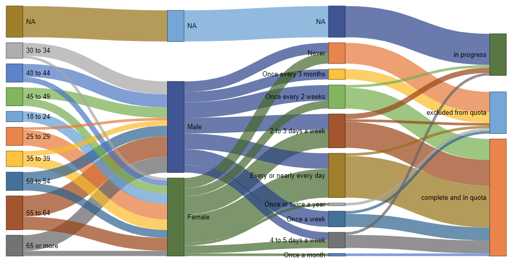
This Sankey Diagram lets us quickly distinguish between respondents who have been flagged as excluded from the quota and those that are complete and in quota – meaning that they were aged over 18, had a known gender, and consumed cola at least once a month. Now you could do the same thing with code or manually looking through crosstabs, but the Sankey diagram will save you a heap of time.
Data quality
What about the data quality for each question and variable? Here are some things to check for: poor-metadata, unusual sample sizes, outliers and other funky values, too small categories, incorrect variable types, and incorrect variable sets. Check out the eBook for more detail.
Routing and filtering instructions
You’ll also want to check your routing and filtering instructions. You could scan through your raw data, but it’s time-consuming and easy to miss exceptions – especially if you have a large dataset. Here’s where the Sankey diagram comes in handy again.
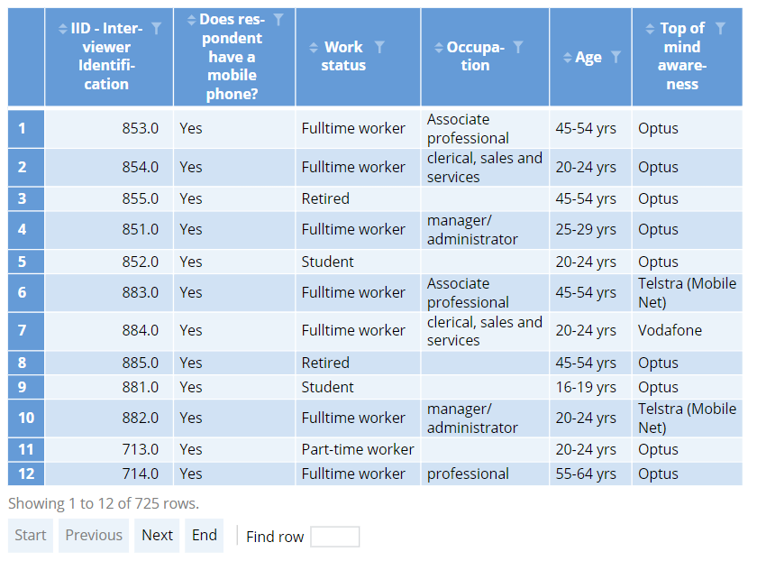
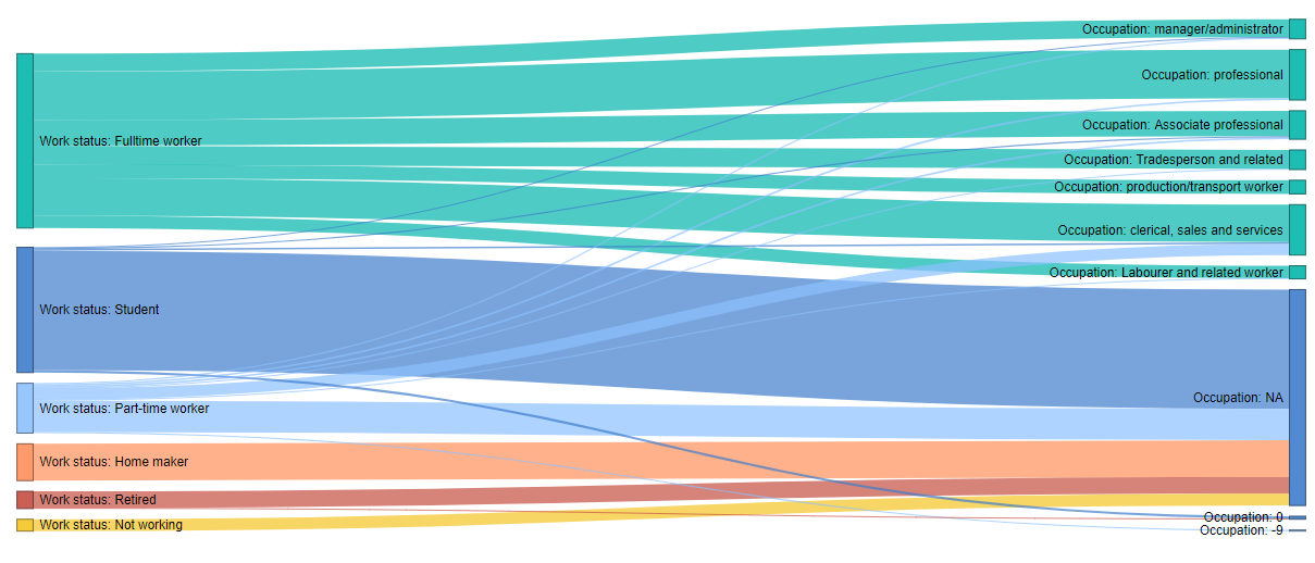
Our table shows that those of a full-time work status were asked for their occupation. However, our Sankey diagram immediately gives us clues that some students and part-time workers were also asked for their occupation – indicating there is a problem with our survey routing and the data will need to be cleaned.
Missing data patterns
All right, are we finally done with checking things? Not quite, but don’t worry, the bulk of our data cleaning has already been done. Now we’ve got to check for missing data patterns. The best way to do this is – surprise, surprise – visually. We’re going to create a heatmap or line chart that shows the missing values for each observation, with each ‘column’ representing a different variable and lines representing missing values – and if we’re lucky it’s not going to resemble a Jackson Pollock painting.
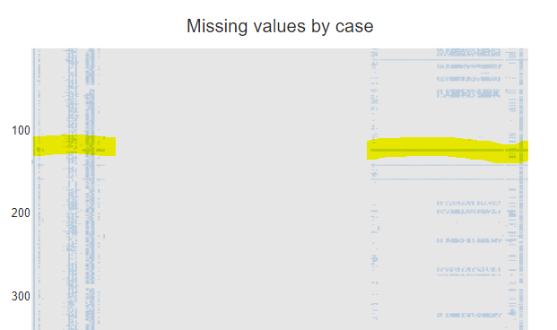
Different lines or clusters of lines indicate different problems with missing data. For example, long horizontal lines (highlighted on the left) can indicate observations with severe missing data issues. See the eBook for more details.
Duplicates
Duplicates can be a serious problem. Sometimes you can find them just by analyzing the ID variables. Other times you’ll need to jointly analyze sets of variables.
Unit tests
When cleaning data, it is super useful to set up some unit tests to automate the process of checking for errors. This is an especially good investment when it comes to longitudinal or tracking projects as unit tests can automatically check key things whenever new data is uploaded. Some common things to test for in unit tests include: out of range errors, flow errors, variable non-response, variable consistency errors, lie tests, and sum constraint errors.
And finally – clean the data!
We’ve now spent a bit of time looking for problems in the data. Now it’s time to get our Marie Kondo on and finally fix them up.
If you’d rather skip the manual tidying, tools like Displayr’s Data Preparation Agent can now handle most of this automatically. It checks, cleans, and structures survey data in seconds; fixing reversed scales, flagging straight-lining or dodgy responses, creating variables like NPS and Top-2-Box scores, and even categorizing open-ended text.
You’ll save hours and still end up with a dataset that’s consistent, transparent, and analysis-ready.
Recoding and rebasing
Often you may want to set inconsequentially small values of “don’t know” to be missing values. This tells your analysis software to automatically filter the table and recompute the values with the “don’t knows” excluded. This is also known as rebasing. Other common ways of recoding values include capping and re-aligning values with your labels.
Merging categories
You can also merge small categories. In some software, this is regarded as another example of recoding. In Q or Displayr, merging is considered a separate process, since merging does not affect the underlying values of data.
Fixing metadata
Typically, you can fix metadata by adding or correcting labels.
Deleting respondents
A respondent’s data is excluded from the data when, for example, they have completed the survey too quickly (speeders), given the same answers to all questions (straightliners), and give inconsistent responses throughout. The most useful way to do so it via filters.
Nice work, your data should be in tip-top, sparkling clean shape now! Download our free eBook for loads more detailed information and specific steps for how to do this in Q, Displayr, R and SPSS.