

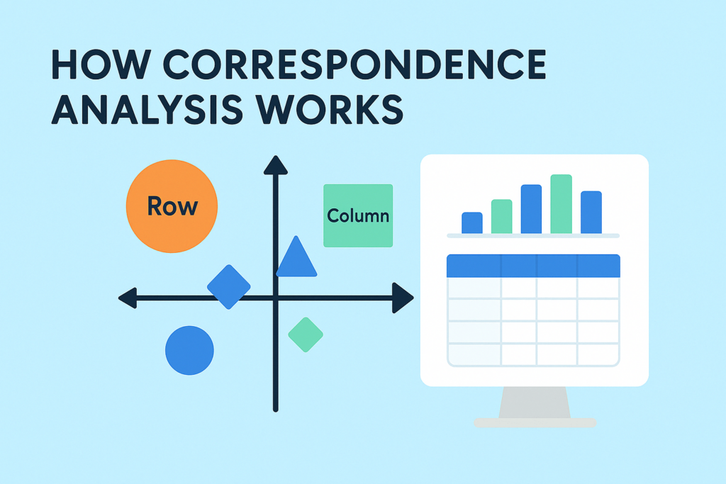
What is correspondence analysis?
Correspondence analysis is a data science tool for summarizing tables. It helps you see relationships between categories—like brands and customer opinions, or products and preferences—by turning raw numbers into intuitive visual maps. Instead of getting lost in the rows and columns, you get a clear picture of how things relate.
It is often compared to Principal Component Analysis (PCA), as both techniques are used by researchers to reduce complex data into simpler, visual forms that highlight underlying patterns and relationships. However, while PCA is used on continuous numerical data, correspondence analysis is tailored to categorical data.
In this post, we’ll break down how correspondence analysis works in simple terms, with real-world examples, so you can understand the logic behind it without diving into complex math.
Correspondence analysis example
The table below shows some data on the traits of some animals, with the resulting correspondence analysis map below. This post explains, in simple terms, how the map is computed from the table.
Step 1: Compute row and column averages
In the first step, compute the averages for each row and column, as shown below.
Step 2: Compute the expected values
Next, for each cell, compute what are known in the trade as the expected values. Each cell’s expected value is the row average for that cell, multiplied by the column average, and divided by the overall average. So, looking at Big and Dog, we have 35 * 61 / 51 = 42. The following table shows all the expected values.
Step 3: Compute the residuals
The residuals are computed by subtracting the expected values from the original data. Thus, for Dog and Big, the residual is 80 – 42 = 38. The residuals are shown below. These residuals are at the heart of correspondence analysis, so do not skip to the next step until you are really sure you get what they mean.
The residuals show the associations between the row and column labels. Big positive numbers means a strong positive relationship. The opposite is true for negatives. Let us look at the residuals for Dog. We can see that its biggest score is for Friendly. And, its lowest score is for Resourceful. If you look at the original data table at the top of the post, neither of these conclusions should surprise you.
The interesting result in the first row is Animal which, for Dog, sits at 100. But, the residual is only 5, indicating virtually no association between being an animal and being a dog. Why? All rows of the data are animals (and four, like the Dog, mammals). So, while a Dog is an animal, like all the other things in the analysis, this association becomes very weak, which is what is reflected in the residuals.
Step 4: Plotting labels with similar residuals close together
Compare the residuals for Cat with those for Dog. While the Dog residuals are generally larger, most are in the same direction. If you take the time, you will realize that in terms of residuals, Dog and Cat are most similar. The next most similar is Dog and Wallaby. Then comes Rat. Last, the Cockroach is least like the Dog. Now look at the blue labels in the plot below, which represent the rows of the table. The relative position of the other animals from Dog in the visualization is consistent with the similarities of their respective residuals.
Now look at the variance shown in the axes labels of the chart. The horizontal dimension explains 89% of the variance in the data whereas the vertical dimension explains only 8%. You can infer the relative amount explained by each dimension on a well-drawn map. That is, we can see on this map that the points vary much more on the horizontal than on the vertical, and this is why the relative variance explained of the dimension varies so greatly.
Together, these two dimensions explain 97% of the variance. This, in turn, tells us that the map represents almost all of the information in the residuals, which is good news. If, instead, they explained a relatively small amount, the map will not tell us the complete story.
Now look at the columns. Big and Friendly are almost equally large, which is why they are next to each other on the map. The least similar trait to Big is Resourceful, which is why it is on the other side of the map to Big.
Step 5: Interpreting the relationship between row and column labels
Now we come to the tricky bit. Correspondence analysis places the row labels on the plot such that the closer two rows (animals) are to each other, the more similar their residuals. This also applies to the column (traits) labels. Most people conclude then that the greater the proximity between a row label and a column label, then then the higher the residual and association. Wrong. If you think about it for a bit, then you may realize that it is impossible to create a map with such an interpretation (and, good careers have been tarnished in the effort to do it.)
To better understand this, compare Dog and Big with Wallaby and Lucky. Dog and Big are close together. Lucky and Wallaby are almost identically proximate. Recall also that the residual for Dog and Big is very high, at 38. Because of this, as we might expect, they are close together on the map. Nevertheless, the residuals for Wallaby and Lucky is only 2, yet they are even closer together on the map than Dog and Big. What is going on here?
Now, take a look at Cockroach. Its residual for Athletic is high at 42. As this is bigger than the 38 for Dog and Big, intuitively, you would want Cockroach and Athletic to be very close together on the map. But, Cockroach has an even bigger residual of 61 for Resourceful, and if we put Cockroach and Athletic next to each other, where can we put Resourceful? There is, in fact, no way to position the labels to sensibly communicate these residuals.
Fortunately, all is not lost. The way that correspondence analysis works means that we can compare between row labels based on distances. We can also compare between column labels based on distances. However, if we want to compare a row label to a column label, we need to:
- Look at the length of the line connecting the row label to the origin. Longer lines indicate that the row label is highly associated with some of the column labels (i.e., it has at least one high residual).
- Look at the length of the label connecting the column label to the origin. Longer lines again indicate a high association between the column label and one or more row labels.
- Look at the angle formed between these two lines. Really small angles indicate association. 90 degree angles indicate no relationship. Angles near 180 degrees indicate negative associations.

Let us work through these rules using some examples. Look at Wallaby and Lucky to the right. The angle is about 30 degrees or so, indicating some form of association. The short lines, however, suggest that the correct interpretation is that there is either no association or a very weak one.

The plot for Cockroach and Athletic is reproduced to the left. The angle is very small, suggesting an association. The arrows are both, in relative terms, long, suggesting a strong association. As the arrow to Resourceful would be even longer, and the angle marginally smaller, this tells us that Cockroach is even more strongly associated with Resourceful than with Athletics.
I return to this example, and add a whole lot more examples of interpretation, in How to interpret correspondence analysis plots (it probably isn’t the way you think).
Correspondence analysis in Excel
Each of the examples above have been in Displayr, an all-in-one analysis and reporting solution for market researchers. It is also possible to perform correspondence analysis in Excel. It is also possible to perform correspondence analysis in Excel, though the process is more manual. Excel refers to correspondence analysis in the context of contingency tables, which are typically created using pivot tables. From there, you’d need to calculate row and column profiles, expected values, and residuals, and then use matrix operations or an add-in (such as XLSTAT) to compute the results and generate a visual map.
If you’d rather not build the maps by hand, a dedicated correspondence analysis tool produces them straight from your raw data, significance-tested and ready to report.
Want to create your own correspondence analysis but don’t know where to start? Try using Displayr as your market research software of choice today.
