


Visualizations should make the most important features of your data stand out. But too often, what’s important gets lost in the minefield of data. But now you can highlight systematic changes from random noise by adding trend lines to your chart!
In Displayr, Visualizations of chart type Column, Bar, Area, Line and Scatter all support trend lines. Trend lines can be linear or non-parametric (cubic spline, Friedman’s super-smoother or LOESS).
Adding a linear trend line
Linear trend lines can be added to a chart by fitting a regression to each series in the data source. In the chart below, the linear trends are shown as dotted lines in the color corresponding to the data series. We see there is considerable fluctuation in the frequency of each search term. But the trend lines clarify that the overall trend for SPSS is downward, whereas the trend for Stata is increasing.
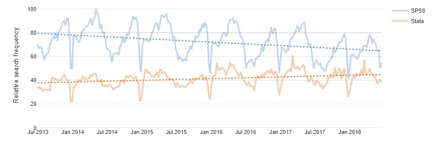
The data for this chart was generated by clicking Insert > More > Data > Google Trends. In the textbox for Topic(s) we typed in a comma-separated list of search terms (i.e., “SPSS, Stata”). This creates a table scoring the number of times each term was searched for each week. Any input table that has a similar structure to this can be used to create a chart. 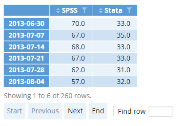
If we click on the table, the object inspector showing the properties of this output is shown on the right. Under the Properties tab, expand the General group to see the name of the table, in this case google.trends.
We create a chart by selecting Insert > Visualizations > Line. In the dropdown for Output in ‘Pages’ select the name of the input table (i.e., google.trends). On the Chart tab in the object inspector, look for the Trend lines group. Set the Line of best fit dropdown to Linear. We also tick the checkbox for Ignore last data point. This option is useful for ignoring the last time period which may be incomplete if the data is in the process of being collected.
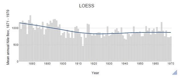
Trend lines using non-parametric smoothers
In many cases, we want to estimate a trend that is not constrained to a straight line. To estimate smooth (non-parametric) trend lines, we can use cubic splines, Friedman’s super smoother or LOESS. Note that LOESS uses a fixed span of 0.75 which may sometimes be overly large. In contrast, the cubic spline and Friedman’s smoother uses cross-validation to select a span, and they are usually better at identifying the important features. For example, in the figure below, the LOESS trend line suggests there is a gradual decrease in river flow from 1870 to 1900. However, the cubic spline and Friedman’s super smoother picks up a sharp decrease in 1989.
This example uses Nile, which is a built-in dataset in R. It is a time-series object, so to load the dataset in Displayr, first create an R Output and type the following code in the textbox for R code:
data(Nile)
x = Nile
The second line is necessary to assign a name to the time series data. You will then be able to use the data set in a chart by selecting x in the Output in ‘Pages’ dropdown (under Data Source in the Inputs tab).
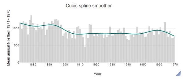
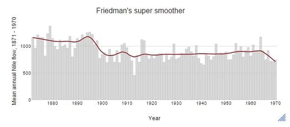
Trend lines are added by going to the Chart tab in the object inspector and selecting a method (cubic spline, Friedman’s super smoother or LOESS) for the line of best fit. Once this option is selected, other controls to customize the appearance of line of best fit will be shown under the Trend Lines group. You may also want to adjust the opacity or the color palette (under the Data series group) of the data (i.e., column bars).
To find out more about visualizations in Displayr, head to our blog now. Ready to use trend lines for your own data? Grab your free trial of Displayr now.
