

Microsoft Excel has been used to create charts and visualizations for as long as (or longer than) any other application being used today. In fact, Microsoft released the first version of Excel back in 1985! While there are certainly drawbacks associated with using Excel for visualizations, especially in terms of data centralization and file version control, the benefits and history of Excel make it a staple in almost every analyst’s toolbox. In this article, I’ll explore how to create a simple bar chart in Excel.
Don’t forget though, you can also easily create a bar chart for free using Displayr’s bar graph maker!
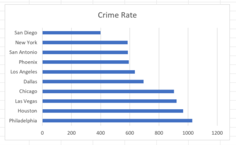
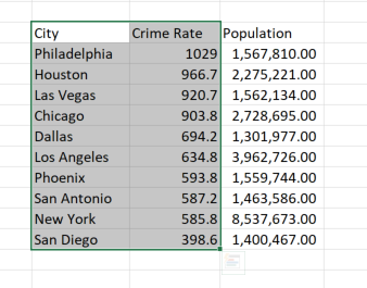
The easiest and most straightforward way to create a bar chart in Excel is to first highlight the data that you want to chart and then select bar chart from the Charts menu. As an example, below we have crime rates per 100,000 population of the 10 largest cities in the United States. For this example, we are only interested in charting crime rate by city, so we highlight the City and Crime Rate columns, but ignore the Population column.
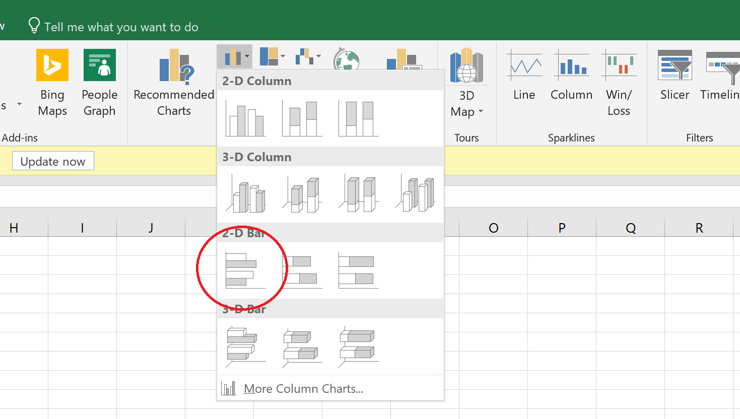
With the data highlighted, next select Insert > Charts (group) and select bar chart drop-down. From this menu, select the first chart in the 2D Bar section.
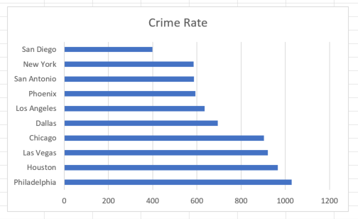
A default bar chart object is created on the page. You can modify all of the bar chart properties by clicking on the chart and then going to the Chart Tools menu that appears at the top of the menu tool bar.
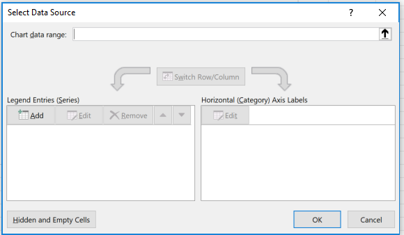
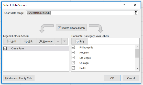
Note that the method outlined above is not the only way to create a chart in Excel. Alternatively, you could first select the bar chart from the Insert > Charts menu to create a blank chart object. Next, select Chart Tools > Design > Select Data (Data group). This opens the Select Data Source dialogue box.
Under Legend Entries (Series) click Add, and for Series name, select the header of the values you want to chart. In this case, we select the header Crime Rate. For Series values, select the actual values in the Crime Rate column of our data table. Next on the Horizontal (Category) Axis Labels section, click the Edit button, select the labels in the City column and click OK. Excel will generate the exact same chart as above.
Ready to move beyond Excel? There are other ways to create visualizations that offer more advanced options and flexibility. Check out “How to create a bar chart in Displayr”.
