

Bump charts, also known as ranking plots, are a great way to compare rankings of information by groups. Displayr assumes that your data is in a “tidy format” when you create such a plot. In this post I show how to set up the data correctly to create a bump chart.
Step 1: Converting the data to tidy data for your bump chart
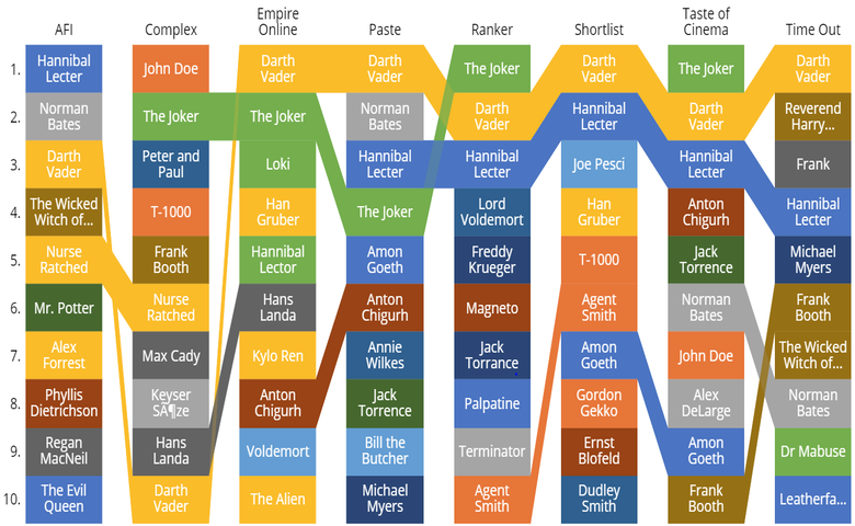
The screenshot below shows some of the data, showing how different websites have ranked different villains (seriously though, The Joker?).
To create a bump chart we need to wrangle this data in a tidy data format. There are lots of ways to do this, but I’ve just used Excel with a bit of cutting and pasting. The one tricky bit to note is that I have used the reverse ranks, so a rank of 20 means it is the highest rank, 19 second highest, and so on. The data for the first site is displayed below and clicking Next will show you all the data for the other sites stacked underneath.
Step 2: Import the tidy data as a Data Set
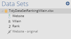
Assuming that have saved your tidy data as a spreadsheet (with nothing else in it except for three columns, as shown above), then go into Displayr, press the + Add a data set button (bottom-left of the screen), select the source and then the data file, and press OK. The Data Sets pane should then appear something like what is shown here, except that you will have different variable names.
Step 3: Make all the variables numeric
If you look at the image of the data sets pane you will see that there is a letter a next to Villain. This means that Displayr has interpreted the data as being text. In order to analyze the data we need to tell Displayr that the data should be treated as being categories rather than free-form text, which we do by clicking on the variable, and then in the Object Inspector, change Properties > INPUTS > Structure to Mutually Exclusive Categories (Nominal). A new variable will appear, with a name like Villain1, and you will see little circles (radio buttons), rather than the letter a, which tells us that we have successfully changed the structure of the data.
Step 4: Create a table
- Press Insert > Table (Analysis).
- In the Object Inspector, select the variable containing the data that is ranked (in this case the villain1) in the Inputs > DATA > Rows dropdown.
- Set Inputs > DATA > Rows the variable that you wish to go across the top of the visualization (in this example, Website).
- Press Inputs > FILTERS & WEIGHT > Weight: New and choose the variable containing the ranking number (in this example, Rank) and press Create Weight.
- To apply the weight, by selecting it in Inputs > FILTERS & WEIGHT > Weight. You will now have a table that looks like the one below. Don’t worry if it doesn’t make much sense to you, so long as it has this basic structure.
Step 5: Create the bump chart
In the Object Inspector, press Inputs > OUTPUT > Chart > Ranking plot (which is in the Miscellaneous group and has an icon that looks like the visualization shown below). Ranking plot is Displayr’s term for a bump chart. You should now have a chart like the one shown below. You can customize this in the Chart tab of the Object Inspector. For example, by default it shows the top 10 but we can make it show all 20 using Chart > NUMBER OF RANKS. You can also customize the color palette by selecting Chart > Formatting and changing the colors via the drop down menu.