

The most standard way for graphically representing categorical data is with a column chart. The advantage of using column charts is that you can easily see the differences between categories. While these charts can handle multiple series of data quite well, the ease of making comparisons decreases as more data points are added. This article will outline the steps for generating a column chart visualization in Displayr using either the Chart or Visualization menu.
Two Methods and Four Chart Types
There are two methods of creating charts in Displayr. The first is to simply change the way you table is displayed to a Chart. The second is to create a visualization output. Visualizations are more customizable than Charts.
Column charts also come in different types depending on the data that you use. One dimensional data (i.e. a single value or a single series of values) will generate a typical set of columns, as you would expect. If you have two-dimensional data in a table, then you have several more options: a Clustered Column Chart, a Stacked Column Chart, and finally Small Multiples Column Chart. Let’s look at these different types.
Visualization Method: Column Chart from a Variable
A basic column chart can be made either directly from a variable or from a table. To make one from a variable directly, take the following steps:
- Go to Insert > Visualization > Column Chart.
- In the object inspector on the right side of the screen, under Inputs > DATA SOURCE > Variables in ‘Data’ select the variable you want to chart.
- Click Calculate and/or ensure the Automatic box is checked.
Your chart will generate, and look something like the below (but obviously with different values and labels – this is just my data after all!)
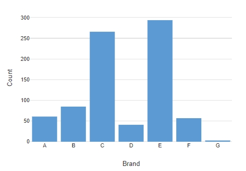
When supplying a variable to a column chart, the values in the variable will be treated as categorical, i.e. like counts of things. My chart here shows that I have just over 50 cases that have selected “Brand A” in my data, and almost 300 that selected “Brand E”. If you provided the Column Chart visualization with a numeric variable, then you would get a column for each number in the variable, and the columns representing the number of times each of those numeric values have been stored in your data. The use of counts is a restriction of passing variables to the Column Chart function. If you want to show proportions, percentages, averages and so on, then we should make a table, and then turn that table into a Column Chart.
Visualization Method: Column Chart from a Table
There is only really one additional step to doing this versus creating a Column Chart from a single variable:
- Under Data Sets drag the variable you want to chart on to the Page.
- With the table selected, go to the object inspector on the right, and under Properties > GENERAL > Name make a note of the table’s name, or change it to your liking.
- Optional: Check the box Properties > LAYOUT > Hidden from exported views to make sure the table won’t visually appear in your published version of the document, and drag it off to sit outside the main Page lay-out.
- Go to Insert > Visualization > Column Chart.
- In the object inspector on the right side of the screen, under Inputs > DATA SOURCE > Output in ‘Pages’ select the name of the table we made before.
- Click Calculate and/or ensure the Automatic box is checked.
My table looks like this after step 3, above:
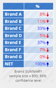
The chart will look almost exactly the same as the earlier example, with the exception that the scale will use the percentages from the table on the y-axis.
Visualization Method: Clustered Column Chart from a Table
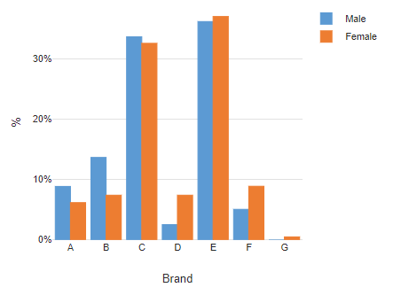
A clustered Column Chart represents data as multiple columns next to each other, or clustered together. Ideal for displaying two-dimensional data, we need a table with rows and columns. Displayr will automatically default to a Clustered Column Chart when you give it a table with rows and columns.
- Under Data Sets drag the variable you want to chart on to the Page.
- Select a second variable, and drag that into the Columns box on the table already made.
- With the table selected, go to the object inspector on the right, and under Properties > GENERAL > Name make a note of the table’s name, or change it to your liking.
- Optional: Check the box Properties > LAYOUT > Hidden from exported views to make sure the table won’t visually appear in your published version of the document, and drag it off to sit outside the main Page lay-out.
- Go to Insert > Visualization > Column Chart.
- In the object inspector on the right side of the screen, under Inputs > DATA SOURCE > Output in ‘Pages’ select the name of the table we made before.
- Click Calculate and/or ensure the Automatic box is checked.
The table I came up with looks like this:
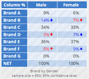
And here’s the resulting chart:
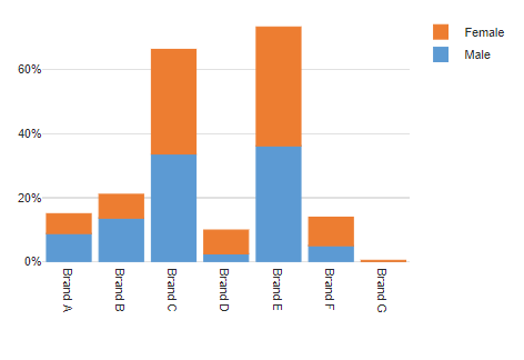
Visualization Method: Stacked Column Chart from a Table
The steps here are exactly the same as when making a clustered column chart, with one additional thing to do. Follow the same as above when creating a Clustered Column Chart, but between step 6 and 7, insert:
6b. Under Inputs > OUTPUT check the box labelled Stack series.
The chart will look something like this, depending on your data:
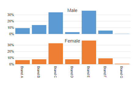
Visualization Method: Small Multiples Column Chart from a Table
Small multiples are repeated smaller version of a column chart where each version is created from the data series used in the clustering or stacking. In other words, given the above examples, small multiples will give you two small charts, one for “Male” and one for “Female”. Creating one is simple. Again, follow the same steps as for a Clustered Column chart, but add in the additional step here
6b. Under Inputs > OUTPUT check the box labelled Show as small multiples (panel chart)
The Chart Method
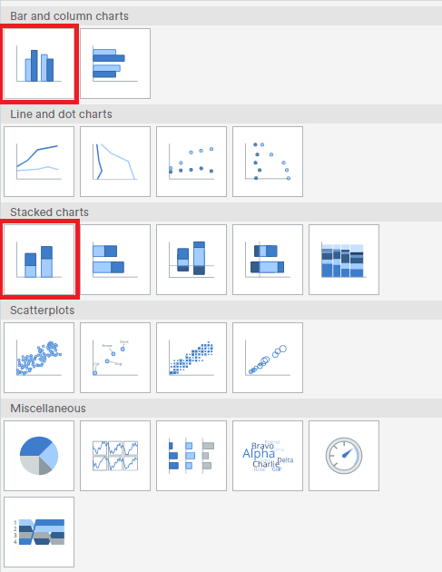
The second method for creating charts is to simply change the table into a Chart. We do that by selecting the table on the Page and then going to Inputs > OUTPUT > Chart and selecting the chart type. In this case, we want to change our table to a Column Chart so select either a “regular” column chart under Bar and Column charts > Column Chart or the stacked version under Stacked Charts > Stacked column chart.
These options can also be accessed from the menu option Insert > Chart. When doing so, and not referencing a table already, you will need to supply the variables the chart should be created from in the Rows and Columns fields in the object inspector on the right of the screen.
Now that you’re an expert on column charts, check out what else you can do in Displayr!