
Pie charts are the classic choice for showing proportions for mutually-exclusive categories. There are various packages available for creating charts and visualizations in R. One of the more popular packages used today is the ggplot2 package. In this post, we'll show how to use this package to create a basic pie chart in R.
When To Use A Pie Chart?
Before we get started, let's brush up on some pie chart basics. A pie chart is a circular-shaped graph that shows the proportion of different categories. Each category can be considered a 'slice of the pie.' Importantly, the entire pie (the sum of all categories) should represent 100%.
A staple for all researchers, pie charts are particularly useful when you are trying to compare the proportion of different categories within a single dataset. They provide a quick, visual representation of how a whole is divided into parts, making it easy to identify the largest and smallest segments.
A pie chart is effective at visualizing data like market share, budget allocation, demographic breakdown, and resource distribution.
Creating A Pie Chart In R From Your Data
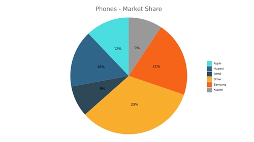
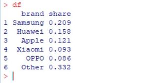
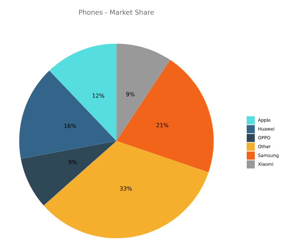
All you need for a pie chart is a series of data representing counts or proportions, together with the corresponding labels. We first create a data frame containing the values that we want to display in the pie chart. For this example, we'll use some sample data showing global market share for mobile phone manufacturers.
df = data.frame("brand" = c("Samsung","Huawei","Apple","Xiaomi","OPPO","Other"),
         "share" = c(.2090,.1580,.1210,.0930,.0860,.3320))
Next, we'll use this data frame to create the pie chart using the ggplot2 package.
How To Make A Pie Chart
First we'll load the ggplot2 package and create a bar chart using the geom_bar function. Then we'll convert this to a pie chart.
library(ggplot2)

# Create a basic bar
pie = ggplot(df, aes(x="", y=share, fill=brand)) + geom_bar(stat="identity", width=1)

# Convert to pie (polar coordinates) and add labels
pie = pie + coord_polar("y", start=0) + geom_text(aes(label = paste0(round(value*100), "%")), position = position_stack(vjust = 0.5))

# Add color scale (hex colors)
pie = pie + scale_fill_manual(values=c("#55DDE0", "#33658A", "#2F4858", "#F6AE2D", "#F26419", "#999999"))

# Remove labels and add title
pie = pie + labs(x = NULL, y = NULL, fill = NULL, title = "Phones - Market Share")

# Tidy up the theme
pie = pie + theme_classic() + theme(axis.line = element_blank(),
          axis.text = element_blank(),
          axis.ticks = element_blank(),
          plot.title = element_text(hjust = 0.5, color = "#666666"))
I've generated this pie chart with a specified custom color palette.
Using ggplot2 For Pie Charts
ggplot2 lets you build a plot in stages. You can sequence functions for modifying the plot by "adding" them, by which I mean a "+" sign is used to separate the different function calls. In the code above I have broken up the stages across multiple lines to help with readability, but you can typically do it all on one line The code above builds the pie chart by:
- Starting with a bar chart.
- Converting it to polar coordinate system to make it round.
- Adding data labels and colors - supplied as hex codes.
- Adding the title, removing axis labels, and removing a lot of the default theme.
There are a wide range of additional properties that can be modified in the ggplot2 package including chart and axis titles, borders, grid lines, legend, etc. A complete list of properties and attributes can be found on the the ggplot2 webpage.