Area charts are useful for visualizing one or more variables over time. We can create area charts in R using one of the many available plotting packages. In this article, we’ll examine how to create an area chart in R using the ggplot2 package.
Don’t forget though, you can easily create an area chart for free using Displayr’s free area chart maker!
Adding Data
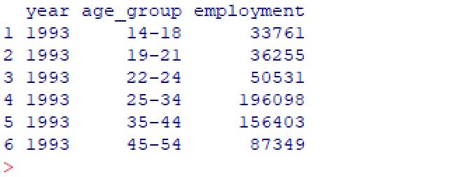
Before I can make a chart, I need to have some data. For this example, I will load a CSV data set which contains the total number of agriculture jobs by age group in the US from 1993 to 2017. I add a data frame containing this data by using the read.csv()function, and then preview the data set by using the head()function.
df = read.csv("employment.csv", header = TRUE)
head(df)
We’ll now use this data frame to create the area chart using the ggplot2 package.
Creating an area chart
First, I’ll load the ggplot2 library in R.
library(ggplot2)
Next, I call the ggplot() function to create the plot object.
plot = ggplot(df, aes(x=year, y=employment, fill=age_group))
This specifies the data frame to be input to the ggplot function, and it defines which variables will be used as the x-axis, y-axis and fill values. In this case, I want the plot the year on the x-axis with the total employment count on the y-axis. The fill parameter is optional, and if it is omitted a single value area chart will be created. Here I have instead specified the age_group variable, and this will result in a stacked area chart by age group.
Next, I call the geom_area() function to draw the area chart.
plot + geom_area()
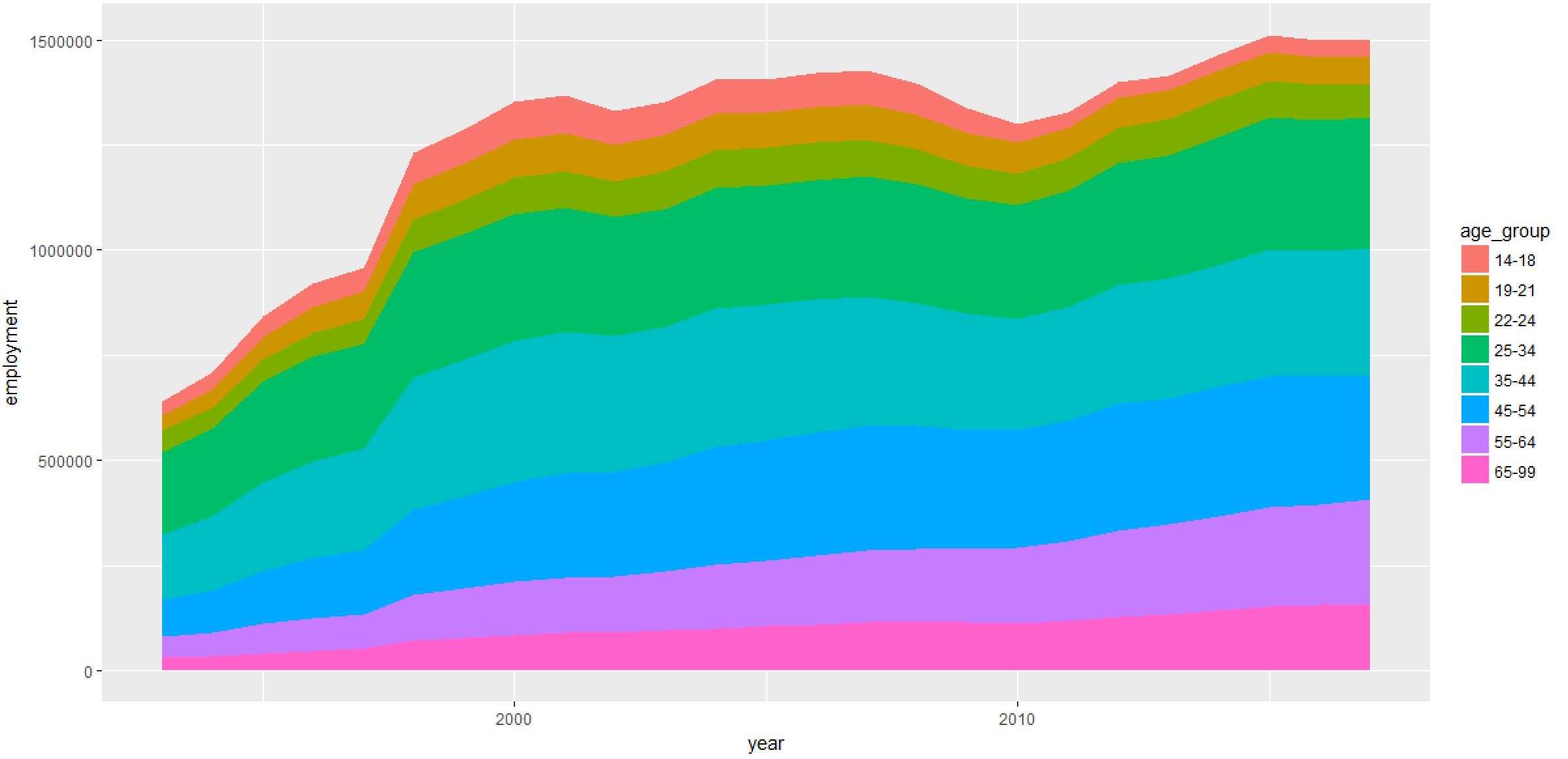
The above chart was created with the default ggplot2 settings, but there are several chart formatting options that can be modified. In ggplot2 you can build a plot in stages. This means that you can sequence the functions for modifying the plot by “adding” them with a “+” sign. This is used to separate the different function calls. The code below applies a series of additional formatting functions to the chart above. I have broken up these functions across multiple lines to help with readability, but these can all be on one line as well.
plot +
  geom_area(colour="black", size=.2, alpha=.8) +
  theme_bw() +
  scale_x_continuous(breaks=seq(1993,2017,1)) +
  scale_y_continuous(breaks=seq(0,2000000,100000)) +
  ggtitle("Total US Employment (1993-2017)") +
  labs(x="Year", y="Total Employment")
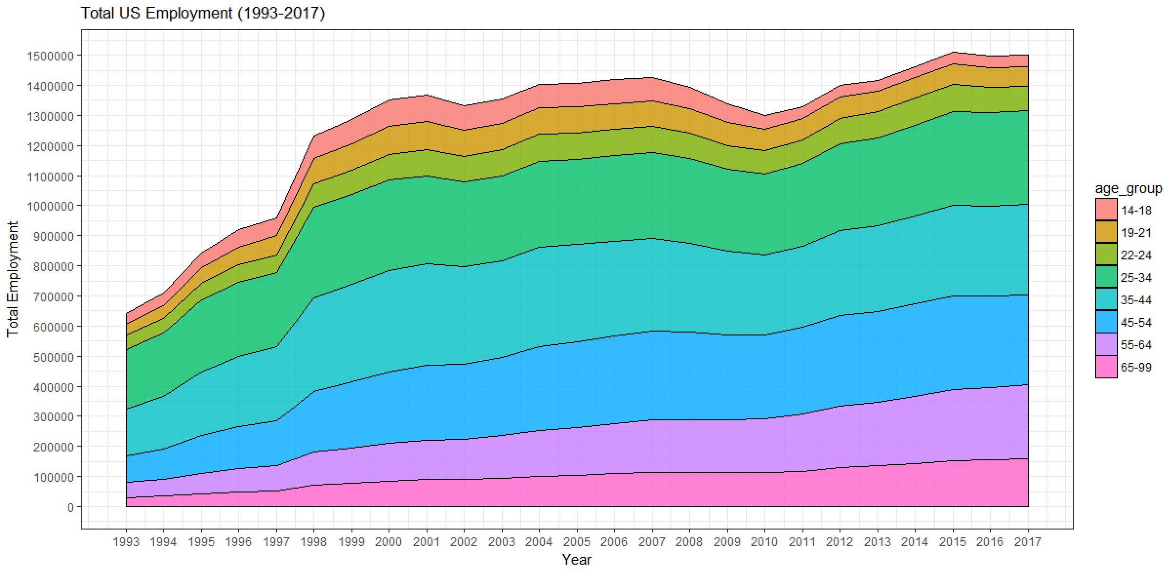
The code above builds this area chart by:
- Starting with a default area chart.
- Adding standard black/white themed background colors.
- Adding x-axis labels and scalings.
- Adding y-axis labels and scalings.
- Adding the title.
- Adding x-axis and y-axis labels.
There are a wide range of additional properties that can be modified in the ggplot2 package including chart and axis titles, borders, grid lines, legend, etc. A complete list of properties and attributes can be found on the the ggplot2 webpage.