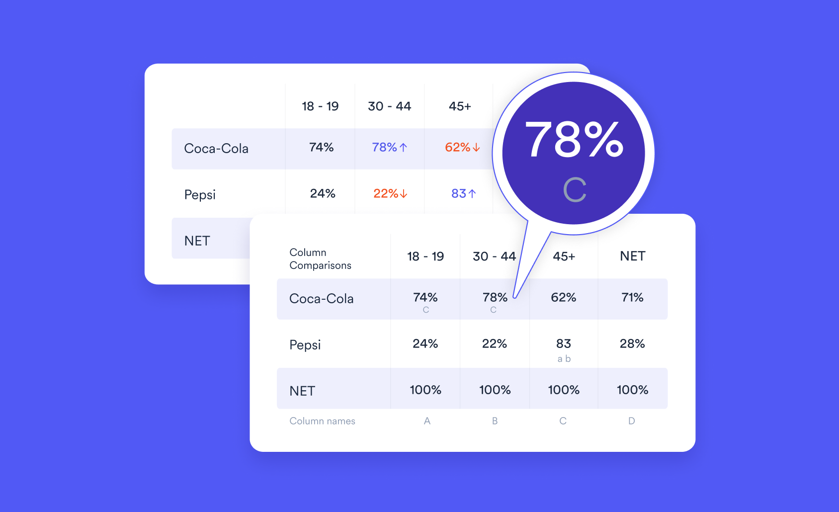
Pictograph vs Bar Chart: Which One Should You Use?

When visualizing data, choosing the right type of chart is essential. Two commonly used formats—pictographs and bar charts—offer different strengths. In this post, we’ll compare the two by first explaining what they are, then exploring when and why pictographs can sometimes outperform bar charts.
What is a Pictograph?
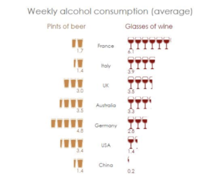
A pictograph (or pictogram) is a chart that uses icons or symbols to visually represent data. Each icon typically represents a fixed number of units (e.g. one beer glass equals one drink). This direct, visual mapping makes pictographs immediately intuitive, especially for small count data.
Despite their reputation as being “for kids,” pictographs are incredibly effective in the right context. For instance, look at the example below, which shows alcohol consumption using beer and wine glass icons. Even without a legend or axis labels, you can instantly interpret the message: the French and Italians prefer wine, the Germans favor beer, and the British and Australians consume roughly equal amounts of both. Americans and Chinese drink less overall and favor beer.
You can easily create pictographs like this one using Displayr’s free pictograph maker.
What is a Bar Chart?
A bar chart uses rectangular bars to represent the size of different values. It is one of the most common chart types and is especially effective when comparing magnitudes across multiple categories.
Bar charts excel in cases where precision, comparison across many categories, and clarity for high volumes of data are essential. However, they can become less effective when displaying very small values or when the main goal is to make the data feel tangible or memorable.
Pictographs Have an Intrinsic Scale
The icons used in a pictograph give it an intrinsic scale. This can be seen clearly in the example below, which compares the fatality rates of various diseases.


Both a pictograph (right) and a bar chart (left) show that SARS is three times more deadly than pertussis. However, the advantage of the pictograph becomes clear when comparing smaller values. It clearly shows that SARS has a fatality rate an order of magnitude higher than smallpox—something harder to distinguish in a bar chart without closely reading the axis labels.
The finer resolution provided by icons is especially helpful for smaller values. In a bar chart, the dominance of large bars can obscure the differences among smaller ones. In contrast, the icon-based design of a pictograph makes those smaller distinctions more visually apparent.
Pictographs Show Quantities Visually
A well-designed pictograph makes quantities easy to grasp at a glance. In the example, icons are arranged in 10x10 grids to help viewers quickly estimate quantities based on area—no need to count or check axis labels. Even without data labels, the massive difference between diseases like SARS and malaria is obvious just from the visual pattern.
While adding data labels can provide precision, the main strength of a pictograph lies in its ability to visually convey the magnitude and meaning of data without requiring detailed reading.
The Science of Pictographs
Pictographs are especially useful for displaying small count data—whole numbers that are greater than or equal to zero. Examples include the number of glasses of wine, meals in a day, or times a horse kicks you. This is where pictographs shine, as you can see below.
The direct correspondence between each symbol and the underlying data makes interpretation intuitive. This is why pictographs are commonly used in early childhood education—and yet, they're often underrated in adult-level data visualization.
Another advantage is that pictographs are often more memorable than standard charts. Our brains are wired to remember visuals better than abstract numbers.
Of course, there’s a limit. Too many icons can become overwhelming. While no exact rule exists, the classic psychological guideline known as the “rule of seven plus or minus two” suggests keeping key counts within the single-digit or low-double-digit range for maximum clarity and impact.
Verdict: Pictograph vs Bar Chart
So, which should you use: a pictograph or a bar chart?
- Pictographs are better for small count data and proportions where you want the audience to intuitively feel the data. They excel at being visually engaging and memorable and are great when your data consists of whole numbers or simple percentages (e.g. “11 out of 100”).
- Bar charts, on the other hand, are better for precise comparisons, large datasets, and when you need to display fine-grained differences across many categories. They are more scalable and generally considered more neutral and formal.
The bottom line: Use pictographs when clarity, simplicity, and visual storytelling matter most. Use bar charts when precision and analytical rigor are your top priorities.
Ready to create your own pictograph?
You can create your own pictograph for free using Displayr.
Acknowledgments
Data from:
- List of human disease case fatality rates – Wikipedia
- Charting World Alcohol Consumption – The Daily Viz