

A Ranking Plot, also known as a Rank Flow Plot, is particularly useful for comparing data that differs in magnitude
Interesting information can be hard to find when data differs in magnitude
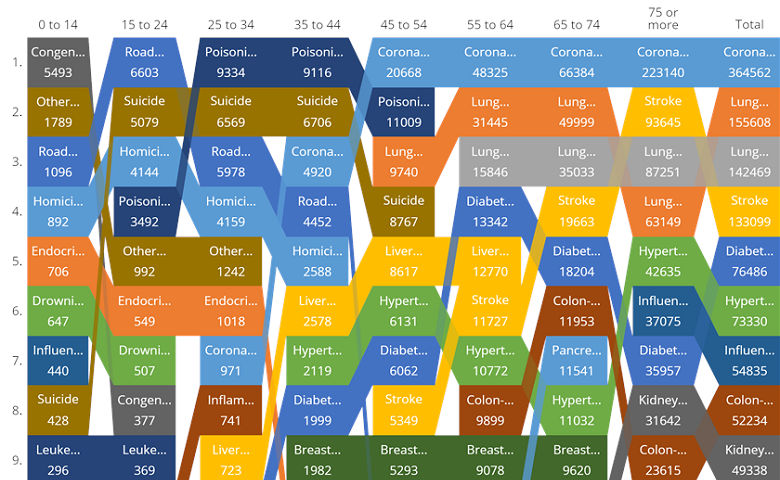
The table below show causes of death by age in the USA for 2014. We can easily see from the table that death is most common among the elderly. Not such a helpful conclusion. The real story has been overwhelmed by the higher magnitude of death rates among the elderly.
A more insightful way to look at the data is in terms of relative differences in causes of death by age. The differences do not leap out at you when you look at this table. It is precisely for data like this, that the Ranking Plot is excellent.
A Ranking Plot quickly highlights the differences
The Ranking Plot below allows us to quickly see lots of interesting results that would have taken a long time to extract from the complex table.
Reading across the top row of the Ranking Plot we can see how the main causes of death vary until 45 years of age. After 45 years of age coronary heart disease dominates the statistics. We can also see that the age of 45 is the key change point. Before that, misadventures of various kinds play a prominent role. After that, the coronary heart diseases is the number one cause of death.
If you want to play around with the cause of death data and the Ranking Plot used to create them, you can do so here.