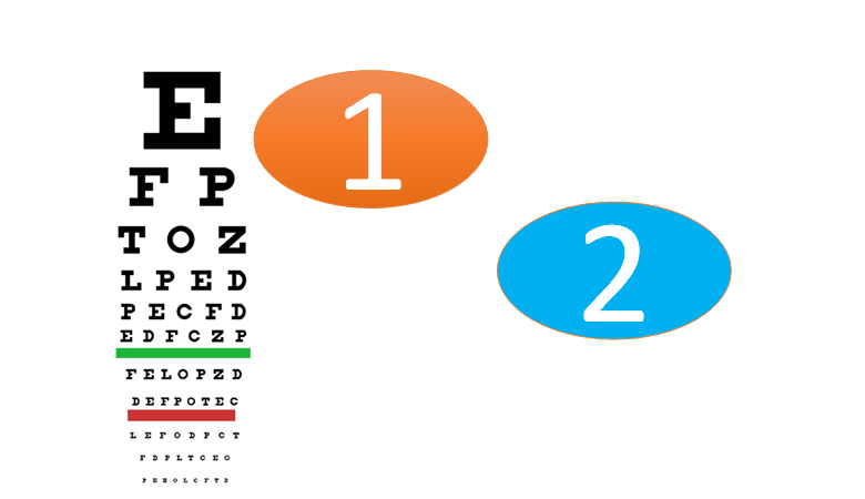
All else being equal, small visualizations are better than big visualizations. There is no need to take my word for it. You can prove it to yourself with a simple experiment. Once you have finished reading this sentence, focus on the big, orange number 1, and, at the same time, try and see how far you can get down the Snellen chart.
Perhaps you can make out the E, the F, and the P. While doing this, my guess is that you feel your eyes flickering in an effort to cheat. Now, focus on the blue number 2. Unless you are special, you likely cannot make out a single letter.
 The principle here is one you know well. It governs where we place our TVs and monitors. It also helps us work out where to stand in an art gallery. We find it easier to recognize shapes when they are in a narrow field of vision. We even have an old adage to describe this: you cannot see the forest for all the trees.
Let us do the same thing with a simple chart. Look at the chart to the right. It is pretty easy to see the pattern.
Now, look at the bigger chart below. More is clearly less. It takes a lot more movement of the eyes before we can see the story. Unless you access this post on a device with a small screen!
The leading practitioner of the art of small visualizations today is perhaps The Economist magazine, which publishes lots of informative and perfectly-size visualizations. So, the next time you create a visualization that exactly fits onto a page in PowerPoint, or within the margins of a blog post, see if you can shrink it. Sure some people with bad eyes may struggle, but they all know how to zoom.
Acknowledgements
The Snellen chart is by Jeff Dahl, and was downloaded from Wikipedia. It is based on the public domain document: CC BY-SA 3.0, https://commons.wikimedia.org/w/index.php?curid=4262200