
What is a Column Chart?
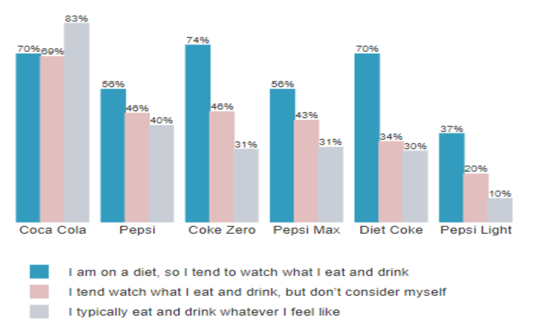
A column chart is a data visualization where each category is represented by a rectangle, with the height of the rectangle being proportional to the values being plotted. Column charts are also known as vertical bar charts. Column chart example In the example below, the height of each bar is proportional to the percentage of […]
Customizing Colors Within a Series on a Bar, Column, or Pyramid Visualization

In Displayr, you can customize the colors within a series for bar charts, column charts, and pyramids created using Insert > Visualization. This can make visualizations more informative and engaging. The normal boring use of color The bar chart below is the default bar chart created by Displayr. Color is merely adornment on this chart; […]
How To Use Sparklines To Show Trends In Charts
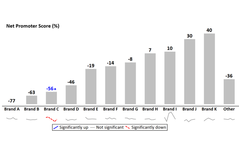
Adding sparklines to a line chart that has multiple series of data can vastly improve readability and interpretation. Line charts are one of the standard charts used in tracking market research. But, as soon as they have more than a couple of series of data, they tend to be awful. This is aptly illustrated by […]
How to Make a Column Chart in Displayr
The most standard way for graphically representing categorical data is with a column chart. The advantage of using column charts is that you can easily see the differences between categories. While these charts can handle multiple series of data quite well, the ease of making comparisons decreases as more data points are added. This article […]
How To Add a Line to a Column Chart

By adding a line to a column chart, you can add context to make your visualization more compelling and better display the relationship between two related concepts. For instance, you may want to show a Top 2 box alongside NPS or a count of respondents next to an average rank. Even if your data is […]
