


In Displayr, you can customize the colors within a series for bar charts, column charts, and pyramids created using Insert > Visualization. This can make visualizations more informative and engaging.
The normal boring use of color
The bar chart below is the default bar chart created by Displayr. Color is merely adornment on this chart; it communicates nothing. It is boring!
Using color to focus
This next chart does a much better job. It uses color to draw the user’s eye to a feature of the data.
To do this in Displayr and Q, set Chart > Data Series > Color palette to Custom palette (color pickers), check the option Multiple colors within a single series, and manually set the colors.
Using color schemes
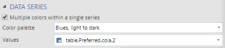
The next level up is to specify a color scheme of some kind. In this case, I have used a series of blues. This chart is a terrible visualization, as the color is being used for visual adornment in a way that can only undermine the true pattern in the data. If the data was sorted, it would be a much better visualization.
In this visualization, I’ve used Blues, dark to light as the Color Palette. There are lots of other color scales to use, and you can also provide custom ones.
Making the colors conditional on data
My favorite application of this new feature is shown below. Here the darkness of the blue is proportional to the values (i.e., employing redundant encoding).
Rather than use Blues, dark to light, I’ve instead set a Custom Gradient from white to blue, and I’ve specified that the color should be proportional to the values in the table, which is done by selecting the table in the Values selector (shown below). An entirely different series of data could also be used (e.g., the length of the bars could relate to attitude, and the colors to brand usage).
When combined with small multiples, you can get even more value from this feature, as it makes for effective redundant encoding, as in the pyramid chart below.
