
Why Pie Charts Are Better Than Bar Charts

Ok, ok, this blog’s title would be a bit more accurate if the word “often” appeared in the title. In my defense, all the anti-pie chart trolling provoked me! Troll HQ, Wikipedia, writes “Statisticians generally regard pie charts as a poor method of displaying information”. Ouch! And a curious error of logic hides here. Let […]
How to Make a Pie Chart in R
Pie charts are the classic choice for showing proportions for mutually-exclusive categories. There are various packages available for creating charts and visualizations in R. One of the more popular packages used today is the ggplot2 package. In this post, we’ll show how to use this package to create a basic pie chart in R. When To […]
What’s Better Than Two Pie Charts?
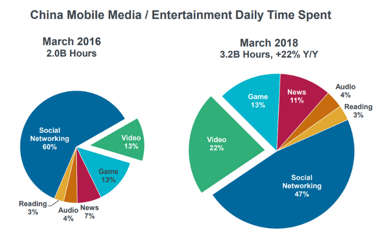
Every year, the famed venture capitalist Mary Meeker releases her Internet Trends, a tour de force PowerPoint presentation. It’s an influential deck – each year amassing views in the millions. It is normally a triumph of effective communication, but I did find one slide that was – from a textbook perspective – a car crash. […]
A Pie Chart for Pi Day: The Data Scientist Pie Eating Challenge

The challenge In his informative post, David points out that the visualization below, from the Wall Street Journal, is a poor one. Sure it looks pretty, but it takes quite a bit of work to figure out the answer to the question it poses at the top. Where does the time go? “What Data Scientists Do All […]