


The challenge
In his informative post, David points out that the visualization below, from the Wall Street Journal, is a poor one. Sure it looks pretty, but it takes quite a bit of work to figure out the answer to the question it poses at the top. Where does the time go?
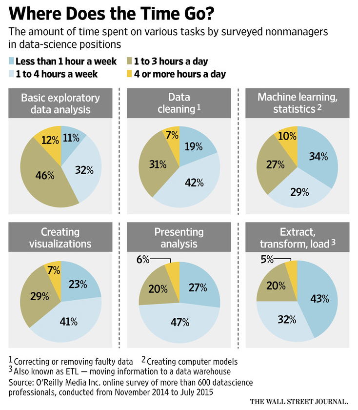
“What Data Scientists Do All Day at Work” by Deborah Gage, Wall Street Journal, March 13, 2016.
This analysis was done in Displayr. To see Displayr in action, grab a demo.
Book a Displayr Demo!David’s better plot
David creates small multiples of column charts. You can check out the code here.
This new plot is, to my mind, a clear improvement on the original, although it has a bit too much of the Tufte funeral style for my own liking.
But, it is a complex chart, not a visualization
However, I think this is still a complex chart rather than a visualization. To interpret it correctly requires a strong mind. Compare Presenting analysis with Machine learning/statistics. The highest column is for Presenting analysis (47%), but taking frequency properly into account, more time is actually spent on Machine learning/statistics. Sure, the reader can easily work out this correct interpretation, but they need to work it out, as their instinctual interpretation – a higher column is meaningful – is not correct.
A solution is to:
- Make educated guesses about the average of each of the column categories. My guess is that < 1 a week is 0.25 times a week, 1-4 a week is 2.5 times a week, 1 – 3 a day is 14 a week, and >4 a day is 40 times a week. This is often referred to as midpoint recoding (even when not using midpoints)
- Multiply the percentages in each column by the guessed averages and sum them up.
- Convert them to percentages.
- Create a high-quality pie chart.
Is the pie chart truly better?
The pie chart clearly shows less information than the early charts. And, it makes assumptions that are, at best, educated guesses. But, to my mind, it does a better job, in that it quickly communicates that main pattern in the data, which is that all the categories are reasonably large, with no one activity dominating the time of data scientists.
This analysis was done in Displayr. To see Displayr in action, grab a demo.
Book a Displayr Demo!