

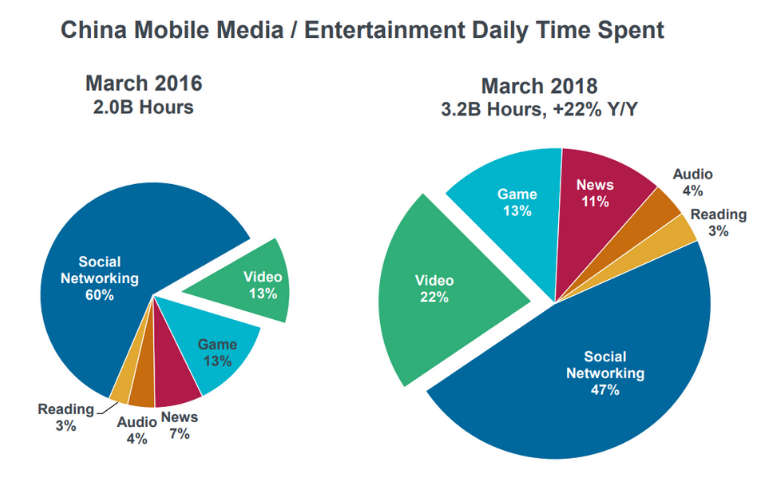
Every year, the famed venture capitalist Mary Meeker releases her Internet Trends, a tour de force PowerPoint presentation. It’s an influential deck – each year amassing views in the millions. It is normally a triumph of effective communication, but I did find one slide that was – from a textbook perspective – a car crash. I’ve reproduced it below. Two pie charts on one page! Of course, you can easily create your own pie charts for free using Displayr’s pie chart maker. Go on, try to do better.
I like pie charts more than most, but this slide accentuates their great weakness – the difficulty of comparing slice sizes – by requiring the reader to compare slices across pie charts. Additionally, the pies have been rotated differently, making the comparison more difficult. The pies have also been resized to make it clear that the market has grown. However, the resizing has been done incorrectly, with the pie on the right being 96% larger than the one on the left, despite the market having only grown 60%! This makes the focal comparison – video – misleading.
The management consultant’s friend
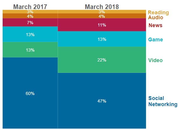
A reasonably standard chart exists for such comparisons in the world of management consulting. It is variously known as the mosaic plot or mekko (apparently in honor of the Finnish design house, Marimemekko, which has similar designs). Like its friend the stacked column chart, a mekko is better for comparing proportions than two pie charts. However, it is still far from a perfect chart. Part of the problem is that many clients find them confusing. And they’re not altogether wrong – unless you have a ruler, these charts are not so great for comparison purposes. The chart shows us that video has increased its share of the growing market, but we cannot easily see by how much. Similarly, it looks like social networking has declined in share but still grown in absolute terms, but it is hard to be certain without doing the math.
Going old-school
Funnily enough, in the first half of the twentieth century, there was a standard solution to the problem of simultaneously comparing changes in share and size – a back-to-back pictograph bar chart (see Rudolf Modley’s Pictographs and Graphs from 1937). In the visualization below, I’ve used a clock showing a value of two to denote every 200 million hours.
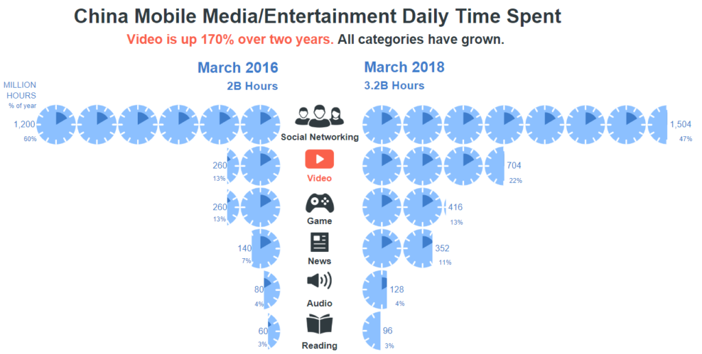
At a technical level, this visualization outperforms the two previous ones as it makes the key comparisons of interest to the viewer clearer – these being:
- All the categories have grown
- The dominant activity in both 2016 and in 2018 was social networking
- Social networking’s share of time has declined
- Social networking has grown by 300 million hours
- Video has increased at the fastest rate (170%)
- News has also grown rapidly
Despite its technical merits, I’m not super-proud of this visualization. It took about an hour to create. When I look at it I see a lopsided seagull. My wife, who works in consumer insights and has seen more than her fair share of visualizations, tells me it is f***ing awful; a judgment she reached after about 1 second (sigh). Unless the audience is highly engaged, a visualization needs to be able to be interpreted in less than 5 seconds. Whatever criticisms can be made of the original visualization, reproduced below, it passes this test, as it needed to, being in the appendix of a 296 chart presentation that was presented in half an hour. It is hard to beat two pie charts. But, if you do have an engaged audience, give the back-to-back pictograph bar chart a try!