


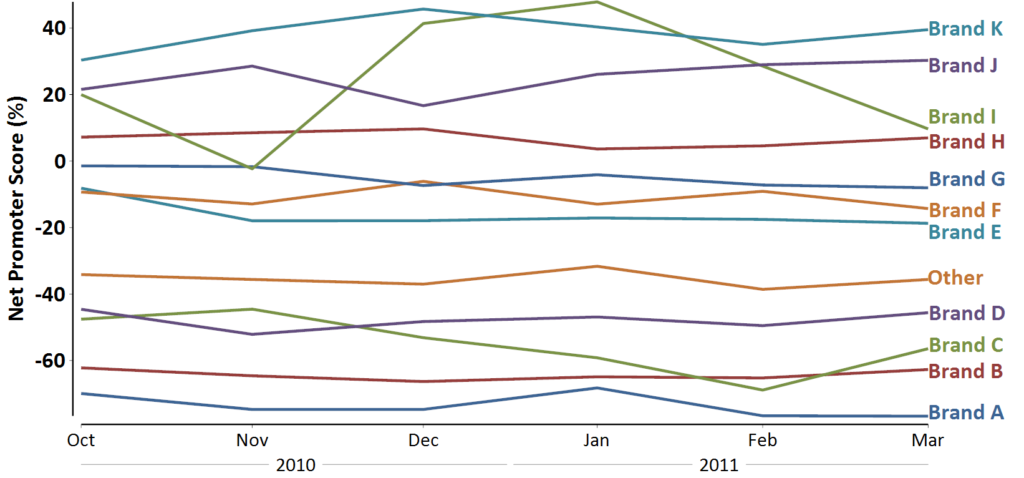
Look at the chart below. It is hopeless. Sure, a bit of care has been put into making it look better than most line charts. However, what does it tell us?
You need to put in hard work to extract insight from most line charts (that have more than a few series of data). Good practice in data visualization is to use small multiples instead. In this post, I illustrate what this means, and explain why our brains find such visualizations superior.
The challenge is the chart, not the data
When visualizations are difficult to read, it is tempting to blame the intrinsic complexity of the data. This is often not the real story. The whole point of using visualizations is to allow us to tap into our brain’s skill at interpreting visual complexity. Consider a photo of a friend. It is substantially more complicated than the chart above. Yet, we can quickly look at the photo and obtain key conclusions: who is in it, when it was taken, whether they are happy or sad, and perhaps what they were doing.
What makes the chart above difficult is that the key information – the lines – appear to our brains as essentially flat lines of different colors. But our brains have little experience in analyzing such patterns, and thus we struggle to interpret the chart. When I look at it, it conjures to my mind nothing so much as… spaghetti. And, that is not a good thing, as I do not look for patterns in spaghetti.
Small multiples
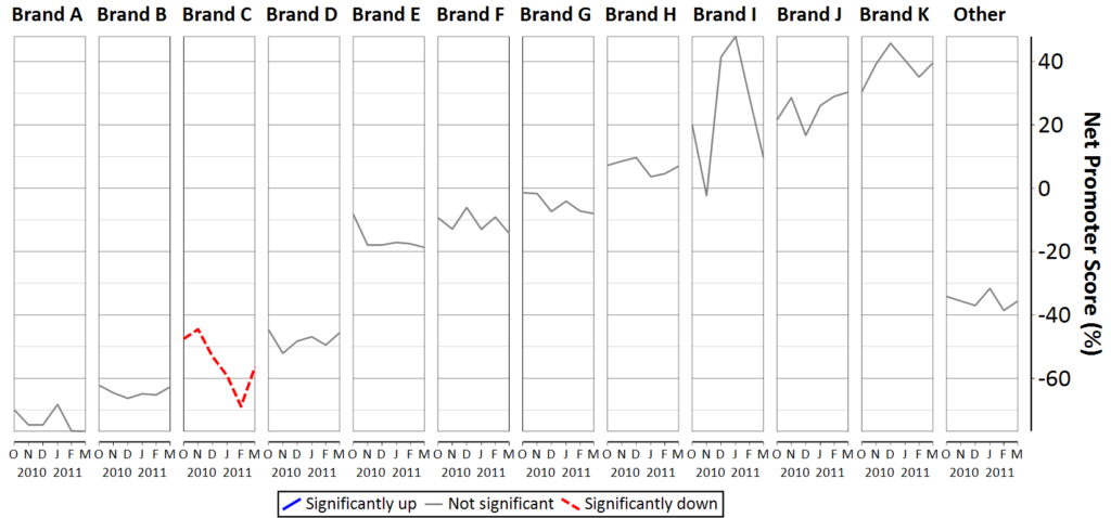
The next visualization shows the same data, but with the performance of each brand represented as a separate graphic. This is known in the visualization literature as small multiples.
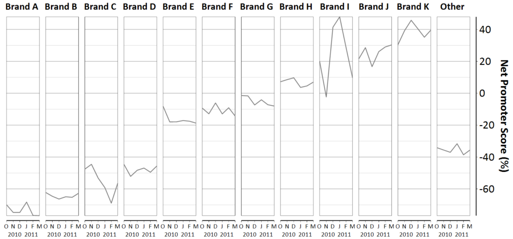
It is much easier for our brains to decode this chart, as:
- The line representing each brand is not flat, which makes it easier for our brains to see the patterns.
- One of the key features of the chart – the difference between the brands – is communicated by the location of the lines, rather than color. This helps us because our brains are much better at interpreting patterns in space than in color. (If you doubt this conclusion, think back to the example of the family photo: you can still get all your key conclusions when the photo is in black and white).
- The individual graphics have been ordered to make it easy to see the average difference between the brands. This helps us to appreciate the data in two different ways. First, in terms of the average performance of each brand. Second, in terms of each brand’s trend.
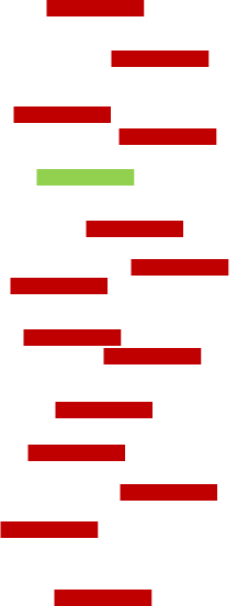
A simple visual experiment
A simple visual experiment quickly illustrates the underlying reason why small multiples work so well. When you look at the image below, you can immediately spot the odd one out.
Similarly, it is easy to spot the odd one out with the next image.
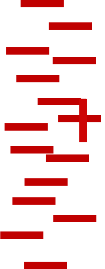
With this final image, even though it is very simple, it takes a little longer.
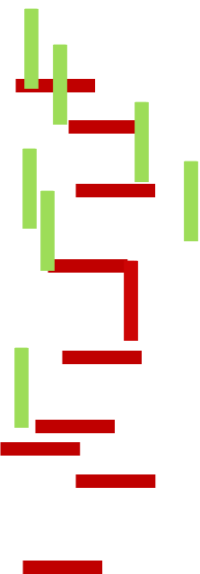
What makes this last one a bit harder? The first visualization used three dimensions: vertical position, horizontal position, and color. The second visualization also used three: vertical position, horizontal position, and direction. The final uses four dimensions. Every dimension increases the cognitive load, making it slower for us to see patterns. When we switch from the line chart at the beginning, to the small multiples, we are cutting a whole dimension out (color). Our brains return the favor by being quicker to spot the patterns.
Bringing color back into play
Having gained the psychological benefits of the small multiples, we can bring color back into play in a secondary role. The visualization below uses color to highlight statistically significant trends. In this case, the red dashed line indicates a significant decline in performance (i.e., time is negatively correlated with Brand C’s performance).
Conclusion
There are really two broad principles underlying why small multiples are desirable:
- In general, our brains are better when we create visualizations which use as few dimensions as possible. We get confused by high dimensional visualizations. This is the point emphasized by the experiment.
- By splitting a big visualization up into smaller and simpler visualizations, the great skill of our brain – understanding patterns – comes into play. I have written about this in much more detail in The 5 Second Rule and the Need to Create Instantly Recognizable Visualizations.
Acknowledgements
All the visualizations in this post were created in Q (www.q-researchsoftware.com).
The visual experiment is adapted from Figure 6: Green, Marc. 1998. Toward a Perceptual Science of Multidimensional Data Visualization: Bertin and Beyond. https://graphics.stanford.edu/courses/cs448b-06-winter/papers/Green_Towards.pdf. The more general principle, about focusing on lower spatial dimensions rather than color comes from Jacques Bertin’s( 1967) Sémiologie Graphique. Les diagrammes, les réseaux, les cartes, Translation 1983. Semiology of Graphics by William J. Berg.
