Tutorial: Who is the Booziest Country in the World?

Already read our article on "Who is the Booziest Country in the World?" and are ready to create your own pictographs and interactive geographical map? We've got you!
Creating the first pictograph bar chart:
 1. Open Displayr, click Add New to begin a new document and import your data.
If your data is in a format that's easy to import (like an Excel file), then you can press 'Add a data set' and upload it straight away.
If you're anything like me and had data that was unhelpfully scattered across different sources and in tables that could not be copied, the easiest thing to do is manually add it an Excel file and upload it.
Displayr will give you an option to add the data as a table or as a data set. Either option is fine.
2. Create the pictograph bar chart.
If you added your data as a data set: In the top banner click Insert > Visualization > Pictograph > Bar Chart. On the right hand side, look for Data Source and select your data in the drop down menu.
If you added your data as a table: Click the table and on the right hand side, look for Output and change the chart type to Bar Pictograph.
3. Customize the pictograph for your own purposes.
Appearance:
If your data is untidy or looks out of scale, you may want to delete rows or columns as appropriate. On the right hand side, look for Data Source and click the 'paste or type data' button. Delete/Add rows and columns as you like.
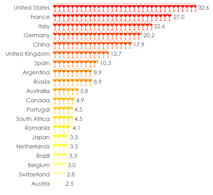
Icon: Your data will have been shown with the default icon, 'stick man'. For our purposes, we obviously want wine glasses instead of the stick man. Click on the Chart tab on the right hand side. Change the drop down menu option under Appearance from 'stick man' to 'wine'. As you can see, there are loads of options for you to customize to your heart's content.
Color: We also wanted to change the color scheme to something that fit with the theme of wine a bit better. Again, on the right hand side, look for Data Series and then change the color in the drop down menu from 'default' to whatever you would prefer. I used heat colors.
Font: You can also change the font style, color and size in that same Chart tab.
Creating the second and third pictograph bar charts:
 The initial steps for these pictographs are the same. Upload your data set and create the bar pictograph. The only thing I have changed is the customization of the appearance.
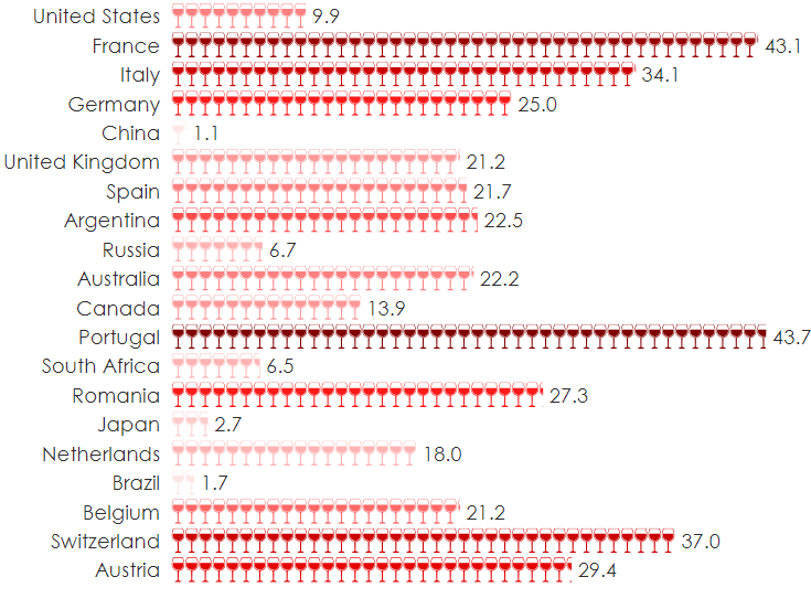
For the second bar pictograph, I decided I wanted to customize the colors to represent the varying amounts. Since I wanted to keep the countries in the same order for comparison sake's, selecting a dark red to light red gradient would not work - this would just show the darkest to lightest colors from top to bottom.
So instead, I created a custom color palette. After you select custom color palette a text box appears below it for you to add the color hex code in. Hex codes are six digit codes representing the intensity of a color. You can find them easily online. For example, the first three codes I entered were: #ff8080, #990000, #cc0000
Creating the interactive geographical map
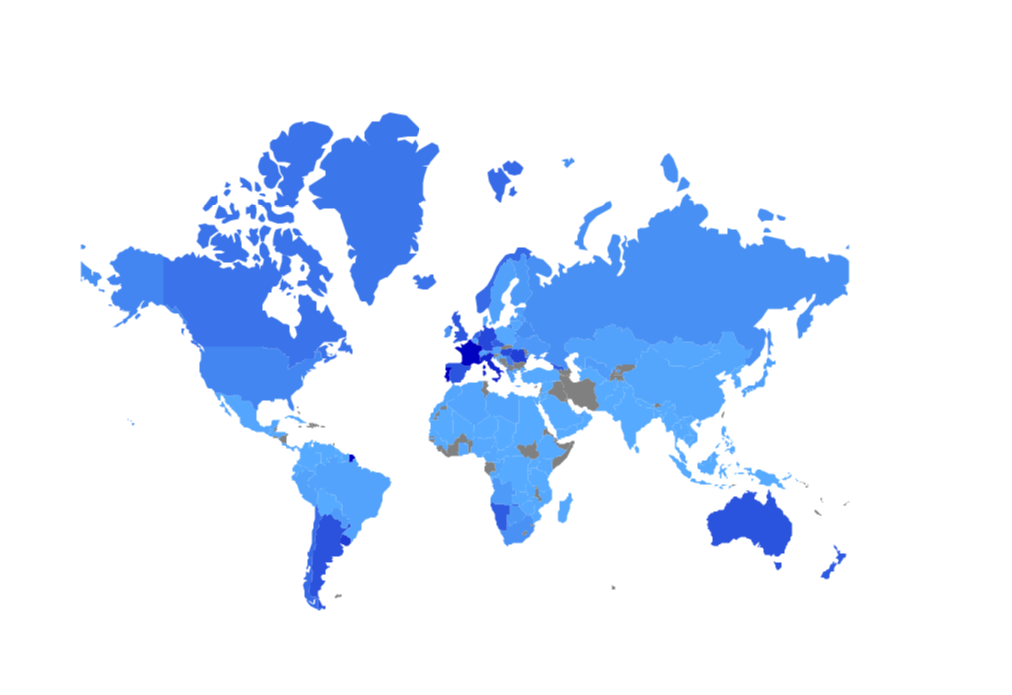 Like above, you can either click Insert > Visualization > Geographical Map > Data Source > Select your data from the drop down menu or hit 'paste or type data' to enter it manually.
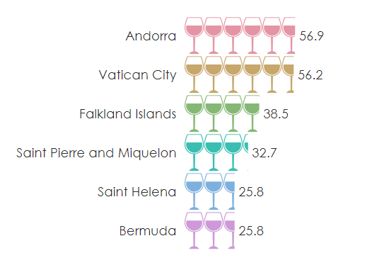
Most likely, your data source may not contain data from every country. Like me, you may have only twenty countries in your original data. To add more countries simply hit 'paste or type data' and manually input them.
You also have two different options for packages: Plotly or Leaflet. Plotly is faster but more basic as it can only produce maps of the world (by country) and US states. Leaflet, on the other hand, is more flexible and can produce state and postcode maps from many countries. However, Plotly has the advantage of being able to create "small multiple" maps - basically lots of little similar maps. They also vary in appearance. To change packages, click the Chart tab and under Appearance change 'Plotly' in the drop down menu to 'Leaflet'. You can also change your color palette in the same Appearance section.
That's about it! Have questions? You can drop us an email in the contact us section of our website here and we'll get back to you asap.