


While Displayr already has automated significant testing and highlighting built-in, our suite of “Rules” functions allows you take Table and Chart automation to a whole new level. You are really only limited by your imagination!
What are Rules?
Rules are a set of predefined automated functions – most commonly they could be thought of as a way of conditionally formatting tables (where you specify the conditions). But the range of available functions extends well beyond formatting. The current library* of automated options includes (but is not limited to):
- Highlighting cells or chart series via custom criteria (e.g., ranges, greater/less than, top n).
- Applying color scales to entire tables or charts.
- Adding text, symbols to table cells or chart data labels.
- Customizing significance comparisons.
- Removing rows or columns or hiding cells based in specific criteria (e.g., minimum sample size).
- Reformatting columns (e.g., include sample size; re-label but leave source variable intact).
- Customizing footers.
- Automatically re-sorting charts or tables, by columns or rows of your choice.
- Weighting or filtering selected columns or rows.
* There are currently 70 rules to discover! We are constantly adding to the library of rules and soon you will be even able to create and save your own.
How to create Rules
Once you have created a Table or Chart and selected it, the Rules menu is available on the Inputs tab of the Object Inspector panel.
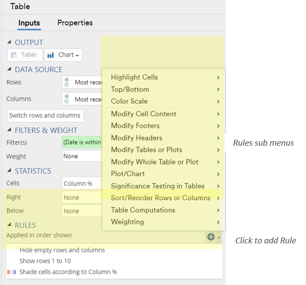
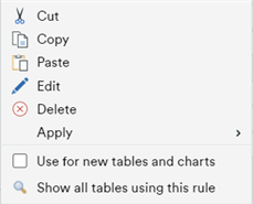
As you create rules, they are added to the list in the box in the Object Inspector. From here you can set the order that they are applied (by dragging and dropping), or right click for more options (see below). Importantly, you can copy a rule and then paste it into the same box for other Tables or Charts, which immediately applies the same rule settings. You can also make selected rules the default for any new outputs (“Use for new tables and charts”).
Examples of Rules in Action
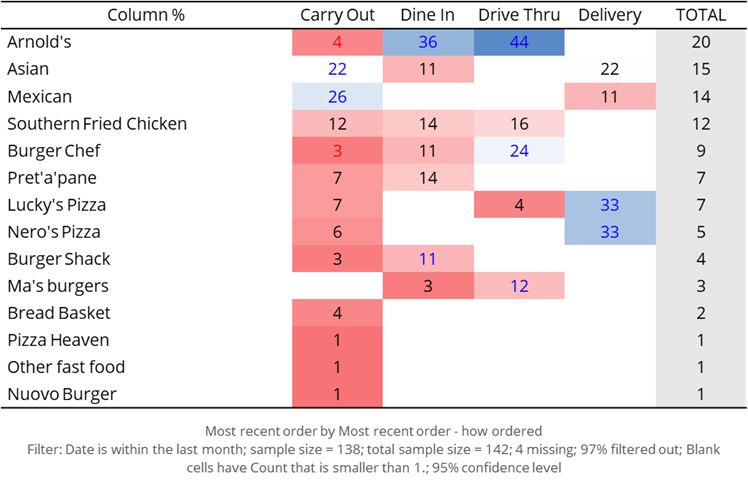
Example 1: Conditional formatting of a table and chart
This basic table has a Color Scale Rule applied, with higher values in blue and lower values in red, so it acts like a heat-map. Note there an additional rule to suppress cells where there were no responses recorded, to tidy the table up (this is indicated in the footer).
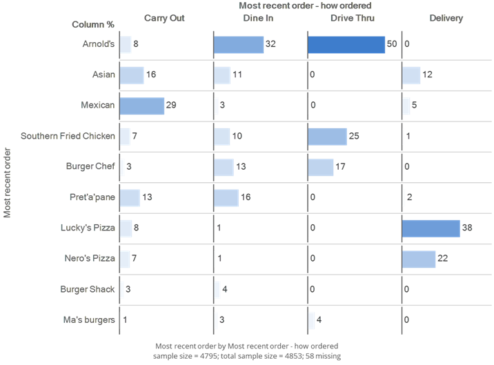
The grid-of-bars chart has a Custom Color scale applied, to emphasize the higher values. To keep the chart “clean” there is also a rule applied to only select the top 10 rows from the source table (based on the total brand score).
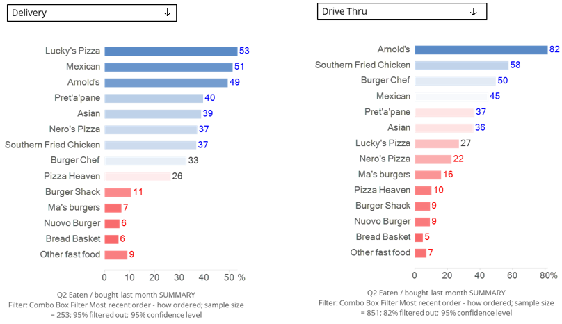
Example 2: Automatically re-sorting a specific column
Here the chart on the left (with a filter set to ‘Delivery’) has a rule applied to Sort Rows Automatically when the data changes. As soon as the filter is changed to Drive Thru (on the right), the chart updates with the new rank-ordering. Displayr cleverly leaves “Other” at the bottom, which would be the convention in market research.
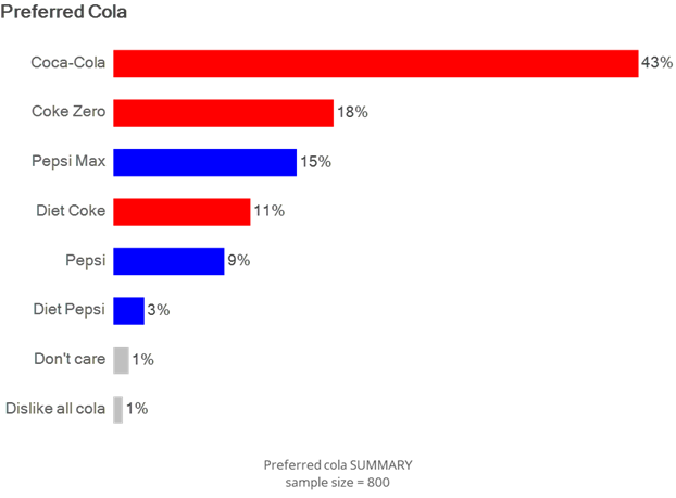
Example 3: Formatting Data Series based on text content
You can even make the format of a chart conditional on the items containing specific text. In this example, any category containing “Coke” or “Coca” has been set to appear red. Any category containing “Pepsi” has been set to appear blue.
Once this rule has been set up it can be applied to any chart containing information on cola brands. This rule alone would have saved the author countless hours across a long career!
In Summary
You can see from these simple examples the potential for rules to turbo-charge your analysis and reporting. This is particularly true when you combine several rules together (which will operate in the order they are listed). Think of one of those tedious tracking tasks, when you want to update an end of period summary of the Top 5 Brands Considered, for example. Date variables in Displayr can be set to always show the last n time periods, (select the Date Variable then Date/Time > Period Type > Duration > Duration n). With this filter in place the “Consideration” table or chart can then have rules applied so it always:
- Arranges the brands is descending order.
- Shows only the first 5 rows.
- Displays brands in custom colors, like in Example 3 above.
Try rules out see how far your own imagination takes you!