


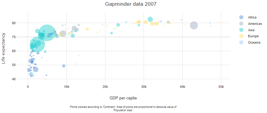
In the bubble chart below, each bubble represents a country, its area is proportional to its population size, the color indicates the continent, and the horizontal and vertical positions relate to GDP per capita and life expectancy, respectively.
Required data
A bubble chart requires at least three variables (columns) of data: one showing the size of the bubbles and two others showing the horizontal and vertical position of the points.
Variants of bubble charts
Labeled bubble charts
Each individual bubble can be labelled, as shown below. This is typically only practical when there is a relatively small number of data points. The example below shows the first three columns from the table above.

Numeric color variables
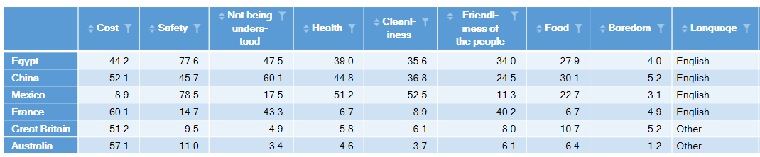
Color can be used to encode numeric variables. In the example immediately below, dark grey indicates high levels of concerns regarding food when traveling to the different countries, light blue indicates an absence of a concern, and in-between colors represent differences in degree (e.g., food concerns are marginally higher in Great Britain than in Australia, and marginally lower in Mexico than in Egypt).

Maps
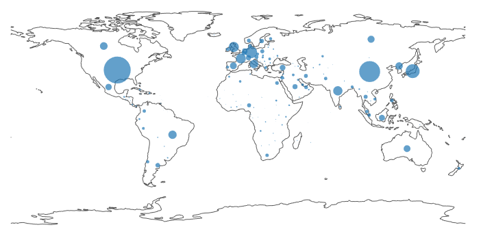
Bubbles can also be drawn on top of maps, and these are sometimes known as cartograms. From a conceptual perspective, this is identical to the previous examples, with the horizontal and vertical positions being latitudes and longitudes. However, the key difference is that an image is used in the background.
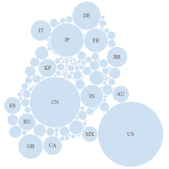
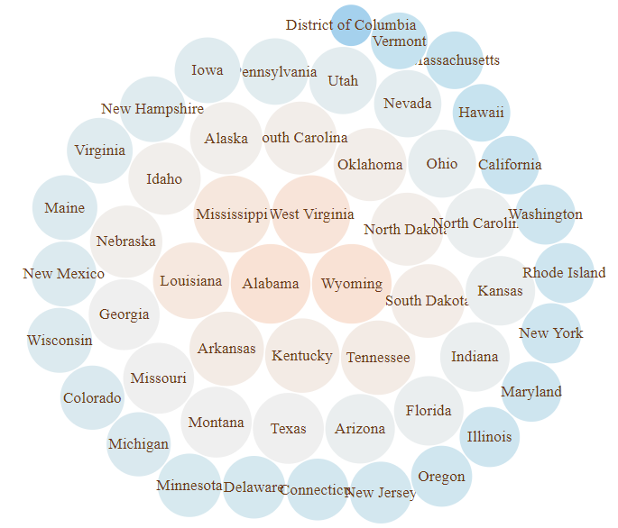
Bubble clouds
Bubble clouds, also known as circle packing, are another type of bubble chart. Here, the position of the circles is chosen so as to make them fit closely together. In the second example, shown further below, the the bubbles have been ordered from biggest to smallest, and color has also been used to redundantly encode the data.
Software to create a bubble chart
All the visualizations in this post were created in Displayr. You can easily create your own scatter plot or bubble chart in Displayr!