


A labeled scatter plot is a data visualization that displays the values of two different variables as points. The data for each point is represented by its horizontal (x) and vertical (y) position on the visualization. A text label is used to show the meaning of each data point.
Don’t forget you can create a scatterplot for free using Displayr’s scatterplot maker!
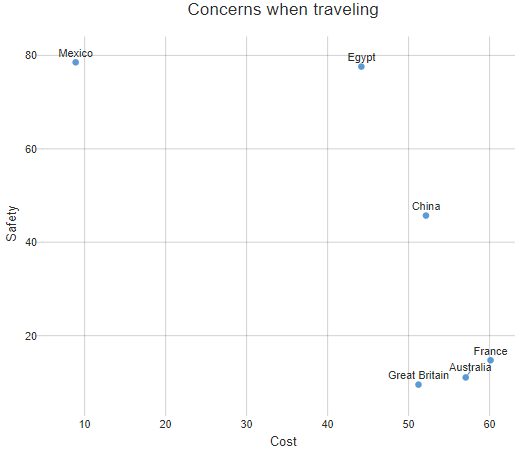
In the labeled scatter plot below, each point represents a country, with the horizontal position showing the percentage of people who consider cost to be a concern when travelling to the country and the vertical position showing the proportion who regard safety as a concern.
Create your own Labeled Scatterplot
Create your own Scatter Plot
Required data
A labeled scatter plot requires at least three variables (columns) of data: one will be shown as labels, and two others as the horizontal and vertical position of the points. The plot above has been created from the first three columns of the table below.
Variants of labeled scatter plots
Colored groups
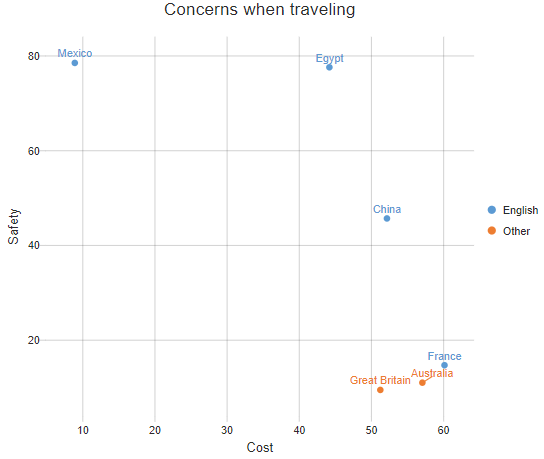
Color can be used to add an additional categorical variable to a scatter plot. In this example, color indicates whether the countries have English as a first language.
Bubble charts
The points in a labeled scatter plot can instead be displayed as bubbles (circles), where the area or diameter is proportional to some other numeric variable. In the example below, the area of the circles is proportional to the number of people to indicate they had concerns about health when traveling to each of these countries.

Numeric color variables
Color can also be used to encode numeric variables. In the example immediately above, dark grey indicates high levels of concerns regarding food when traveling to the different countries, light blue indicates an absence of a concern, and in-between colors represent differences in degree (e.g., food concerns are marginally higher in Great Britain than in Australia, and marginally lower in Mexico than in Egypt).
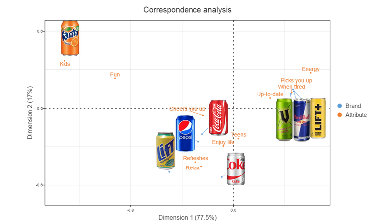
Images
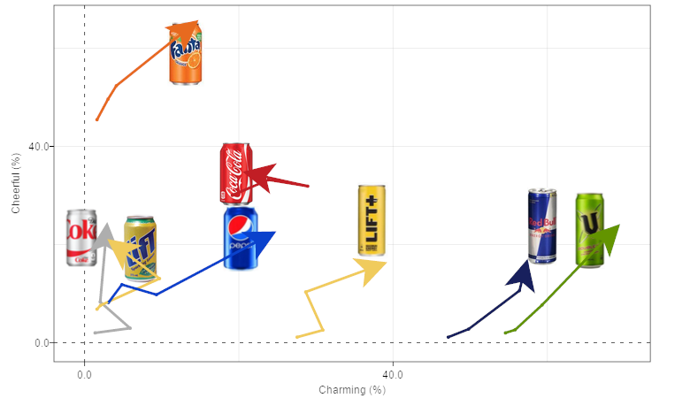
Images can also be used in the place of points and labels. In the labeled scatter plot below, each brand’s label has been replaced with the image of a can.
Trend lines
Trend lines can be used to connect related points. In the visualization below, the lines represent the change in the values of the brands over time.
Software
All the images in this post were created in Displayr.
Check out the rest of our blog or Help Center for more examples, or if you’re ready to get started, make your own labeled scatter plot in Displayr for free!
