

Overplotting is when the data or labels in a data visualization overlap, making it difficult to see individual data points in a data visualization. Overplotting typically occurs when there are either a large number of data points and/or a small number of unique values in the dataset.
Fixes for overplotting include reducing the size of points, changing the shape of points, jittering, tiling, making points transparent, only showing a subset of points, and using algorithms to prevent labels from overlapping.
Main types of overplotting
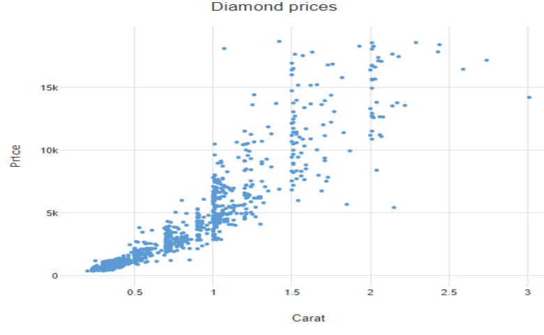
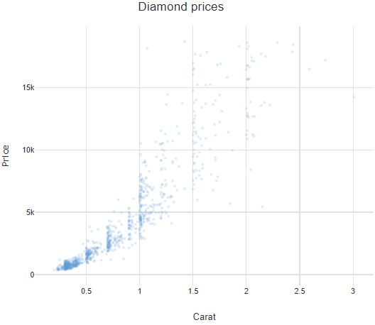
Too many data points with similar values
One of the main causes of overplotting is where there are too many data points with similar values. In the plot below, for example, at the bottom left all the data points to merge together to form a blue region. Although we can see that there are clearly a lot of points here, there is no way to know how many (e.g., there could be a million points, each on top of each other).

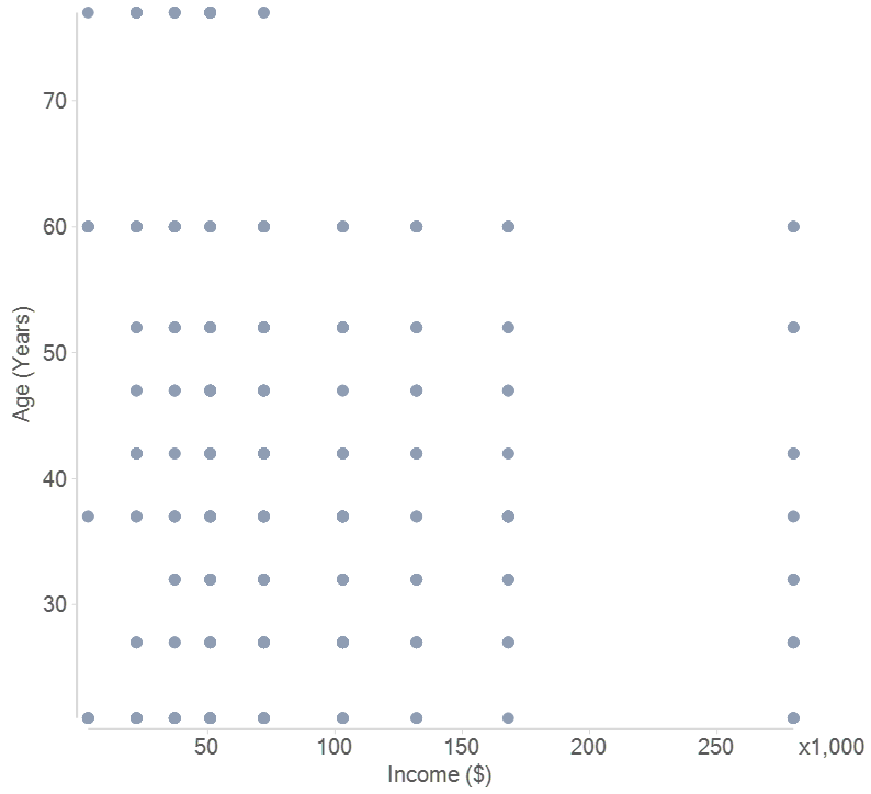
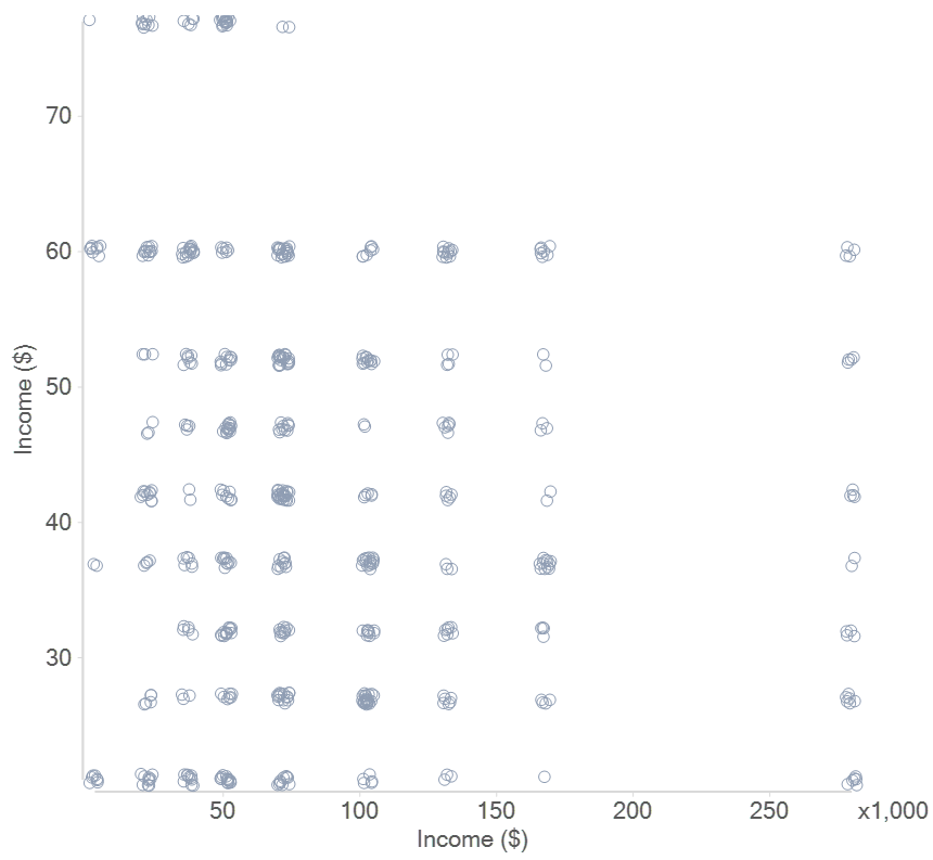
Data points with a small number of unique values
The scatterplot below shows age by income. This visualization exhibits a telltale sign of overplotting, which is that the data appears in neat rows and columns. There is no way to determine from this visualization if, say, there is only one person aged 60 with an income of $50,000 or more. The cause of the overplotting here is that the data has been collected in such a way that there are a small number of unique values (e.g., everybody aged 55 to 64 has been assigned a value of 60).
Overlapping labels
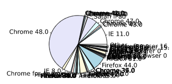
A third major type of overplotting occurs when the labels of a plot overlap. This occurs most commonly with pie charts and labeled scatter plots.
Remedies for overplotting
Reduce the size of points
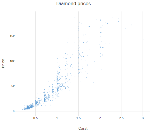
You can solve overplotting by reducing the size of the points used in the plot, as shown below. The chief benefit of this strategy is its ease. The weakness is that it provides no guarantee against overplotting. There is no way of looking at the visualization below and discerning if, for example, there are 1,000 dots on top of one another at the same place.
Showing a subset of the data points
Another simple approach to dealing with overplotting is to only show a subset of the points (e.g., randomly select 100 points and show them). This is rarely the best approach – you may leave out interesting data and overplotting might occur anyway.
Changing plotting symbols (glyphs)
The scatterplot above has used a dot as the symbol (also known as a glyph). Alternative symbols can be used, such as unfilled circles and + signs. However, like reducing the size of the points, this strategy provides no visual feedback to prove there is no overplotting.
Use transparency to deal with overplotting
The most useful approach to dealing with overplotting is often to create points that are partially transparent (the setting for this in the software will typically refer to one of transparency, opacity, or alpha level). When overplotting occurs it is then evident by darker regions, where the degree of darkness is caused by the multiple overlapping points. A weakness of this strategy is that although it makes the existence of overplotting clear, the magnitude of the overplotting is less clear.
Jittering
Jittering refers to the practice of adding small randomly generated numbers to the values prior to their being plotted. This strategy is most effective when there are a small number of unique values, as in the example below.
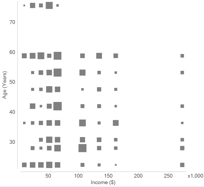
Tiles
Another strategy is to create tiles, where their area is proportional to the number of data points. When there are a small number of unique values this approach is particularly effective at overcoming overplotting.
Use software designed to avoid overplotting of labels
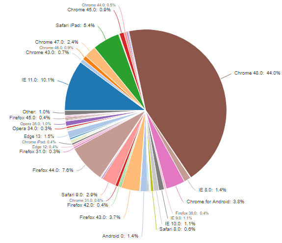
The solution to the overplotting of labels is to use software specifically designed to solve the issue. There are a variety of strategies that software can automate, such as changing font sizes, using lines to connect labels to data, removing labels from less important data points, and including labels in hover effects. For example, I’ve shown Displayr’s version of the pie chart below.
Now that you know all about overplotting, discover more data science terms with our What is guides!
