

Create your own Time Series Graph
Creating a time series graph
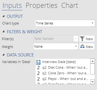
This chart can be created by selecting Insert > Visualization > Time Series Graph. A new output will be created on the current page, which you can customize using the Object inspector on the right. Like all of the other Displayr visualizations, there are three methods to enter data. However, the time series chart differs from the other visualizations in that it requires date or time information. The three methods of data input are:
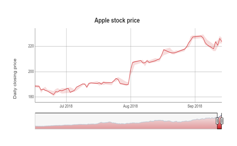
- Outputs in ‘Pages’. You can use any of the tables in the rest of your Displayr document with dates or times as row names here. In the example above, we used Stock Prices to get the price of Apple shares over the last 10 years.

- Variables in ‘Data’. We can also plot variables directly from the dataset. The variables will be treated as though they were columns of the input table. Put the date variable first, and then one or more numeric variables following it. If you see a warning about duplicated entries in the date variable, then you need to check the aggregation period (e.g., monthly instead of weekly data) of the date variable. To adjust the aggregation, click on the variable in the Data tree then in the object inspector on the right, click on the Date/Time button under Structure.

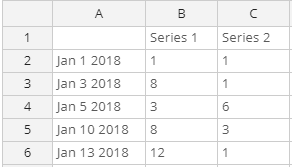
- Paste or type data. If you don’t plan to use the data for other analysis, the most direct approach is to type it into the chart object. Click the red button labeled ‘Paste or type data’. A spreadsheet will pop up into which you can enter your data. In the same way as the other input options, the left-most column should contain date information. For most standard formats, Displayr is able to automatically convert text to dates.

Create your own Time Series Graph
Options
 Additional options to customize the time series graph can be found in the Chart tab of the object inspector. Specifically, the options for time series graph are:
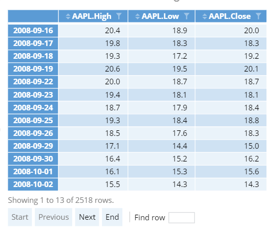
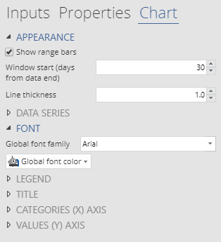
- Show range bars. In the time series graph above, you can see a shaded region surrounding the red line. This shaded region is determined by the AAPL.Low and AAPL.High columns. The chart automatically determines which columns to use for the lower and upper bounds by checking the mean value of each column. Note that this option requires input data to contain exactly three columns and cannot be used with multiple series.
- Window start controls the initial state of the range selector at the bottom of the chart. In the example at the top of this article, we set the window start to 90 days to show prices over the last quarter. Viewers can scroll on the range selector to change the date range, but the window start determines their first view of the chart.
Related charts
Other chart types in Displayr can also handle time series data. In particular, Line or Column charts have additional options for adding smoothed trend lines or customizing data labels. You can easily switch between chart types using the Chart type dropdown (in the Inputs tab of the Object inspector ).