


One of the best things about using Displayr is that everything is connected – for a given visualization or chart it’s easy to trace the steps and review how it was created, and changes to any input are automatically reflected in linked visualizations. This saves a lot of time when building or updating documents.
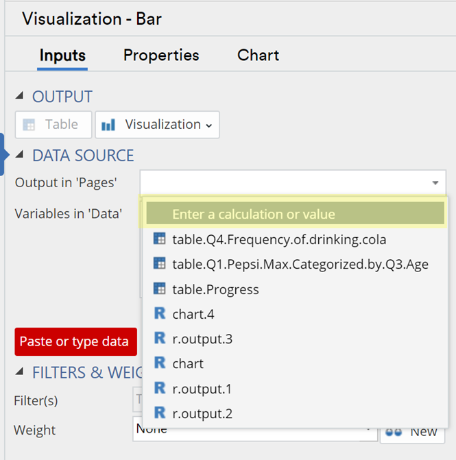
However you can make the process of creating inputs for visualizations, charting, and tables even easier by adding calculations or values directly to the data input drop-down.
Example 1 – Custom Selection from a complex table
Here is a typical table that has been created from some consumption data for fictitious fast-food brands.
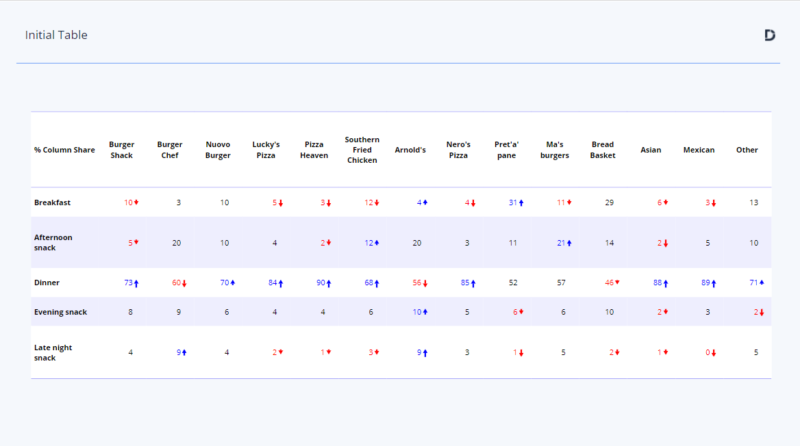
Let’s say we are only interested in charting the data for Burger Chef and a direct competitor, Burger Shack. One way to do this would be to:
- Duplicate the question (to keep the original data and table intact)
- Create the table
- Hide all but the two columns in question, or, use the Tables > Selection function to create a subset of the table
- Insert a visualization, say for a column chart
- Hook up the table to the visualization.
This would work fine but it also adds some complexity – Step 1 adds over 100 new variables to the Data Set (some of the rows have been merged) and there are several interdependent elements in the workflow described above.
With the ability to ‘ Enter a calculation or value’ directly in the drop-down, in combination with Displayr’s point-and-click formula creation, the process is a whole lot easier. You can see this in action here.
We took that slowly so you can see the steps, but in less than 30 seconds we’ve achieved the required result, and with fewer steps.
Example 2 – Modifying a Variable before visualization
The same Data Set contains information on the estimated number of visits each brand attracted in a month.
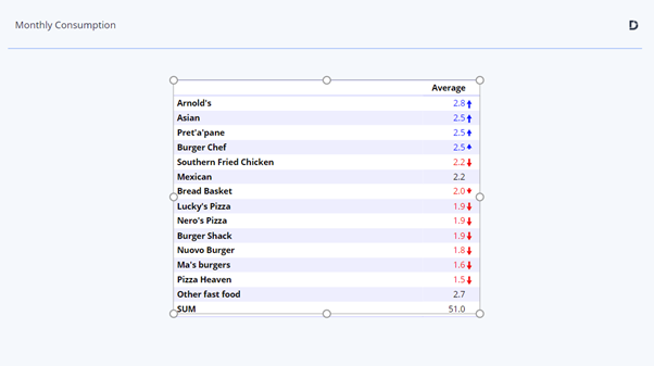
Let’s say we wanted to express this as a weekly average, to conform with other market metrics (e.g. weekly sales). Again, one way to do with would be to:
- Select the variable set
- Calculate > Divide, which creates a new copy of the variable set
- Enter ‘4’ as the single number to divide by, as a proxy for weekly data
- Insert a visualization, say for a bar chart
- Hook up the table to the visualization
Using the ‘Enter a calculation or value’ function this can be done without the need to create any new variables, as shown in this video
Again, all the required steps have been condensed to a few simple ones, and in just a few seconds
Learn more about custom selections and formula creation in Displayr: Calculate Anything! or Boost your analysis with in-built Calculations
The possibilities for Displayr’s custom selection and formula creation functions are vast – now you can easily add such calculations to visualization drop-downs, the only limit is your imagination!