Adding labels to a scatter plot is a great way to increase understanding. By using logos we can take that process a step further. Users are immediately aware what each point represents. In this post I explain how to add logos to a scatter plot in Displayr.
Don’t forget you can create a scatterplot for free using Displayr’s scatterplot maker!
A scatter plot with labels
The plot below shows a measure of how many people drink different brands of soft drink when at restaurants and when exercising. Each point is labelled with the name of a brand. In Displayr this is created from the toolbar with Visualization > Scatter > Labeled Scatter.
We can read that energy drinks (V, Lift Plus and Red Bull) are popular while exercising, but not at restaurants. The plot is not difficult to understand, but it could be better.
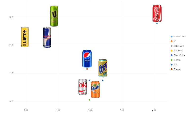
Adding logos improves clarity
We add logos in Displayr by supplying a comma delimited list of URLs in the order of the data. The improved chart is shown below.
Logos take advantage of the picture superiority effect: a cognitive bias whereby people remember pictures more than words. The phrase “a picture is worth a thousand words” springs to mind! Note that although you can scale logos can be scaled with the Logo size parameter, logos are only suitable for plots with a low number of points. Otherwise the plot becomes too busy and confusing.
You could convey the same information by using text labels or by coloring the points and a legend. However, the brain processes logos faster and remembers them better.
Summary
Adding logos to scatter plots in Displayr is simple process that aids user understanding. Logos also makes scatter plots look more professional.
You can follow the steps, or add some polish to your own charts in Displayr by following this link.