


TL;DR: The Top 7 Alternatives to Word Clouds
The common option: A word (phrase) cloud…
Creating a meaningful visualization from data with long lists can be challenging. While word clouds (sometimes known as phrase clouds) are often the popular choice, they are not always the best option. This post illustrates seven alternatives to word or phrase clouds that can be used to visualize data from long lists, each has its own trade-offs. The visualization examples in this post use the GDP of 185 countries and are created using R.
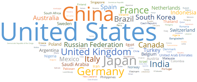
What is a word cloud (or phrase cloud)?
This visualization below is a word cloud (or sometimes referred to as a phrase cloud), which shows the whole names of countries (i.e., phrases) rather than just words. A word cloud with phrases can be a useful addition or alternative to regular word clouds. The size of each country in the cloud is in proportion to its GDP. While word clouds are often ridiculed, they do scale well. Unlike most charts, a word cloud gets better the more things it displays. But word clouds are far from perfect. The rest of this post explores some better alternatives to word clouds. All these word clouds and alternatives to word clouds are created in Displayr, which provides a more flexible and powerful alternative for word or data visualization than PowerPoint or Tableau.
Why do we need alternatives to word clouds?
The main reasons a researcher might avoid word clouds include;
- Longer words appear more prominently, skewing perception
- It is difficult to compare values accurately
- Too many words can cause readability challenges
- There is no way to show relationships between words and trends over time
So, if you think any of these roadblocks might impact your data visualization efforts, keep reading! We’ve got some great suggestions to enhance your data storytelling.
1. Circle Packing
One standard “fix” to word clouds involves creating a bubble chart with a circle packing algorithm to arrange the bubbles. This avoids the problem that different word lengths bring to word clouds. However, despite their appeal, in this case, the cure is worse than the illness. The small size of the bubbles prevents writing in the labels of all the countries. I have to put the names into tooltips which appear when you hover your mouse over the bubbles.
While I love these plots, I am not a great fan of tooltips for critical information. You can, no doubt, appreciate this point if you access this from a mobile device or the R-Bloggers website, where the tooltips cannot be seen unless you click on the visualization.

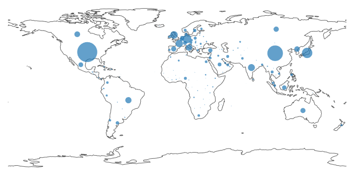
2. Cartogram
Rather than packing the circles close together, we can spread them out on a map. I have done this in the cartogram below. The resulting visualization, in most regards, improves on the visualizations above. Problems, however, occur here too. The cartogram relies on a firm understanding of geography, and it fails completely for Europe, where overplotting causes issues. If you have a scroll wheel on your mouse you can zoom in (go to the interactive cartogram). Nevertheless, just as with including names in tooltips (as done with the circle packing), this is a salve rather than a cure. The IMF, who provided the data used in this post, have created a nicer interactive cartogram if you want to see how to do this better.
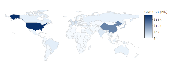
3. Choropleth
A choropleth solves the cartogram’s overplotting problem. However, it introduces a different problem. The choropleth below gives a very poor understanding of the distributions of GDPs, essentially splitting the world into three tiers: US, China, and others.
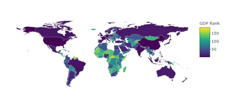
We can improve our ability to distinguish between the countries with smaller GDP by changing to a multi-color scale and transforming the data, as shown below. This does a much better job at allowing us to understand Africa. It also brings to the fore the poor state of the economies of central Asia, which is a feature not emphasized by any of the other visualizations.
However, this sharpening of discrimination among the smaller economies comes at a large cost. The naked eye struggles to discriminate between the bigger economies (e.g., Australia vs the US). Furthermore, just as the word cloud struggles when words differ in lengths, the choropleth has its own biases relating to the size of the countries. For example, Japan and Europe can easily be overlooked on this map.
Geographic visualization probably works the best for this particular data set. The next few visualizations are much more generally applicable, as they can be used for non-geographic data.
Try Displayr’s free choropleth tool.
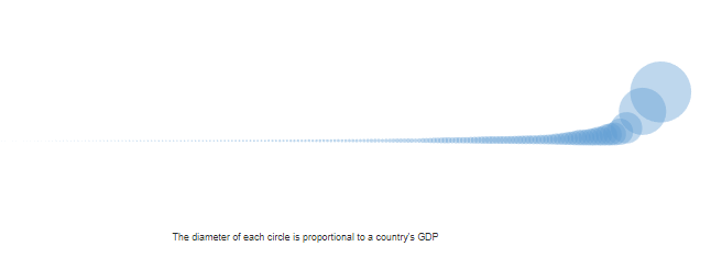
4. The Horn of Plenty
The visualization below takes the bubbles from the cartogram and circle packing and orders them by size, which creates a surprisingly effective way visualizing the distribution of population sizes. However, once more the critical information about which country is which is hidden in tooltips, making this a poor visualization for most problems.
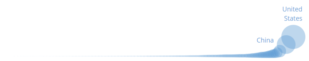
We can make the point that the US and China are the world’s largest economies by adding labels. However, this is not such a compelling improvement. Most viewers could likely have guessed what these labels tell them anyway.
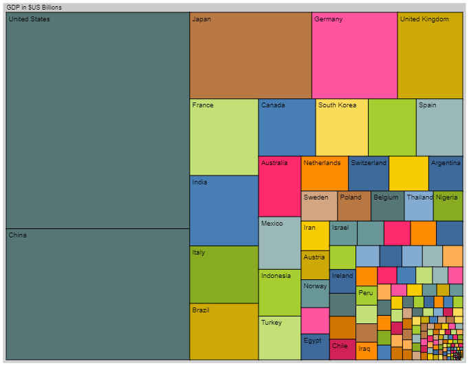
5. Treemap
All the previous bubbles and plots showed size proportional to diameter, which provides a challenge to most quantitatively-oriented minds, and certainly introduces a degree of perceptual error. Treemaps are the rectangular cousin of bubble charts with circle packing, with the area of each rectangle proportional to GDP. Of the non-geographic visualizations, it is the best one so far, in that it both shows the distribution in a striking Escher-like way while allowing us to see the labels for most of the big countries. But, it is still not without problems. Some countries cannot be found. And, the relative ordering for all but the four largest economies is hard to discern.
6. Donut Chart
As I have mentioned before, the hatred that most numerate people have of pie charts is not justified. To my mind, the donut chart below outperforms all the non-geographic visualizations examined so far. Notably, it emphasizes aspects of the data not evident in any of the other visualizations. For example, it allows us to see that biggest four countries’ GDP exceeds that of the rest of the world. If you are wanting to find data for one of the countries with a smaller GDP, you can, unfortunately, only do so via tooltips.
7. Grid of Bar Charts
I call this last visualization a grid of bars. It consists of a series of bar charts next to each other. I have created each of these charts using R. Then, I laid them out and added a heading in Displayr. You can do this just as easily in PowerPoint or any design app. For a description of how I created it, see my post A Beginners Guide to Using Functions to Create Chart Templates Using R.
This visualization is not pretty, but it is the only visualization which manages to adequately convey the distribution as well as all the detail. Its only real technical limitation is that it can be hard to find a specific country (which is less of a problem in the earlier geographic visualizations).
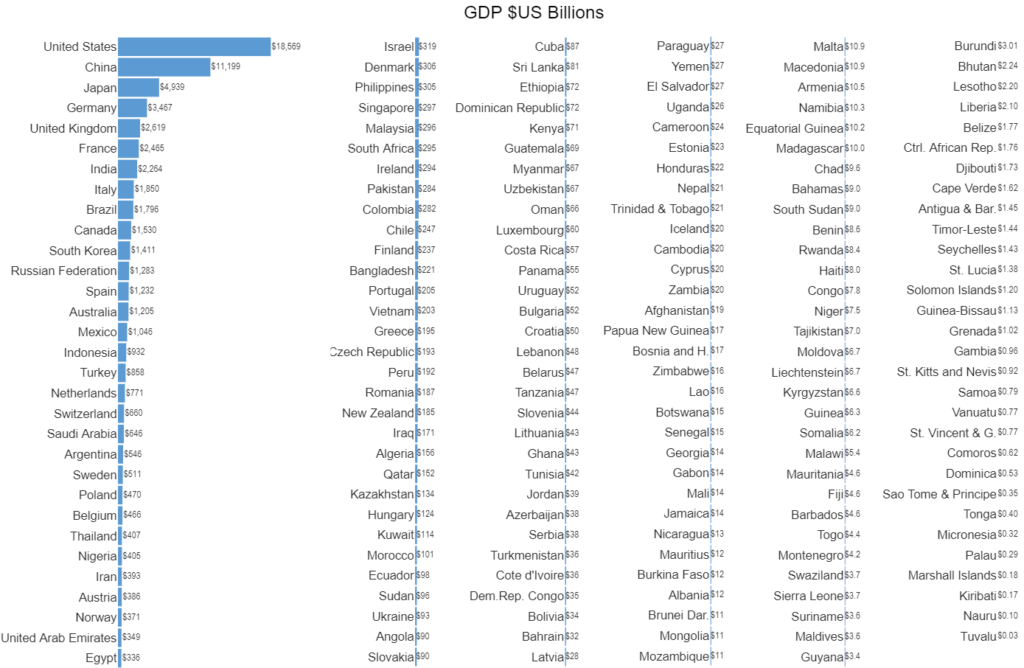
Try Displayr’s free bar chart tool.
What have I missed?
In this post, I have shown eight different ways of visualizing long lists of data. Do you know of any better methods? If so, please add a comment.
Explore the visualizations yourself
You can log into Displayr and access the document used to create each of these visualizations here. To see the R code, click on a visualization and the look in Properties > R CODE on the right of the screen.
Acknowledgements
The bubble charts with circle packing use Joe Cheng’s bubbles package. The cartogram, choropleth, horn of plenty, and grid of bars use plotly. The treemap uses canvasXpress.
You can easily create word clouds or phrase clouds in Displayr. Get started today.