
A correlation matrix is a table of correlation coefficients for a set of variables. Correlation matrices are used to identify patterns of relationships between variables, as an input to other types of analysis (like PCA), and as a diagnostic tool for checking the results of an analysis. I’ll show you two easy ways to create a correlation matrix in Displayr.
Create your own Correlation Matrix
The coefficient indicates both the strength of the relationship as well as the direction (positive vs. negative correlations). For more information about the decisions that must be made when computing a correlation matrix, see What is a correlation matrix?
In Displayr, you can create a correlation matrix in two ways. The first is to use Insert > More > Correlation > Correlation Matrix. This produces an interactive heatmap of the correlations between the variables that you specify. The second method is to create a table with two numeric variables sets in the rows and columns. In this article we look a both approaches.
Data preparation
In most cases, we use numeric data to create a correlation matrix. Before using either of the tools in this post, you should ensure that the variables that you want to compute correlations for are set up as part of one or more variable sets which have their Structure set to Numeric or Numeric – Multi. In Displayr, the Structure setting tells the program how to work with your data. It determines which statistics can be shown in tables and how the analysis options will ‘see’ the data in your variables.
To change the structure of a variable set, select the name of the variable set in the Data Sets section in the bottom left, and then change the selection in the Structure menu, which you will find in the Object Inspector on the right of the screen.
Note: You can also use binary categorical variables (e.g, Male/Female, Yes/No, etc) that will be converted to numeric when calculating the correlation coefficients.
Creating the correlation matrix as a heatmap
To create the correlation matrix as a heatmap:
- From the toolbar, select Table
 > Specialty Tables > Correlation Matrix.
 - Select your inputs from the object inspector (select two or more variables from your data, or change data source to a table, then select your table from the Table dropdown box).
- Choose the Correlation Type and how you want the tool to deal with Missing Data (for more on this, see What is a correlation matrix?).
- Click the Calculate button.
You can check out a more detailed breakdown of how to build a correlation matrix in Displayr.
Using a sample Technology brand survey data file, the following shows the Pearson correlations between various owned devices.
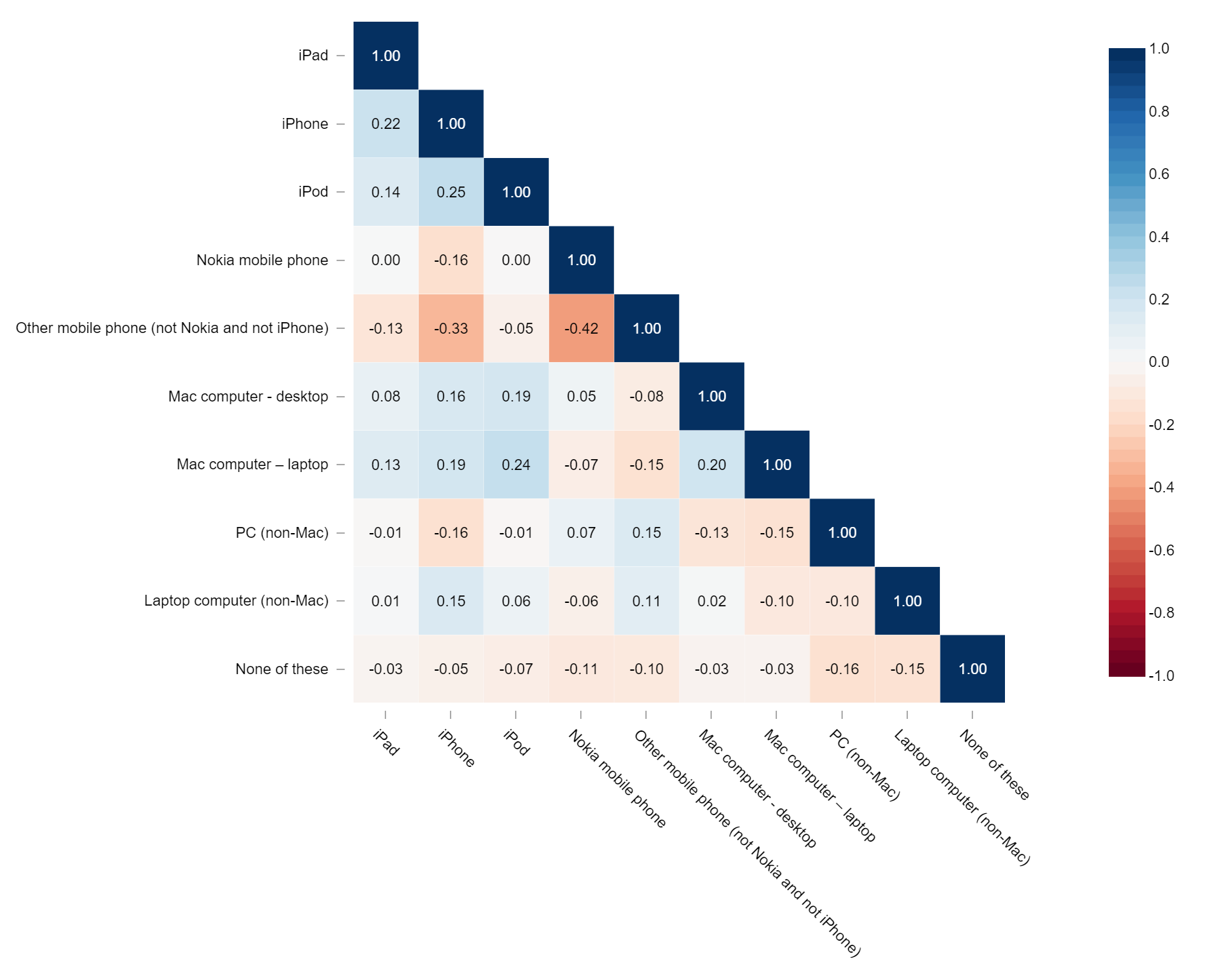
A quick inspection of the results suggests that the correlations are reasonable, as illustrated by the negative correlation between Other mobile phone ownership and Nokia mobile phone ownership. There is also a relatively high correlation between iPhone ownership with iPad and iPod ownership.
Create your own Correlation Matrix
Creating a correlation matrix from a table
The data that you want to compute correlations for may not be set up as a Data Set. It may be something you have pasted in to Displayr (using Home > Paste Table), or it may be a tabular output from some other analysis or calculation. In that case, you may supply the table as an input by:
- Changing the Data Source setting to Table in the options for the correlation matrix.
- Selecting your table in the Table drop-down menu that will appear.
Rows and columns that you don’t want to include in the analysis can be specified by typing into the Ignore box.
Additional properties
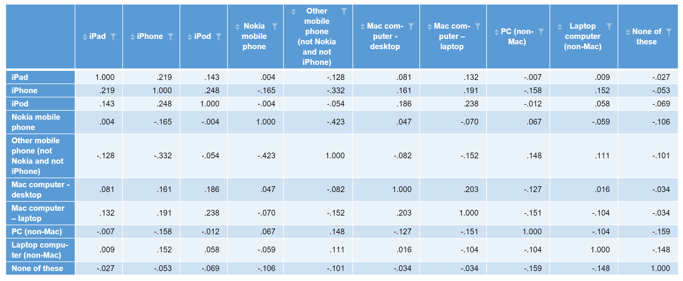
In Displayr, the Correlation Matrix function uses a library specifically designed to generate the Heatmap output. The output will appear in your document with the name correlation.matrix. If you need to have a table of correlation coefficients, you can create a separate R output and reference the correlation.matrix object coefficient values.
First, create an R output by selecting Create > R Output. To generate an R data frame of the correlation coefficients, enter the following code into the R CODE section of the Object Inspector and click Calculate.
correlation.matrix$cor
From our technology example above, the following output is generated.
Creating a correlation table
An alternative approach is to make a correlation table. To do so:
- Select Insert > Table to create a blank table.
- In the Rows section of the Object Inspector, select a numeric variable set. The table will show averages as the primary statistic. If you don’t have a numeric variable set, see above.
- In the Columns section, select another numeric variable set (or the same variable set). The table will now show pearson correlation coefficients.
This approach allows you to create a correlation matrix that is not square (that is, uses two different sets of variables).