A correlation matrix is a table showing correlation coefficients between variables. Each cell in the table shows the correlation between two variables. A correlation matrix is used to summarize data, as input into a more advanced analysis, and as a diagnostic for advanced analyses.
Key decisions to be made when creating a correlation matrix include: choice of correlation statistic, coding of the variables, treatment of missing data, and presentation.
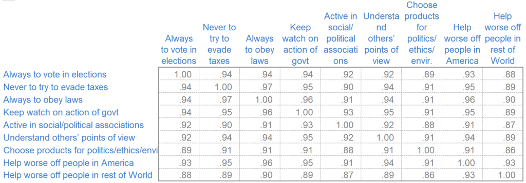
An example of a correlation matrix
Typically, a correlation matrix is “square”, with the same variables shown in the rows and columns. I’ve shown an example below. This shows correlations between the stated importance of various things to people. The line of 1.00s going from the top left to the bottom right is the main diagonal, which shows that each variable always perfectly correlates with itself. This matrix is symmetrical, with the same correlation is shown above the main diagonal being a mirror image of those below the main diagonal.
Create a correlation matrix in seconds
When to use a correlation matrix
As you will see, correlation matrices come in various shapes and sizes. While they can look different, they typically serve the same purpose: to identify relationships between different variables.
This means that when it comes to when you should use a correlation matrix, the possibilities are almost endless. It could be analyzing survey results to see if customer satisfaction is linked to product pricing, or in medical research to understand the relationship between different patient characteristics and a particular disease outcome, or even in finance to assess the co-movement of different stock prices within a portfolio — any situation where you are trying to understand the strength and direction of linear relationships between two or more variables.
By quickly showing how different factors interact with one another, you can spot important relationships at a glance, identify redundancy in your data, and ultimately make better decisions.
Correlation coefficients
A correlation coefficient is a statistical measure that describes the strength and direction of a relationship between two variables. In a correlation matrix, these coefficients are displayed for every possible pair of variables, making it easy to see how strongly variables are related to one another at a glance.
There are many different types of correlation coefficients, but the most commonly used—especially in correlation matrices—is Pearson’s correlation coefficient, often referred to simply as “the correlation” or denoted by the italicized letter r.
Pearson’s r specifically quantifies the strength and direction of a linear relationship between two continuous variables. The value of r ranges from -1 to 1:
- +1 indicates a perfect positive linear relationship (as one variable increases, so does the other).
- -1 indicates a perfect negative linear relationship (as one increases, the other decreases).
- 0 means there’s no linear relationship between the variables.
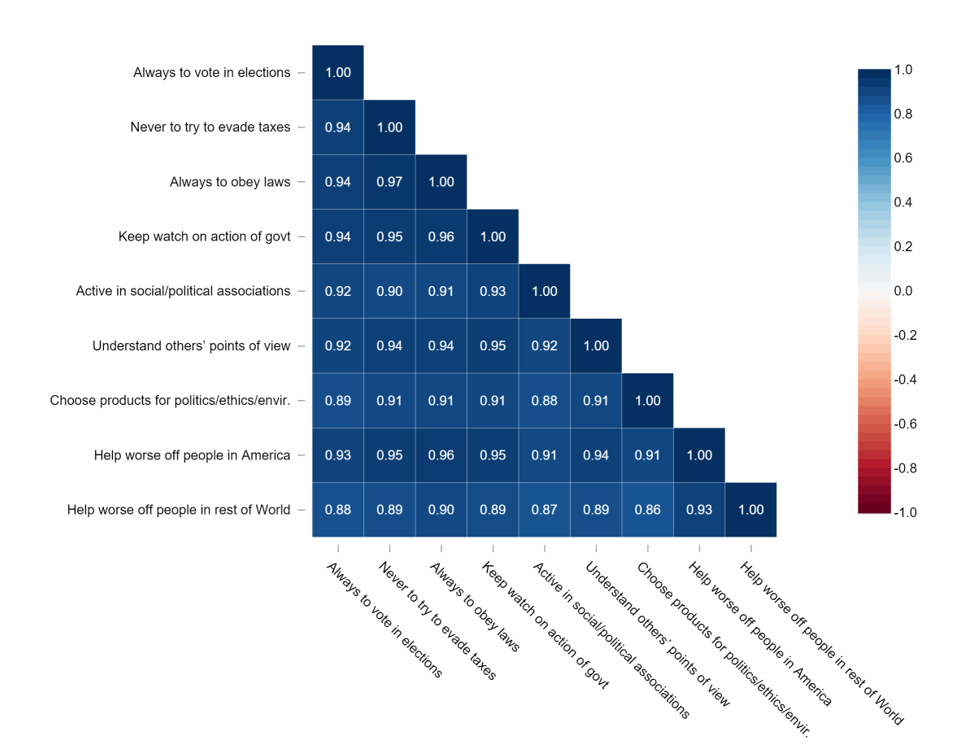
Values between -1 and 1 indicate varying degrees of correlation strength and direction. Correlation matrices often color-code these values to help you easily identify patterns—strong correlations typically stand out visually.
Applications of a correlation matrix
There are three broad reasons for computing a correlation matrix:
- To summarize a large amount of data where the goal is to see patterns. In our example above, the observable pattern is that all the variables highly correlate with each other.
- To input into other analyses. For example, people commonly use correlation matrices as inputs for exploratory factor analysis, confirmatory factor analysis, structural equation models, and linear regression when excluding missing values pairwise.
- As a diagnostic when checking other analyses. For example, with linear regression, a high amount of correlation suggests that the linear regression estimates will be unreliable.
Create a correlation matrix in seconds
Correlation statistic
Most correlation matrices use Pearson’s Product-Moment Correlation (r). It is also common to use Spearman’s Correlation and Kendall’s Tau-b. Both of these are non-parametric correlations and less susceptible to outliers than r.
Coding of the variables
If you also have data from a survey, you’ll need to decide how to code the data before computing the correlations. For example, if respondents were given choices of Strongly Disagree, Somewhat Disagree, Neither Agree nor Disagree, Somewhat Agree, and Strongly Agree, you could assign codes of 1, 2, 3, 4, and 5, respectively (or, mathematically equivalent from the perspective of correlation, scores of -2, -1, 0, 1, and 2). However, other codings are possible, such as -4, -1, 0, 1, 4. Changes in codings tend to have little effect, except when extreme.
Treatment of missing values
The data that we use to compute correlations often contains missing values. This can either be because we did not collect this data or don’t know the responses. Various strategies exist for dealing with missing values when computing correlation matrices. A best practice is usually to use multiple imputation.
However, people more commonly use pairwise missing values (sometimes known as partial correlations). This involves computing correlation using all the non-missing data for the two variables. Alternatively, some use listwise deletion, also known as case-wise deletion, which only uses observations with no missing data. Both pairwise and case-wise deletion assume that data is missing completely at random. This is why multiple imputation is generally the preferable option.
Create your own Correlation Matrix
Correlation matrix best practices
When presenting a correlation matrix, you’ll need to consider various options, including:
- Whether to show the whole matrix, as above or just the non-redundant bits, as below (arguably, the 1.00 values in the main diagonal should also be removed).
- How to format the numbers (for example, best practice is to remove the 0s prior to the decimal places and decimal-align the numbers, as above, but this can be difficult to do in most software).
- Whether to show statistical significance (e.g., by color-coding cells red).
- Whether to color-code the values according to the correlation statistics (as shown below).
- Rearranging the rows and columns to make patterns clearer.
How to create a correlation matrix
There are a number of different tools and platforms available that will allow you to create a correlation matrix. Each solution requires a different amount of data preparation, and some may be harder to use than others. The three most popular tools to build a correlation matrix are;
- Excel: To create a correlation matrix in Excel, download the data into your file, click Data > Data Analysis > Correlation, and choose the desired output option. Correlation matrices in Excel often face issues stemming from poor data preparation, so ensure the data has been checked before creating the table.
- R: Creating a correlation matrix in R can be complex, but it provides several different options in terms of visualizations and formatting. Read our step-by-step guide for more details.
- Displayr: Displayr is the fastest and easiest way to make a correlation matrix. All you need is a data set containing two or more numeric, numeric-multi, or binary categorical variables, then it is simply a matter of making a few clicks. Learn how to create a correlation matrix in Displayr.
Begin quickly creating your own correlation matrices in Displayr today.
Create your own Correlation Matrix
How to Create a Correlation Matrix in R and Python
The section above covers the main tools at a high level. Here is how to build one directly in code.
In R, the built-in cor() function takes a data frame and returns a matrix of Pearson correlation coefficients:
cor(data)To visualize it, use the corrplot package:
library(corrplot)
corrplot(cor(data))
For a full walkthrough including different correlation types and formatting options, see our step-by-step guide to creating a correlation matrix in R.
In Python, if your data is in a pandas DataFrame, a single method returns the full correlation matrix:
df.corr()To visualize it as a heatmap:
import seaborn as sns
sns.heatmap(df.corr(), annot=True, cmap='coolwarm')
Correlation Matrix FAQs
How do you interpret a correlation matrix?
Values closer to +1 indicate a strong positive relationship, values closer to –1 indicate a strong negative relationship, and values near 0 suggest little or no linear relationship.
Because the matrix is symmetrical, you only need to read one half of it.
Why would you use a correlation matrix?
It’s commonly used for exploratory data analysis, identifying patterns, checking for multicollinearity before modelling, and deciding which variables are worth analysing further.
What is considered a strong correlation in a correlation matrix?
What counts as “strong” depends on the research context and the type of data being analysed.
Does a correlation matrix show non-linear relationships?
Two variables can have a strong non-linear relationship and still show a correlation close to zero.
What are common mistakes when using a correlation matrix?
Other issues include over-interpreting weak correlations, ignoring sample size, and failing to account for outliers or missing data, all of which can distort results.