

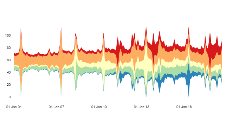
A streamgraph is a type of stacked area chart. It is modified so that the streams are centered around the y-axis and often has a flowing organic shape which can be visually appealing. The size of each individual stream reflects the size of values in each category.
Don’t forget you can easily create a free streamgraph using Displayr’s streamgraph maker.
Creating a streamgraph
This chart is created by selecting Insert > Visualization > Streamgraphs. We can input data to the streamgraph in three different ways.
Option 1: Output in ‘Pages’ – select a table output. For instance, in the streamgraph above, we used the output from Google Trends. Note that for a streamgraph the rownames of the output must be dates or numeric.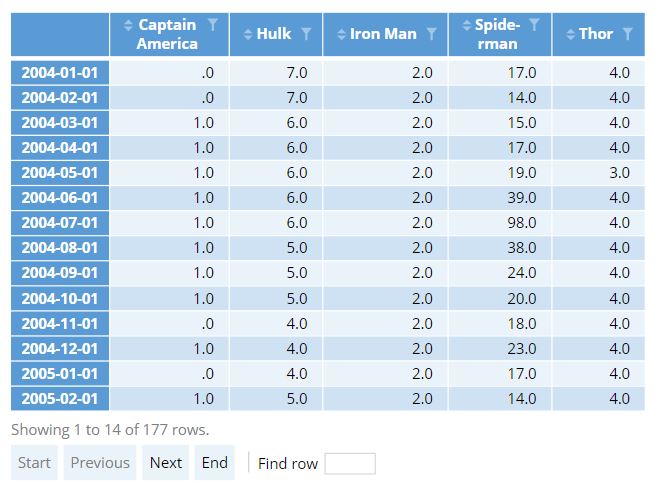
Option 2: Variables in ‘Data’ – select two or more variables from an imported Data Set. The first variable, which will be used for the x axis, should be a date or numeric variable. The remaining variables will be used as y coordinates of different series on the streamgraph.
Option 3: Paste or type data – directly enter data into a spreadsheet object into Displayr. This input should be in a similar form as the first option, with date or numeric row names in the far left column.
Customizing the streamgraph
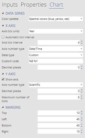 In most cases, the default settings will produce a useable chart. However, if you want to change the colors used in the streamgraph or to adjust the x or y axis ticks, additional controls can be found in the Chart tab of the Object Inspector.
In the streamgraph below, we have changed both the tick format for both the x and y axis. Note that you need to change the axis number type before you can specify formats. Depending on the number type, different format types will be offered. You can also set the format type to custom which will allow you to set any D3 format.
Because the streamgraph is so specialized, it is not as flexible as many of the other chart types. In particular, the margins do not adjust automatically. In the second example, changing the y axis type to scientific notion also increased the width of the tick labels. To account for this, we needed to increase the left margin from 30 to 45.
Related Charts
The streamgraph can be visually appealing, but it also suffers from a number of legibility issues. Specifically, its centering around the y-axis makes it difficult to judge the height of distinct series. You may instead want to try using an Area Chart. For instance, compare the streamgraphs above with the (stacked) area chart below.
Want to create your own streamgraph? Get started, for free!
