


Creating a heatmap in Excel is the fastest way to spot patterns in large tables — no charts needed, just conditional formatting. This guide walks through the exact steps, plus best practice tips for colour scales and readability.
Don’t forget that you can easily use Displayr’s heatmap maker to create your free heatmap!
What’s a heatmap?
A heatmap is a visualization method that colors each cell in a table on a graded color scale. At either end of the color scale you have two different colors. For each intervening value on the scale you have a gradient from one end-point-color to the other. Oftentimes, these colors go from red to green via yellow, reminiscent of the colors used by meteorologists when presenting weather – red is hot/higher, thus “heat” map.
Heatmaps in Excel
To create a heatmap you need a table of data to work with. In this case, I’ve harvested climate data from the World Bank for Sweden between 1901 and 2015. That gives me a very large table with over 100 rows and 12 columns, with cells that contain the average temperature for each month. For our American audience, these temperatures are in Celsius (after all, Anders Celsius was a Swede!). A section of my table looks like this:
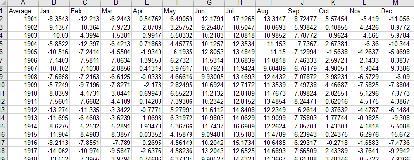
That’s not easy to read at all! Although I can easily tell that the temperatures at either end of the year are lower than the temperatures in the middle of the year, it’s not giving me a good understanding of changes over time. I can’t see what the temperatures look like easily.
How to Create a Heatmap in Excel with Conditional Formatting
Excel can automatically color each cell in my table based on the highest and lowest value in my data. To do this, select all the cells in the table, then go to Home > Conditional Formatting > Color Scales > Red – Yellow – Green. This will instantly color all the table cells, and you’ll end up with something looking like this:
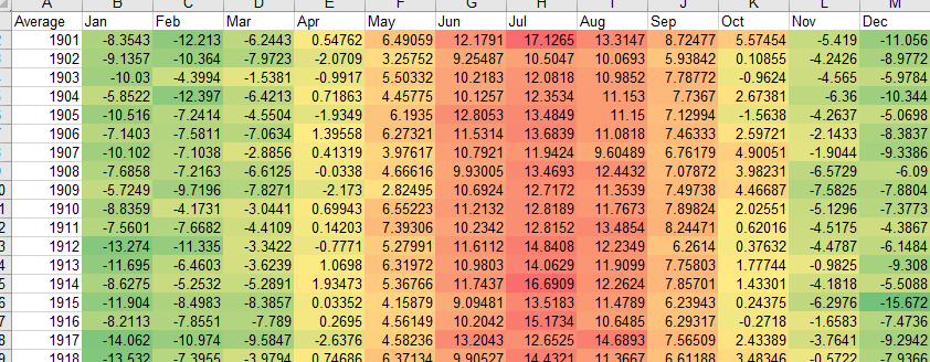
I get an easy overview of what months were hotter than other months – they’re the ones in red. Unsurprisingly, it’s the summer months that are warmer, and the winter months that are cooler. July 1901 and 1914 stand out as particularly warm. December 1915 was not a month I would have liked to have been around in… Brrr!
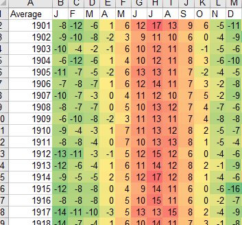
So far so good, but this only allows me to see a part of the picture. I want to see the whole time period between 1901 and 2015. To do that, I’ll change the column and row sizes so that I can fit more onto my screen. First up, let’s get rid of some of these decimal places: they don’t add anything to my story. Select all the cells in the table, then click the Home > Number > Decrease Decimal button a few times, until only the whole numbers remain.
Next, select all the columns together and just double-click one of the little lines between two of them. This will auto-size the columns to the widest width required to show the contents on one row. I’m a little finicky, however, so I want all of them to be exactly the same width. Select all the columns again, right-click, and select Column Width. I’ll set my columns to be 2.5 units wide, and will replace the month labels with a single-letter month label. Here’s where I’m up to:
My table is a little too tall, however, to fit onto one screen.There’s only one solution – I need to re-structure my table so that I can see all the periods next to each other. This is quickly achieved by a little copy and pasting (select the cells, and use ctrl+c on your keyboard on a PC to copy, and ctrl+v to paste). For good measure, I also want to see if the average temperature has changed over time, so I’ve added another column for this, using the =AVERAGE() function in Excel. Finally, I’ve removed the grid lines to create a clean visual of my data (on the View tab in the ribbon, deselect the Gridlines check-box in the Show section.
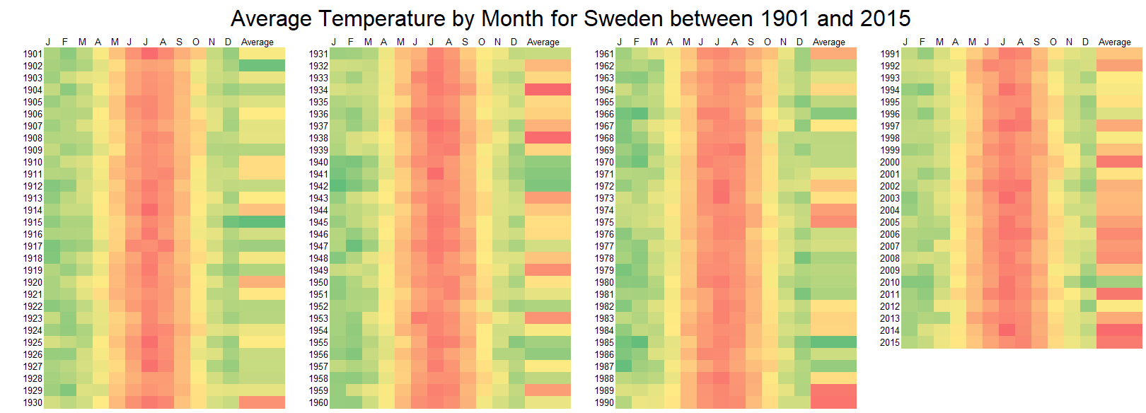
Here’s my final heat map:
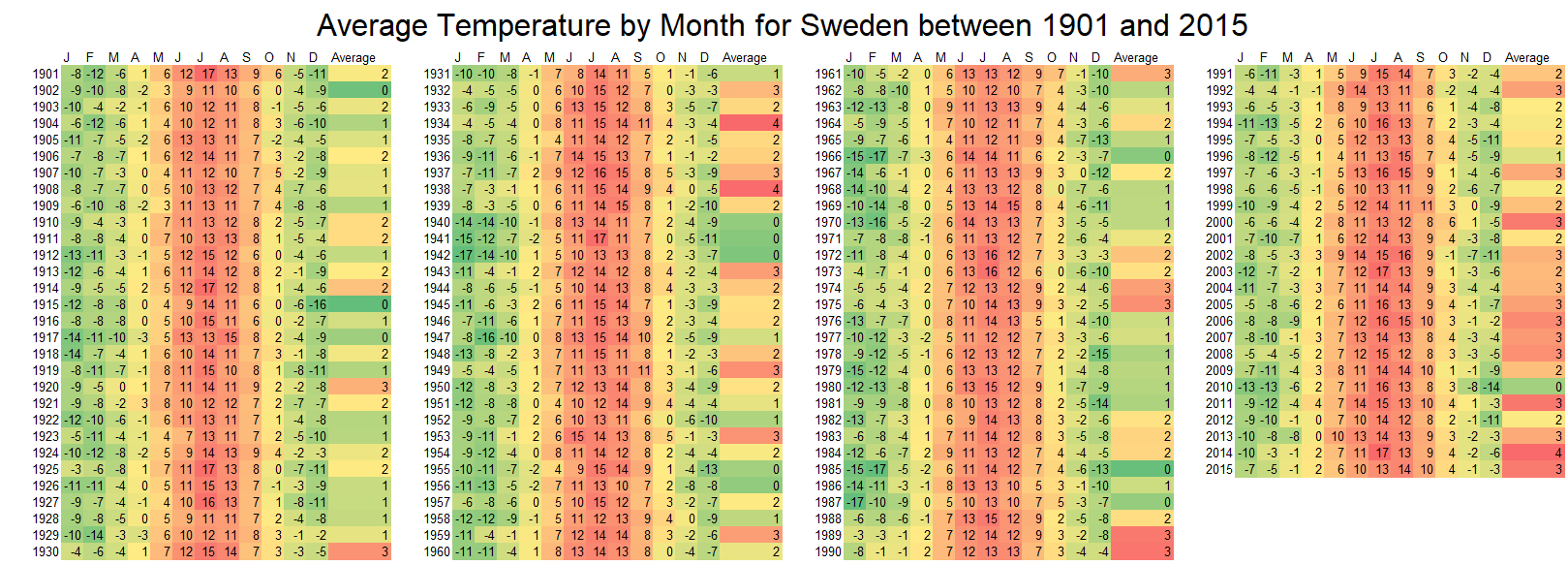
There is only really one pattern that leaps out in this example – the increase in average temperature over the last couple of decades. The frequency of more reddish is higher in the average column the closer to today we get.
Excel Heatmap Colour Scales: Tips and Best Practices
It’s possible to hide all those numbers if you prefer to have a clean heat map. To do so, select all the cells with numbers, right-click and select Format Cells. On the Number tab, select Custom and then type in ;;; (three semi-colons) into the Type box. Click OK. The numbers will be gone, but the formatting remains. Behold!
Best Practices for Excel Heatmaps
To create an effective and visually appealing heatmap in Excel, keep these best practices in mind:
- Use an intuitive color scale: Red-to-green is common, but ensure the colors make sense for your audience (e.g., blue for cold, red for hot).
- Keep formatting consistent: Standardize column widths and remove unnecessary decimal places to maintain clarity.
- Choose appropriate data ranges: Be mindful of extreme values that could skew color distribution—adjust the color scale if necessary.
- Avoid overloading with too much data: Large datasets can become overwhelming; consider summarizing key trends separately.
- Label your data clearly: Ensure readers can easily interpret what each color represents.
- Use contrast effectively: Select colors that are distinguishable for those with color vision deficiencies or provide an alternative visualization.
- Regularly update data: If using a heatmap for ongoing tracking (e.g., financial trends, performance metrics), refresh data periodically to keep insights relevant.
Ready to move beyond Excel? There are other ways to create visualizations that offer more advanced options and flexibility. Check out how to create a heatmap in Displayr!