

Histograms are a chart type for visualizing the distribution of numeric data, like people’s height or weight, or how many fast-food meals they consume per year. A histogram divides up the range of possible values into buckets, places each observation into the relevant bucket, and then shows how many observations are in each bucket. It might look like a column chart, but it has a more specific application. In this post I show you how to draw histograms in Displayr.
Don’t forget, you can easily create a histogram for free using Displayr’s histogram maker.
Method 1 – Paste in your data
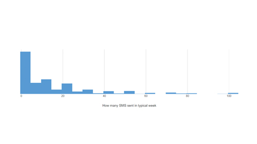
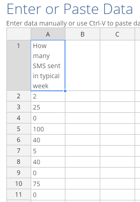
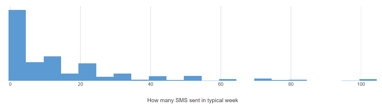
The simplest way to make a quick histogram from some data you have on hand is to just paste it in directly. I have a spreadsheet which contains a column of data that records the number of text messages people said they sent per week. To draw the distribution as a histogram:
- Select Insert > Visualization > Histogram.

- Go over to the Object Inspector on the right and under Inputs > DATA SOURCE, select Paste or type data.
- Paste in your column of data into the spreadsheet interface, and click OK. If you want to create histograms of several variables in the same chart then you can paste multiple columns of data here.
- Tick the Automatic box at the top of the Object Inspector on the right. This ensures the chart stays up to date when you change the data or the settings.
The histogram for my text-message data appears like this:
Method 2 – Use variables from a data set
You can add a data set to analyze in Displayr by clicking Home > New Data Set and choosing from one of the range of sources available. To know more about the kinds of data set you can use in Displayr, check out Introduction to Displayr 2: Getting Your Data into Displayr.
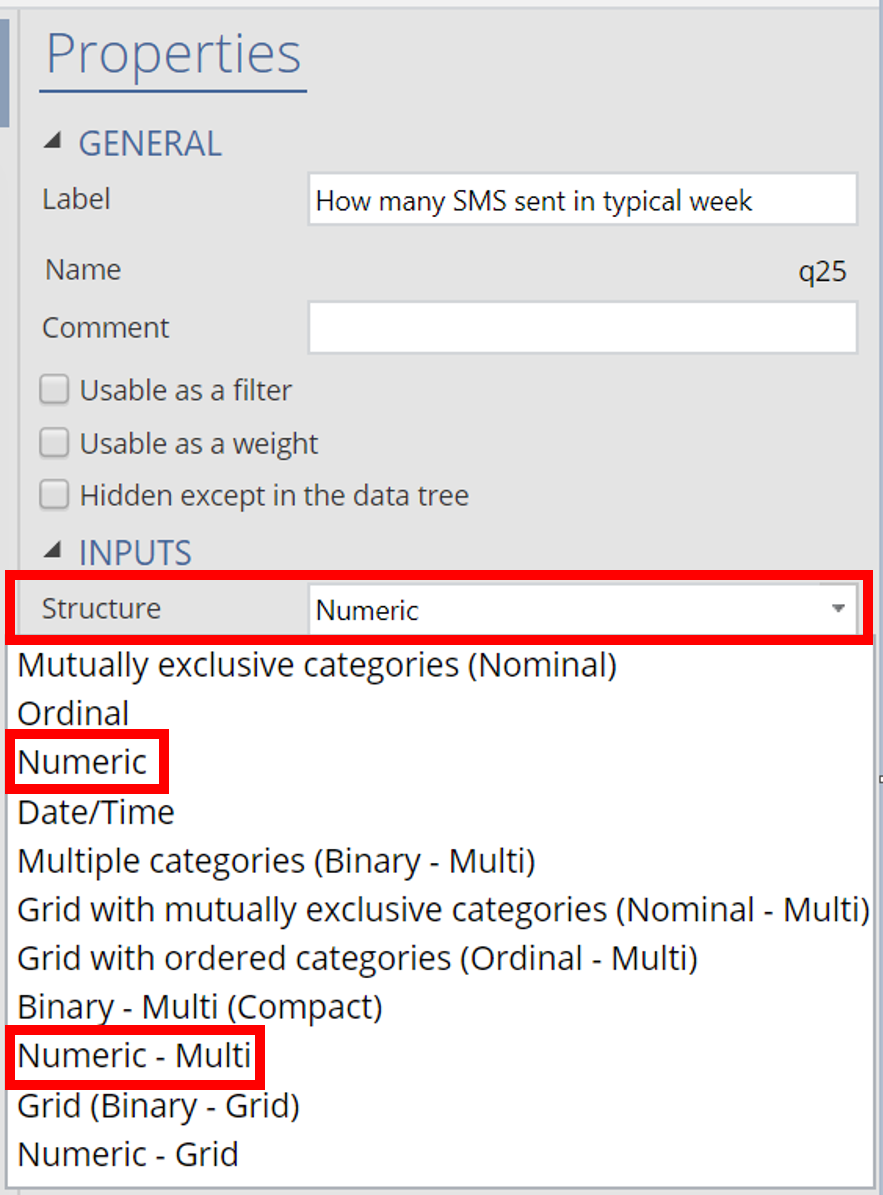
The variables you use in a histogram must be numeric. This means the Structure of the variable set must be either Numeric (for when there is a single variable), or Numeric – Multi (for when there are several variables grouped together. To ensure your variables are set up correctly:
- Select the variable under Data Sets in the bottom left.

- Look in the Object Inspector on the right hand side, and check the current selection under Properties > INPUTS > Structure. If it is not Numeric or Numeric – Multi, change the Structure appropriately.
- If you changed the structure, it is a good idea to check the numeric values that are contained in the variable to make sure they are the ones you want to analyze with the histogram. To do so, click the Values button on the right, and check the entries in the Values column.
Once you’ve set up your data, you can add the histogram using these steps:
- Select Insert > Visualization > Histogram.
- Click into the Inputs > DATA SOURCE > Variables in ‘Data’ and choose the variable or variables that you want to include in the histogram.
- Tick the Automatic box at the top on the right.
Groups
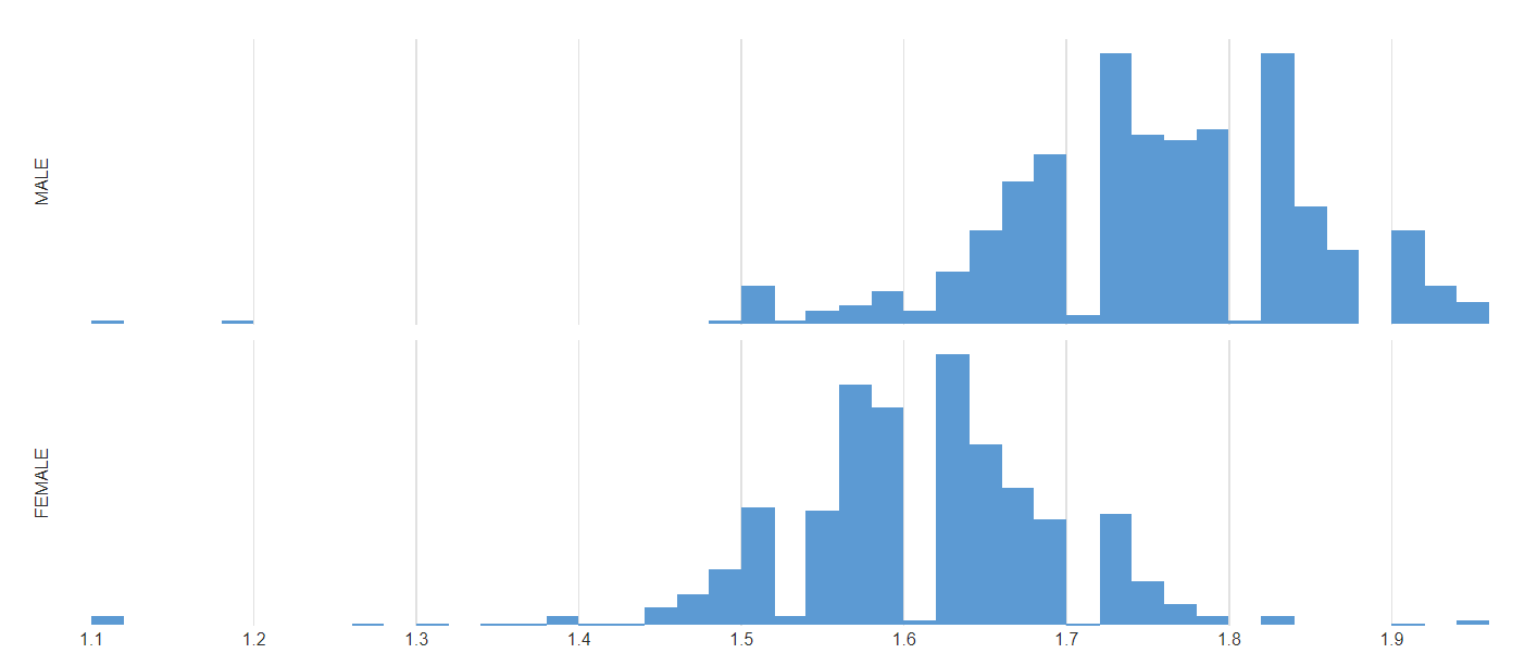
When you use Method 2 and create your histogram from raw data you can also choose an additional variable containing categories. This allows you to draw separate histograms for those groups.
For example, I have a data set containing the heights of people, and I wish to draw two separate histograms for the male and female participants in the study. To do so, follow the steps above in Method 2, and then select the Gender variable under Inputs > DATA SOURCE > Groups in the Object Inspector. The result is a pair of histograms, which conveniently share the same set of axes, allowing for easy comparison.
Discover all the different kinds of visualizations you can create in Displayr!