


Large tables with lots of cells can be difficult to interpret without visualizing the information first. Radar charts are a great way to show which parts of the data stand out compared to the rest of it. If you consider them a sort of line or area chart that’s wrapped around a central point, then you’ve got the right idea.
Create your radar chart for free using Displayr’s online radar chart maker!
We can’t visualize with no data
First thing’s first – we need some data to visualize. I’ve chosen some data about Game of Thrones characters and when they first appear in the book series. This should help me work out which of the tomes I want to bring with me on holiday if I want to read more about my favorite houses. In Displayr, I load my data set from the Insert > New Data Set menu. Once my file is loaded, I drag the variables I’m interested in from the Data Sets onto the Page. For this chart, I’ve crossed the book number where a character first appears, against the house of the characters. It gives me a fairly wide table (there are a lot of houses), that looks like this:
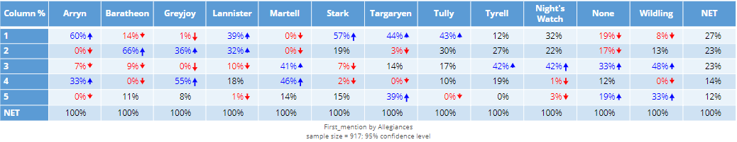
Full disclosure, I’ve done a bit of tidying of the labels and merged some columns.
By the way, if you don’t have a data set to import, you can always paste in a table of results to use in your visualization. You’ll see a big red button ( Paste or type data ) in the radar chart options on the right of the screen, which you can use to add in your results to visualize directly.
From Numbers to Colors
To turn this into a radar chart, I’ll go to the Insert > Visualization > Radar Chart menu option. This places a large grey box on the Page and opens the chart options on the right side of the screen. Under Inputs > DATA SOURCE > Outputs in ‘Pages’ I’ll select the table created earlier. My radar chart is a mess!
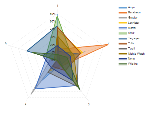
What does this tell me? Well, I can see that 60% of all Starks appear for the first time in the first book, and just over 60% of all Baratheons in the second book. Books three and four introduce a number of characters from House Martell. Anything else is pretty hard to make out. I need to make some changes, and the colors are a good place to start.
Cleaning up your radar chart
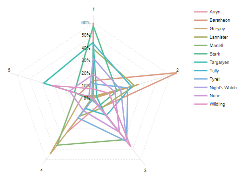
In the chart options under Chart > Data Series > Color palette I select my favorite palette, Rainbow. The chart is still a bit of a mess and difficult to read. There are too many houses to be able to make out the details of those that are introduced more evenly throughout the series. Something has to go, and the first thing to try out is to remove the fill. Unfortunately, in this case, it made things worse…
There’s only one solution. I need to get rid of some houses that I don’t enjoy reading about (our own Red Wedding, if you will). Out with the Tully’s, Tyrell’s, Wildings, and others. On my table, I’ll select the columns I want to remove from my chart. I’ll then click Data Manipulation > Rows/Columns > Hide. Alternatively, I could choose to merge them into a single “Other” category. This will simplify my table quite a bit, but I’m still not happy with the lines only. Putting the fill back in, however, makes this chart (a little) easier to read:
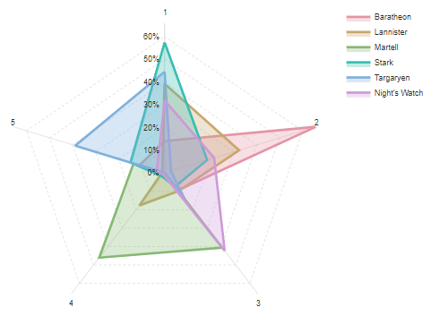
I have a particular predilection for the Targaryens (I’m sure they’re not evil!), so based on this chart, I’m going to bring book 5 with me on holiday. As for radar charts, I’ve learnt that there’s a definite benefit to limiting the number of series you attempt to show in any given single chart.
By the way, if George R. R. Martin is reading this and wants some help sorting out the Meereenese Knot, we’re always available!
You can create your own radar chart for free in Displayr. But now that you’re an expert on radar charts, check out more ideas for visualizations!
