An area chart is based on a line chart, with the area between the line and the x-axis colored to illustrate volume. In this post, we’ll explore how to create a standard area chart and a stacked area chart in Excel, as well as some common issues to look out for.
Don’t forget though, you can easily create an area chart for free using Displayr’s free area chart maker!
What is an area chart?
An area chart might be considered visually similar to both a line chart and a bar chart. Like a line chart, it uses a line to show trends over time. Meanwhile, like a bar chart, it uses color and shading to represent quantities visually.
However, unlike a line chart, it fills in the space between the line and the X-axis with color or shading to show numeric values, making it ideal for showing cumulative data and comparing quantities. This makes it ideal for showing things like sales, revenue, or population growth.
What we are discussing today is a stacked area chart. Stacked area charts are typically the most commonly used, where multiple lines are stacked on top of each other, and the cumulative total is represented by the uppermost line. These charts are ideal for showing the composition and trends of parts within a whole over time. Stacked area charts are ideal for showing how different subcategories make up the total volume, like sales across different categories or usage of different energy sources.
Setting up the data for the Excel area chart
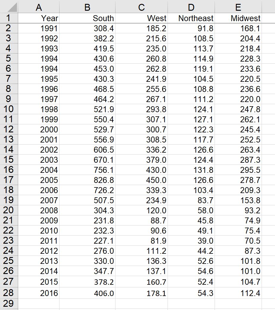
The easiest way to create an area chart in Excel is to first set up your data as a table. The first column should contain the labels, and the second column contains the values. To create a stacked area chart where the values are split into sub-groups, create a column for each of the sub-groups. In this example, we’ll use a data set that shows annual building permits by region for single-unit homes in the US from 1991 through 2016. The following data set shows total permits issued (in thousands) for each region by year. The first column contains the y-axis label (year) with a column for each region. The values in the table represent the number of permits.
Creating your area chart in Excel
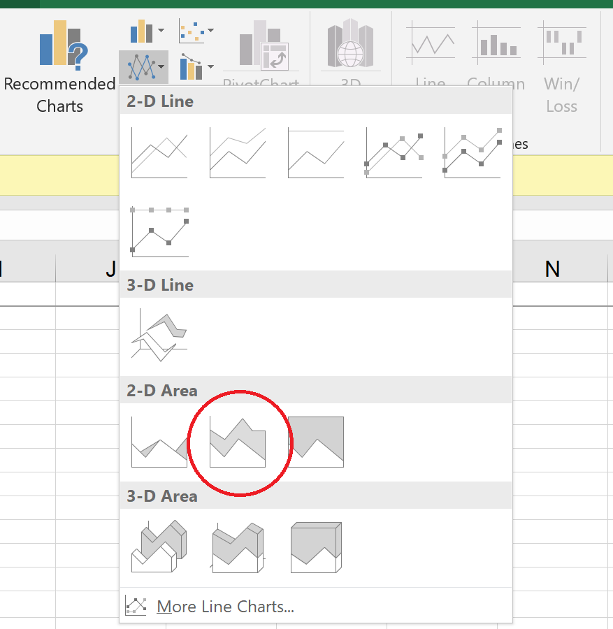
To create an area chart using the above data, highlight the data range (cells A1:B28 in the example above) and select Insert > Charts, select the Line Chart group drop-down menu and then select the second 2-D Area chart option.
The following area chart is created from the selected data. You can modify the properties of the area chart by first selecting the area chart and then going to the Chart options that appear at the top of the menu tool bar. From here you can modify the design and format properties of the chart. In this example, I’ve added a chart title and changed the legend and axis font size.

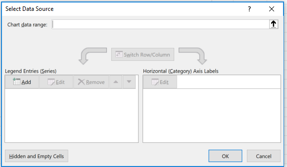
To create the above chart, we started with the data and then turned this into an area chart. In Excel, you can also first create the chart object and then provide the data to populate the chart. To do this, first select the area chart from the Insert > Charts menu to select one of the area chart options. This will create an empty area chart object on the sheet. Next, select Chart Tools > Design > Select Data. This opens the Select Data Source dialogue box. Note that the chart object must be selected for the Chart Tools menu to appear.
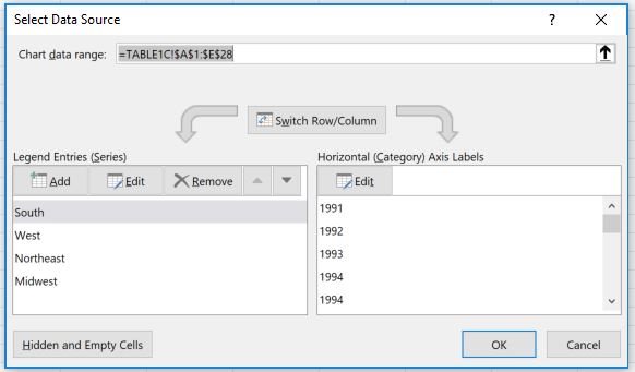
For Chart data range, select B1:E28 from the example data above. In the Horizontal (Category) Axis Labels section, click the Edit button and select cells A2:A28 and click OK. Excel will create the same chart that was created above. Again, you can modify the chart design and formatting using the Chart Tools menu described above.
Common issues to avoid
While area charts are a powerful visualization tool, they come with a few potential pitfalls that can lead to misinterpretation or poor readability – both in Excel and beyond. Here are some common issues to watch for:
-
Overlapping or Obscured Data – In stacked area charts, the data series at the bottom can sometimes obscure those above them, making it hard to distinguish individual trends. Consider using transparency or adjusting colors for better clarity.
-
Too Many Categories – If you include too many data series, the chart can become cluttered and difficult to read. It’s best to limit the number of categories or consider an alternative visualization like a line chart.
-
Misleading Comparisons – Unlike line charts, area charts emphasize volume rather than precise values. If viewers are likely to focus on trends rather than cumulative data, a line chart might be a better option.
-
Scaling Issues – If the y-axis isn’t properly scaled, small variations in data can appear exaggerated or underrepresented. Ensure the axis scale is appropriate for your data range.
-
Improper Use of Non-Stacked Area Charts – Non-stacked area charts can sometimes create a misleading impression when datasets overlap. If showing cumulative totals isn’t the goal, a different chart type may be more suitable.
By keeping these factors in mind, you can ensure your area charts are both visually appealing and accurately represent your data.
Ready to move beyond Excel? There are other ways to create visualizations that offer more advanced options and flexibility. Learn how to create your area chart in Displayr instead!