

This post explores how the R package for labeled scatterplots tries to solve the problem of scatterplots and bubble plots or bubble charts in R.
The rhtmlLabeledScatter R package on GitHub that attempts to solve three challenges with labeled scatter plots or bubble charts in R: readability with large numbers of labels and bubbles, and the use of images.
Don’t forget you can create all of the scatterplots below without R code for free using Displayr’s scatterplot maker!
Create your own Labeled Scatterplot
Four solutions for overlapping labels
1. Automatically arranging labels so they do not overlap
If you look at the scatter plot below, you should immediately see the most obvious way that the package deals with overlapping labels: labels are automatically re-arranged so that they do not overlap. Lines connect labels to their points.
2. Allowing viewers to move labels using drag-and-drop
The second option for dealing with overlapping labels in R scatterplots is that you can drag them. If you are viewing this visualization using a device with a mouse, you can click on the labels to rearrange them to make them even more readable. If you do this using a software platform that can remember the state of an HTMLwidget, such as Displayr, the final position where you leave a label is remembered. Discover more about labeled scatterplots here.
3. Labels can be dragged off the plot
The third option is that you can drag the labels off the plot, which causes them to be added to a legend. A notation on the relevant axis shows the direction of any removed labels (try this for yourself).
4. Tooltips on hover
The fourth option for addressing overlapping labels is the use of tooltips. Hover your mouse over any point and you can see its label.
Bubble charts or bubble plots
The four tools for addressing overlapping labels are also all available for R bubble charts, as illustrated below.
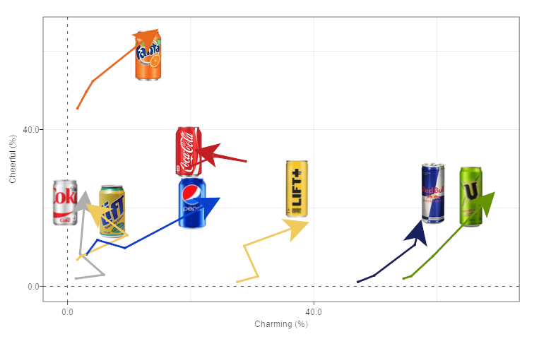
Using images on a scatterplot
It is possible to use images on the scatter plots. Automatically rearranging the images avoids overlaps, as shown in the example below. Read more about adding logos or images to scatterplots or correspondence analysis scatterplots in R or Displayr.
Trend arrows
The last example, shown below, uses trends to show movement over time on the scatter plot.
The source code
Hopefully you found this post on labeled scatterplots and bubble charts or bubble plots in R helpful! Click here to explore Displayr for free and access the R source code (click on a chart, and from the object inspector, select Data > Show Advanced Options > R code > Edit code).