


Most online customer feedback survey platforms such as Qualtrics, SurveyMonkey, Alchemer (formerly Survey Gizmo), etc. typically report between 25% and 50% of surveys are currently viewed on a smartphone or tablet device. As device ownership continues to grow, it won’t be long until a majority of all surveys are taken on a mobile device.
Conducting NPS surveys on mobile devices
Due to this continued expected growth in device ownership and, therefore, mobile survey engagement, it is more important than ever to optimize your Net Promoter Score (NPS) survey for mobile delivery. This will ensure you get the most accurate results possible. In addition, deploying an NPS survey on a mobile device allows for real-time, continuous NPS results as opposed to sending out waves of surveys in bulk designed for periodic measurement. This continuous survey approach aims to reach customers at a consistent and specific point in time or after a specific interaction with your product or service.
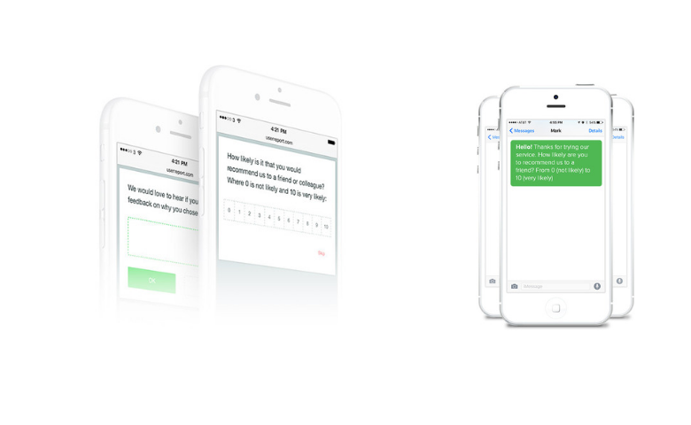
Mobile design optimization
Most of the major survey platforms have built-in mobile optimization in their survey design toolbox. When designing your survey, these survey platforms automatically provide an option for designing the survey in a standard desktop computer format or in mobile device format. This allows you to deploy both a desktop version and a mobile version of your survey simultaneously.
When fielding the survey, the platform can detect whether the survey respondent is using a desktop device or a mobile device and will adjust the layout and inputs accordingly. Thus, respondents should be able to access surveys from any mobile device and the platform will select the appropriate design for that mobile device layout.
When optimized for mobile devices, the NPS question will look similar to a desktop version, but will have larger buttons to select a response since the answer will be selected with a finger instead of a mouse pointer.
General best practices for mobile surveys
Here is a list of general best practices to follow when developing surveys for mobile devices:
- Survey length – try to keep the survey short as you will have a greater chance of break-offs with mobile surveys compared to on a desktop.
- Pages/scrolling – show one question at a time and break up large questions into smaller ones reducing or eliminating the need to scroll, which is more difficult on a mobile device.
- Limit text – avoid using large bodies of text as reading on mobile devices can be cumbersome.
- Response options – one vertical column is best for both single response and multiple choice questions.
- Drop-down lists – avoid using drop-down lists as they are more difficult to read and select a response.
- Grid/matrix questions – avoid grid/matrix question altogether as they are very difficult to display correctly on mobile devices due to having to display horizontal response options and therefore, potentially, horizontal scrolling.
- Open-ends – limit the number of open-ended questions since it is more difficult to type text responses on a mobile device.
- Images – limit the number of images used in the survey, especially larger images since mobile devices may not be able to render large images correctly.
- JavaScript – avoid using JavaScript as it is not supported by all mobile devices.
Now that you’ve collected your Net Promoter, learn how to analyze it by first calculating it.