I have previously shown how Sankey or alluvial diagrams can easily be used to visualize response patterns in surveys and to display decision trees. Following on from these posts, I will now be getting a bit more technical, and describe how to create custom Sankey diagrams in R. I will start by explaining the basics of Sankey diagrams, and then provide examples of automatically created and manually controlled layouts.
Don’t forget you can make a Sankey diagram easily for free using Displayr’s Sankey diagram maker. We call them Sankey diagrams in Displayr, but you may know them as alluvial diagrams or perhaps Sankey plots or Sankey charts. This post deals with generating Sankey diagrams using R code. If you would like use your data to generate a sankey diagram without R code you can do this for free. If you want to look at this example, inspect the R code and replicate it for yourself with your own data, you can also do that for free.
The elements of a Sankey diagram
If you are wondering what a Sankey diagram is, it’s pretty simple. Sankey diagrams are a way of visualizing the flow of data. A Sankey diagram consists of three sets of elements: the nodes, the links, and the instructions which determine their positions.
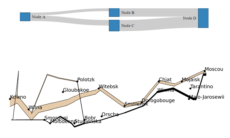
To begin with, there are the nodes. In the diagram above, a node is wherever the lines change direction. However, in the example below, boxes represent the four nodes.
The second element of a Sankey diagram is the links (or edges), that connect the nodes together. These links have a value associated with them, which is represented by the thickness of the link. In the example below, the first link that connects Node A with Node B, is half the width of the second link that connects A with C. Furthermore, the link from B to D is bigger again, and the largest link is from C to D.
Lastly, instructions specify where the nodes should appear in relation to each other. There are two strategies for positioning the nodes. One is to give specific coordinates. This is what is illustrated in the example above: the position of the nodes reflects places in France, Russia, and Poland. Alternatively, the nodes can be placed automatically using an algorithm (most commonly, a variant of the force-directed graph layout algorithm is used).
Using R
I’ve created the example above using R from within Displayr.
It is created using the following R code:
library(networkD3)
nodes = data.frame("name" =
 c("Node A", # Node 0
 "Node B", # Node 1
 "Node C", # Node 2
 "Node D"))# Node 3
links = as.data.frame(matrix(c(
 0, 1, 10, # Each row represents a link. The first number
 0, 2, 20, # represents the node being conntected from.
 1, 3, 30, # the second number represents the node connected to.
 2, 3, 40),# The third number is the value of the node
 byrow = TRUE, ncol = 3))
names(links) = c("source", "target", "value")
sankeyNetwork(Links = links, Nodes = nodes,
 Source = "source", Target = "target",
 Value = "value", NodeID = "name",
 fontSize= 12, nodeWidth = 30)
Some aspects of this code to note:
- Line 1 is loading a package (networkD3).
- Lines 2 to 6 are creating a data frame that contains a single variable, called name. It contains four nodes, which I have creatively named A, B, C, and D.
- Lines 7 to 11 specify the links. Line 8, for example, shows that the link from node 0 (i.e., A) to node 1 (i.e., B), has a value of 10.
- The final rows use the sankeyNetwork function.
If you want to adapt this example, you only need to modify the nodes (lines 3 to 6 in this example), and the links (lines 8 to 11). Additionally, you can play around with, and modify, the example live in Displayr by clicking here. Clicking on any of the examples in Displayr will show you the R code. Modify the code first, and then run it by pressing Calculate.
Sankey diagrams using automated layout
You can also use Sankey diagrams to create conversion funnels, illustrated in the next example. Following this, another one shows data on load energy projections. My first post on Sankey diagrams also features this latter example.
Sankey diagrams with manual layout
In Minard’s classic Sankey diagram of the march of Napoleon to Moscow and back, the thickness of the line shows the size of Napoleon’s army. The nodes are where the line changes direction. Automatic placement determined the position of the nodes in the previous examples, whereas here, the nodes represent the locations of places in Europe.
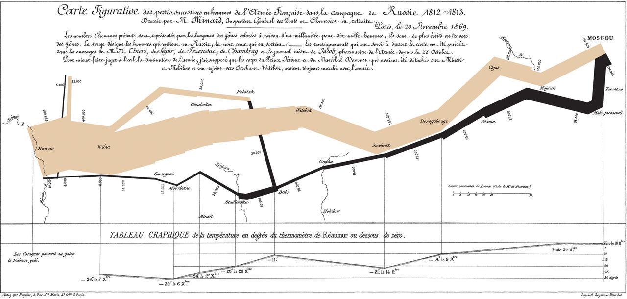
Below you can see Minard’s visualization reproduced in R. The code used to create this example has basically the same structure as used in the previous examples, except that x and y coordinates are provided for the nodes, and the color is explicitly set.
TRY IT OUT
You can investigate this data set further or even work on your own data in Displayr.
Acknowledgements
The final example uses January Weiner’ s riverplot package for R. All the other examples use a modified version of networkD3, created by Kenton Russell (timelyportfolio/networkD3@feature/responsive). networkD3 is an HTMLwidget version of Mike Bostock’s D3 Sankey diagram code, which is inspired by Tom Counsell’s Sankey library. The load energy flow example is from networkD3, which is a reworking of a Sankey library example, using data from the UK’s Department of Energy & Climate Change.