Sankey diagrams are a type of flow diagram, where the quantities being transferred are visualized by the width of the links between the nodes. They are often used to depict the physical flow of objects associated with a process. But Sankey Diagrams can also be used to visualize other types of relationships between variables. One way to highlight commonalities between variables is to group nodes and links using the same colors. In this article, we demonstrate the use of three different types of color schemes.
Don’t forget you can make a Sankey diagram easily for free using Displayr’s Sankey diagram maker.
Create your own Sankey Diagram
Visualizing categorizations
Categories are one of the easiest types of structures to visualize with Sankey diagrams. Sankey diagrams can be used even if the variables do not have a strictly one-to-many relationship. In the diagram below, we show UN Agency expenditure by category in 2015. The thickness of each link is proportional to the expenditure. All nodes and links are colored by the category of the expense. We created this in Displayr, by setting Links colored by to First variable.
The colors show that most of the larger agencies have expenses in only a single category. In contrast, many of the smallest agencies have expenses across multiple categories. The exceptions to this are UNICEF and the UN. UNICEF is equally distributed across Development Assistance and Humanitarian Assistance, while the UN has expenses in all five categories.
Create your own Sankey Diagram
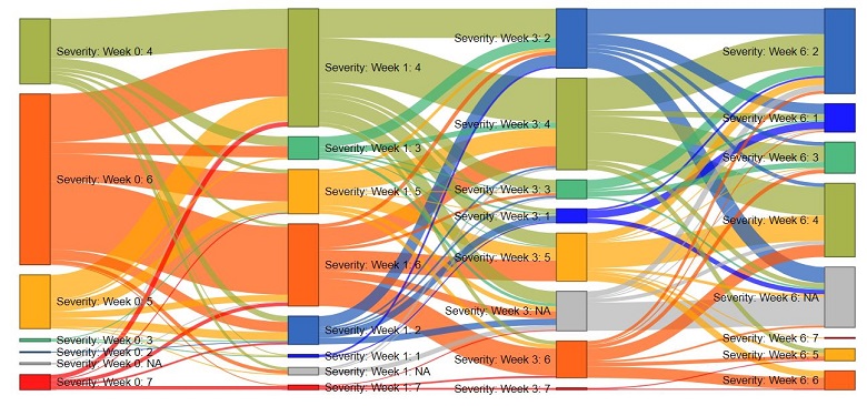
Visualizing change over time
Our second example looks at how patients responded to drug treatments over time. The data is from the NIMH Schizophrenia Collaborative Study. Each of the 437 patients was assessed at 0, 1, 3 and 6 weeks after treatment. The severity of the patient’s illness is evaluated according to the Inpatient Multidimensional Psychiatric Scale which is on a scale of 1 (not ill) to 7 (severely ill).
Because the severity of illness is measured on the same scale at each time point, we use the same color for a level of the scale across variables (i.e. across time points). We created this diagram in Displayr by setting Links colored by to source and also checking the box for Variables share common values.
At first glance, we see that the number of patients with a severe illness (red) decreases over time. However, there is a non-trivial number of patients (64) that have been removed (grey) before the end of the 6 week study. The heaviest links are in fact between nodes of the same color. This indicates that the most common outcome is for there to be no improvement.
Using the Sankey diagram also allows us to follow specific trajectories over time. For example, there is a small group of patients (14) that have illness becoming more severe (from 4 to 5) between weeks 1 and 3. However, patients with severity = 5 in week 3 show improvement by week 6. On closer inspection of the data, 13 of those 14 patients return to a severity of 4 or less by week 6.
Create your own Sankey Diagram
Visualizing association between variables
Sankey diagrams are also useful for exploring correlations between categorical variables. This is illustrated by a data set containing causes of death in Japan in 1990. Unlike the previous two examples, the relationships between the variables are not strong, so we color each node differently. Link colors are set to be the same as the source node, so we can easily compare weights between links.
Are some causes of death more frequently associated with a particular gender or age group? The right-hand side of the Sankey diagram does not look very interesting as the causes of death are evenly distributed between the genders. However, the left side shows that causes of death vary between age groups. For the elderly, malignant neoplasm (tumors) and heart disease are the main causes of death, whereas younger age groups have more varied causes of deaths.
The correlation between cause of death and age is even more striking when we compare this Sankey diagram (showing causes of death in 1990) to causes of death in 1951 (below). In 1951, a larger proportion of mortality is attributed to the young (0-19 years old). The predominant cause of death is infectious diseases, which is negligible by 1990.
You can easily create these diagrams yourself in Displayr. These documents contain both the data and the code for the Sankey diagrams shown above. You can play with the settings and create new diagrams to explore your own data.
Try this yourself in Displayr, or check out more on our blog!