A correlation matrix is a table of correlation coefficients for a set of variables used to determine if a relationship exists between the variables. The coefficient indicates both the strength of the relationship as well as the direction (positive vs. negative correlations). In this post, I’ll show you how to calculate and visualize a correlation matrix using R.
Introduction to correlation matrices in R
A correlation matrix is a table that shows the correlation coefficients between several variables in a dataset. These coefficients quantify the strength and direction of the relationship between pairs of variables. In R, correlation matrices are often used to explore relationships in large datasets, providing a quick overview of how variables move together. They can be especially helpful for identifying multicollinearity, spotting patterns, or preparing data for techniques like regression or principal component analysis.
Pearson correlation in R
The most commonly used correlation method (particularly when it comes to creating correlation matrices in R) is Pearson correlation, which measures linear relationships. The Pearson correlation coefficient is also sometimes referred to as Pearson’s r.
However, you can also calculate Spearman and Kendall correlations for non-linear or ordinal data. Understanding these relationships is crucial for uncovering patterns and insights in your data, whether you’re analyzing survey responses, financial data, or any dataset with multiple variables.
How to make a correlation matrix
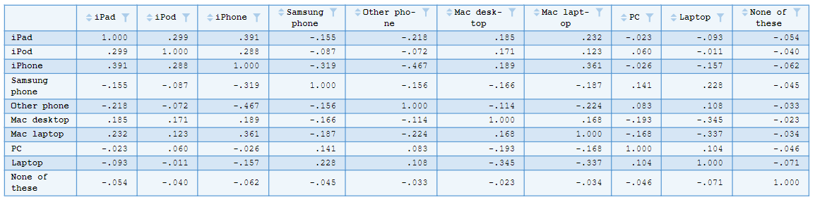
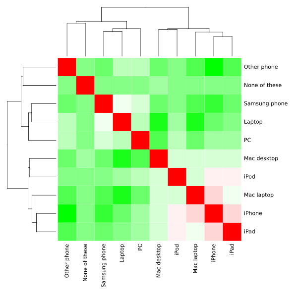
As an example, let’s look at a technology survey in which respondents were asked which devices they owned. I want to examine if there is a relationship between any of the devices owned by running a correlation matrix for the device ownership variables. To do this in R, I first load the data into the session using the read.csv function:
mydata = read.csv("https://wiki.q-researchsoftware.com/images/b/b9/Ownership.csv", header = TRUE, fileEncoding="latin1")
Create your own correlation matrix
What are correlation coefficients in a matrix?
The values in a correlation matrix range from -1 to 1. A correlation coefficient of 1 means a perfect positive relationship between two variables, while -1 indicates a perfect negative relationship. A coefficient close to 0 suggests no significant correlation. By quickly viewing the matrix, I can identify which pairs of variables are most strongly related and which are unrelated.
The cor function
The simplest and most straight-forward to run an R correlation matrix is with the cor function:
mydata.cor = cor(mydata)
This returns a simple correlation matrix showing the correlations between pairs of variables (devices).
I can choose the correlation coefficient to be computed using the method parameter. The default method is Pearson, but you can also compute Spearman or Kendall coefficients.
mydata.cor = cor(mydata, method = c("spearman"))
Significance levels (p-values) can also be generated using the rcorr function, which is found in the Hmisc package. First install the required package and load the library.
install.packages("Hmisc")
library("Hmisc")
Use the following code to run the correlation matrix with p-values. Note that the data has to be fed to the rcorr function as a matrix.
mydata.rcorr = rcorr(as.matrix(mydata))
mydata.rcorr
This generates one table of correlation coefficients (the correlation matrix) and another table of the p-values. By default, the correlations and p-values are stored in an object of class type rcorr. To extract the values from this object into a useable data structure, you can use the following syntax:
mydata.coeff = mydata.rcorr$r
mydata.p = mydata.rcorr$P
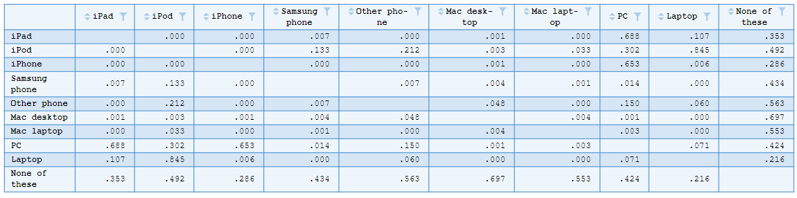
Objects of class type matrix are generated containing the correlation coefficients and p-values.
Create your own correlation matrix
Visualizing an R correlation matrix
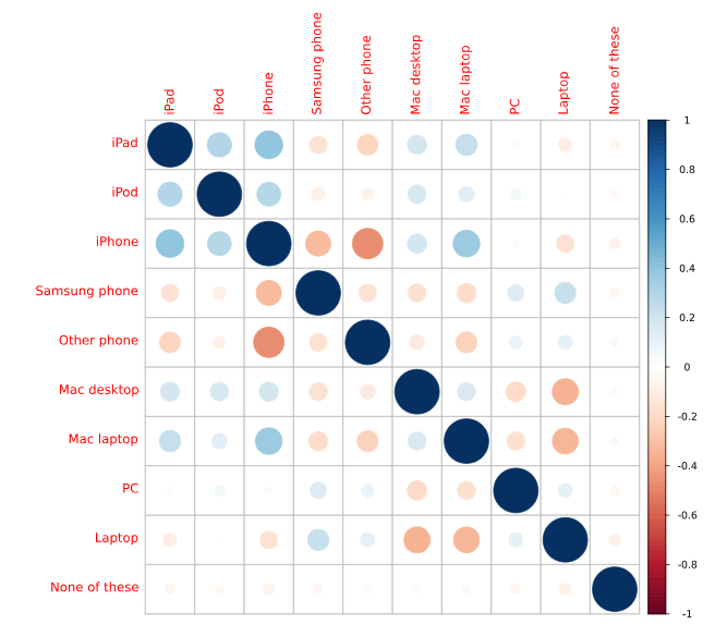
There are several packages available for visualizing an R correlation matrix. One of the most common is the corrplot function. We first need to install the corrplot package and load the library.
install.packages("corrplot")
library(corrplot)
Next, we’ll run the corrplot function providing our original correlation matrix as the data input to the function.
corrplot(mydata.cor)
A default correlation matrix plot (called a Correlogram) is generated. Positive correlations are displayed in a blue scale while negative correlations are displayed in a red scale.
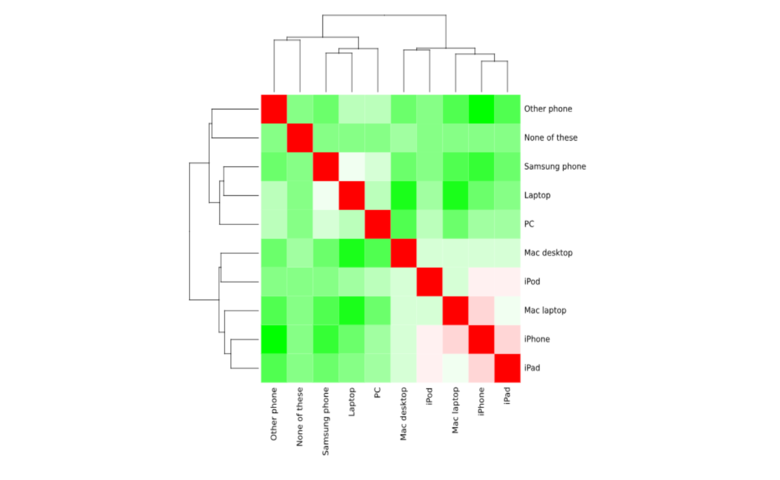
I can also generate a Heatmap object again using our correlation coefficients as input to the Heatmap. Because the default Heatmap color scheme is quite unsightly, we can first specify a color palette to use in the Heatmap. The value at the end of the function specifies the amount of variation in the color scale. Typically no more than 20 is needed here. We then use the heatmap function to create the output:
palette = colorRampPalette(c("green", "white", "red")) (20)
heatmap(x = mydata.cor, col = palette, symm = TRUE)
Interpreting the correlation matrix in R
Once you’ve computed your correlation matrix in R, you can dive deeper into the relationships between your variables by examining the correlation coefficients. The “correlation matrix R” provides a quick and clear way to identify which variables are most strongly related, helping you make data-driven decisions. Whether I’m using Pearson, Spearman, or Kendall methods, interpreting these coefficients can uncover hidden patterns that might not be immediately obvious.
Examples of when to use correlation matrices in R
1. Technology Survey Data
In a technology survey, respondents might be asked about the devices they own, such as smartphones, laptops, tablets, and other electronic gadgets. By using a correlation matrix in R, you can examine if there are relationships between the ownership of different devices. For instance, you might find that people who own a tablet are also more likely to own a smartphone. This kind of analysis helps businesses or researchers understand patterns in consumer behavior, identify product clusters, or predict cross-product purchases.
For example, if a company is looking to market accessories for tablets, knowing that people who own tablets also often own smartphones can help them target ads or create bundled offers for customers who are likely to purchase both.
2. Financial Data Analysis
In the financial world, a correlation matrix is often used to analyze the relationships between different asset returns, such as stocks, bonds, and commodities. By calculating correlations between these variables, investors can determine how various assets move in relation to each other. For instance, if two stocks have a very high positive correlation, it may indicate that they tend to rise and fall together, making them less ideal for diversification purposes.
Financial analysts use correlation matrices to create diversified investment portfolios by identifying which assets are highly correlated and which are not. A low or negative correlation between assets means that they may perform differently under varying market conditions, helping investors reduce risk and maximize returns.
Create your own correlation matrix in Displayr. Sign up below to get started.
Create your own correlation matrix