In this post I show how you can use R to create a Sankey Diagram when your data is set up as a table (data frame).
Don’t forget you can make a Sankey diagram easily for free using Displayr’s Sankey diagram maker.
What are Sankey diagrams?
We call them Sankey diagrams in Displayr, but you may know them as alluvial diagrams or perhaps Sankey plots or even Sankey charts. Sankey diagrams are a way of visualizing the flow of data. Sankey diagrams are perfect for displaying decision trees (e.g., CHART, CHAID). A Sankey diagram consists of three sets of elements: the nodes, the links, and the instructions that determine their positions. Read on to find out how to create a Sankey Diagram using R.
Sankey diagrams in R
There are several different ways to create a Sankey diagram in R, depending on how complex your visualization is. This guide uses Displayr’s flipPlots package (Displayr/flipPlots) as the example. Alongside this package, Sankey graphs are also commonly created with the ggsankey package or the networkD3 package.
Step 1: Create a Tidy data frame
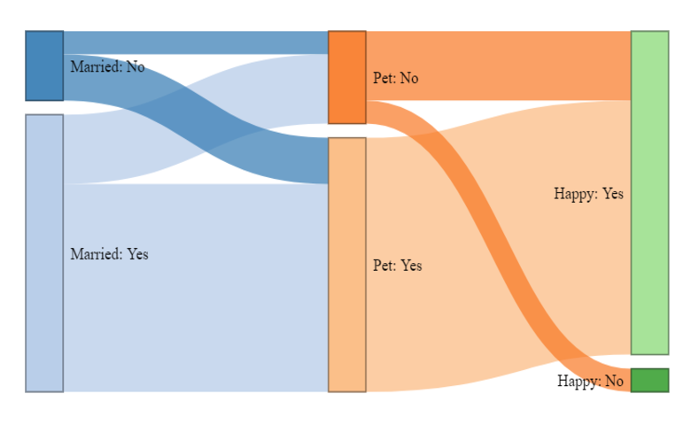
The very first step in creating visualizations is to get the data in a useful format. In the case of Sankey diagrams, the trick is to get the data into the tidy data format. This post uses a simple example to make it clear how everything fits together. Below, you can see the R code to create a small data frame. I’ve shown this as a table, followed by the resulting Sankey diagram.
my.data = data.frame(Married = c("Yes","Yes", "Yes", "No", "No"),
    Pet = c("Yes", "Yes", "No", "Yes", "No"),
    Happy = c("Yes", "Yes", "Yes", "Yes", "No"),
    freq = 5:1)
A few things to note:
- The Sankey diagram is in a different order to the data in the table, with “no” appearing before “yes”. Sankey automatically orders the categories to minimize the amount of overlap.
- Where two rows in the table contain the same information, Sankey automatically combines them. In our table, we can see that the first two rows are the same. Our Sankey diagram has combined them so the flow from Married: Yes to Pet: Yes to Happy: Yes has a weight (width) of 5 + 4 = 9. You can see this value if you hover your mouse over the Sankey diagram.
- The Sankey diagram automatically merges together the nodes (blocks) that have the same text. For example, while we have five rows of data in the example above, we only have two unique values of Pet, which is why only two blocks for pet ownership appears.
- We can pull apart the blocks by changing the labels, as shown in the data frame and resulting Sankey diagram below. My colleague, Carmen is working on modifying the code to be able to split these apart without changing the labels.
Step 2: Install the flipPlot package
The Sankey diagrams I am using in this post, come from our flipPlots package (Displayr/flipPlots). If you don’t know how to install from GitHub, please see how to install packages from GitHub.
Step 3: Create the Sankey plot
We created the first of the Sankey diagrams shown in this post using the code below. Note that the data frame is passed in as the first argument, but the fourth column (the one containing the weight) has been removed. I’ve set link.color to “Source”, which sets the colors that emanate from the same node to be consistent.
library(flipPlots)
SankeyDiagram(my.data[, -4],
              link.color = "Source",
              weights = my.data$freq)
I’ve provided the code for the second sankey diagram shown in the post below. The only difference from the previous code is that I’ve used label.show.varname = FALSE, to prevent the variable names to from being shown in the sankey diagram.
library(flipPlots)
SankeyDiagram(my.data.2[, -4],
              link.color = "Source",
              label.show.varname = FALSE,
              weights = my.data.2$freq)
More complicated Sankey diagrams
If you want to create more complicated Sankey diagrams, which do not easily fit into the structure of a table (data frame), please see Creating Custom Sankey Diagrams Using R.
Acknowledgements
The Sankey diagrams are created using a modified version of networkD3, created by Kenton Russell (timelyportfolio/networkD3@feature/responsive). networkD3 is an HTMLwidget version of Mike Bostock’s D3 Sankey diagram code, which is inspired by Tom Counsell’s Sankey library.