


Any data that’s been collected on a numeric scale or as a continuous measurement can be represented as a histogram. These constitute a fairly traditional way of displaying the shape of the distribution of your data and are often used as the foundation for more advanced statistical analysis, such as working out medians, averages, and standard deviations.
Alternatively, you can easily create a histogram for free using Displayr’s histogram maker.
Get your data ready!
The first thing that sprung to mind when thinking about data collected on a scale is data concerning people’s ages. Rather than go for the morbid option and looking at age at death, how about we look at the average age of people in different countries when they enter into their first marriage? For each country, the data will have an age value, in this case split by male and female, like so:

For some countries, there’s no data, so in the final data set, we’ll have data for 194 countries for males, and 196 countries for females. The values used here are the average ages for each country reported in the source data, between the years 1990 and 2017.
Creating the Histogram
I’ll select the column for “Males” on my spreadsheet (yes, the entire column!), and then go to Insert > Charts > Histogram. This will immediately create a histogram out of the selected data. Excel will select the best options for the data at hand in terms of binning. “Binning” is the grouping of like values together into columns in the histogram. This should ensure that each column represents an equal amount of points on the scale you’re using if you set the bin width.
Alternatively, you can specify the number of bins and then the bin width will be set to the total range divided by the number of bins. There’s really no right or wrong way to decide what bin width or number of bins to show. What matters is that you’re happy that you get an idea of the shape of the distribution. To edit your bin values settings, you need to double-click the x-axis text underneath the histogram. Here’s what I ended up with, after setting my bin width to one year.
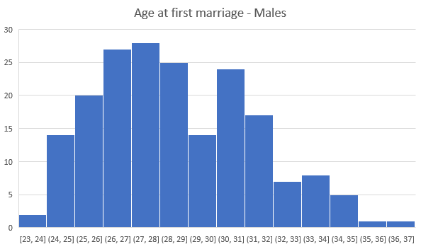
There’s an unexpected dip here among males aged in their late 20:s and early 30:s. Otherwise the histogram reveals no surprises and shows a slight positive skew to younger ages. The histogram for females, however, reveals an interesting pattern:
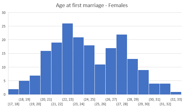
The female distribution (adjusted to show one bin for each year/scale point in the data) appears bimodal. This suggests that there’s something more going on here than you would expect. It looks like there may be two distinct sub-samples among females. At this stage we can only guess at why that may be. Perhaps there’s a difference between developed countries vs. others. Either way, investigating this data further would be necessary to draw any specific conclusions.
Comparing the two
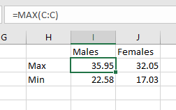
There’s unfortunately no immediate way of creating a single histogram that includes both the distributions for males as well as the distribution for females all in one go. To achieve this, we have to manually aggregate our data, and then chart it as a bar chart. First, we should work out the maximum and minimum values for males and females so that we can establish the end-points of the x-axis in our chart. We do this by using Excel’s built in formulas =MAX() and =MIN(). In my case my “Male” data is in column C, and my “Female” data is in column D. Here are my maximum and minimum values:
Because my lowest value is 17.03, I’ll start by counting the number of cases I have in the range of one year from 17.03 to 18.03, and so on, until I’ve reached the age of 36.03, which is my maximum. I can use a formula for this too, so when I’m done, I will end up with a table like this:
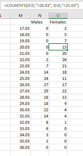
You can see in the formula bar that I used a formula to count the number of cases in each age range. This time, I used =COUNTIFS(). Next, I’m going to multiply my “Male” values by -1. I’m doing this as I want them to appear on the left of my comparative chart. I’ll need to select both the scale points (after reducing the decimals down to none: the .03 will just clutter up my final chart), and the two columns with counts for “Males” and “Females” before selecting my chart type. With all my data selected, I click Insert > Chart > Stacked Bar. Doing so will give me a chart that looks like this:
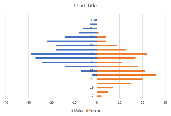
Transforming your stacked bar chart
There’s a few things we can do to make this more readable and more like two histograms. First, in the chart, select the series for men (click one of the blue bars), and then in the Format Data Series > Series Options menu, change the Gap Width to 0. This will update both the “Males” and “Females” to look more like actual histograms. I would also edit the color selection (I really, REALLY don’t like orange, but I’m a total sucker for clichés) and the font color of the age scale y-axis to make it easier to read.
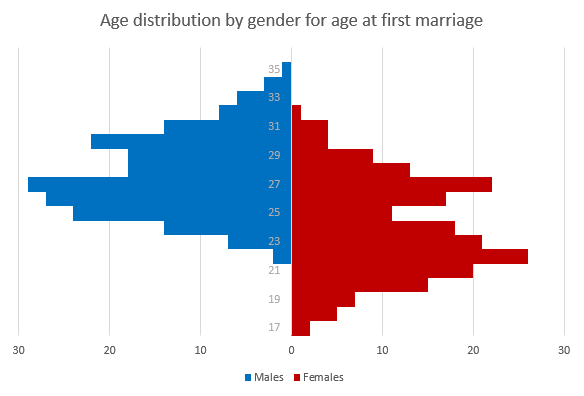
Finally, I would select the x-axis on the chart to alter the number format. The minus signs look out of place, and we don’t need to go over 30 on either side, so I’ll change that too. To do this, double-click the x-axis, and under Format Axis > Axis Options > Bounds set the Minimum bound to -30, and leave the Maximum at 30. Under Format Axis > Number > Format Code I’ll use a format that removes negative signs: #,##0;#,##0 Then I click Add. This will ensure the number format on my axis isn’t too confusing. Here’s my final, comparative, chart:
Ready to move beyond Excel? There are other ways to create visualizations that offer more advanced options and flexibility. Check out how to create a histogram in Displayr!
The data for this blog post comes from https://vps36945.oneworld.nl:5000/lo/ and is used under a CC attribution.
