It’s one thing to know how satisfied your customers are, it’s quite another to understand why. Customer satisfaction driver analysis aims to uncover the factors that influence — or drive — satisfaction. A customer feedback survey should ask respondents for their level of satisfaction with various features or aspects of your product or service, not just their overall satisfaction. With this information, you can identify the key drivers of customer satisfaction.
Relative importance analysis
Looking at the satisfaction scores in your survey, your first instinct may be to apply a linear regression. However, linear regression is not reliable for survey data with correlations. Instead, it is better to apply a modified form of regression using relative weights that are designed to account for correlation between variables. Similar to Shapley regression, relative weights determines what proportion of R-squared from a linear regression model can be attributed to each independent variable.
Below, we show the relative importance output on a data set of the satisfaction of bank customers.
The results above show that the most important attribute is Branch service, which accounts for 32% of the R-squared. If instead we had used linear regression (below), we would still have identified Branch service as the most important. However, we would have mistakenly thought that Fees, Interest rates and Phone service had similar levels of importance. The relative importance analysis, however, shows that Branch service is more than twice as important as Interest rates.
Tutorial: CSAT Driver Analysis in Displayr
Correlation matrix
It can be helpful to look at the correlation between the outcome and predictor variables. Confirming the results of the relative importance analysis, we see that Branch service is the most strongly correlated with Overall Satisfaction. Additionally, the correlation between the predictor variables is low. This explains why the results of the relative importance analysis and linear regression do not differ dramatically. If you find strongly correlated variables in your data set, you may want to remove some of them.
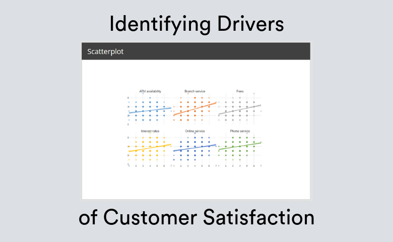
Scatterplot of raw data
Another way to check your data is to create a scatterplot. The example below uses small multiples to show all of the predictor variables. It is not the easiest chart to read because of the overlapping points. But it is useful to check that there are no unusual clusterings for any of the variables.
Importing your data
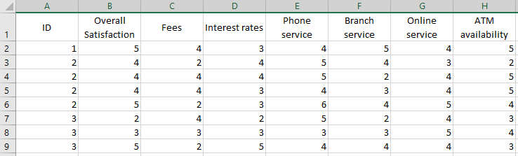
Displayr can import a variety of file types, including .sav (SPSS), Excel, or CSS files. If you are using SurveyMonkey, it is easiest to export your data as a .sav file, which will include metadata about the variables. Alternatively, save your data as an Excel or .csv file. Below, we show a snippet of the .csv file used for the analysis above.
After importing the data into Displayr, make sure that the data is set up properly. In particular, the overall satisfaction and attribute satisfaction scores should be numeric variables. If you look at the Data Sets tab in the bottom-left of the window it should have a numeral as the icon. 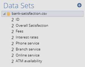
If the icon next to the variables looks different, you can change the structure of the variable by clicking on it in the Data Sets tab. You will then see properties of the variable show up on the Object Inspector on the right of the screen. You can then change the structure to Numeric or Numeric – Multi.
Publishing your dashboard
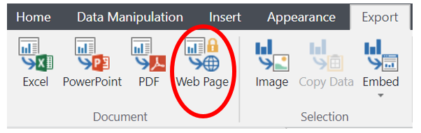
Once your data is all hooked up to the analyses and visualizations in the template, it’s time to publish your dashboard! To publish your dashboard as a web page, go to Export in the ribbon and click Web Page. This will create your published dashboard. You can share this link with anyone you like, and they can navigate through the dashboard. The instructions in the template will be hidden in the published version. If you need to go back and change anything, you can just click Embed > Update All and your published dashboard will update.