

Create your own time series chart
The first approach to smoothing a time series is to add a trend line to a Visualization chart. If your data has already been summarized (i.e., a single value at regular intervals), adding a trend line is the easiest method. You can add trend lines to multiple chart types.
However, for raw data such as responses to a survey over time, the Time Series chart has a simpler interface. It also has more smoothing options. We demonstrate these differences using the hospital.sav dataset containing survey data from patients entering the hospital.
Setting up the date variable
Make sure that your date variable is set up properly before you begin your analysis. Find the Data Sets panel (bottom-left of the screen), check that the date icon is shown next to the variable and then click on the variable. This will bring up the properties of the date variable in the object inspector on the right of the screen.
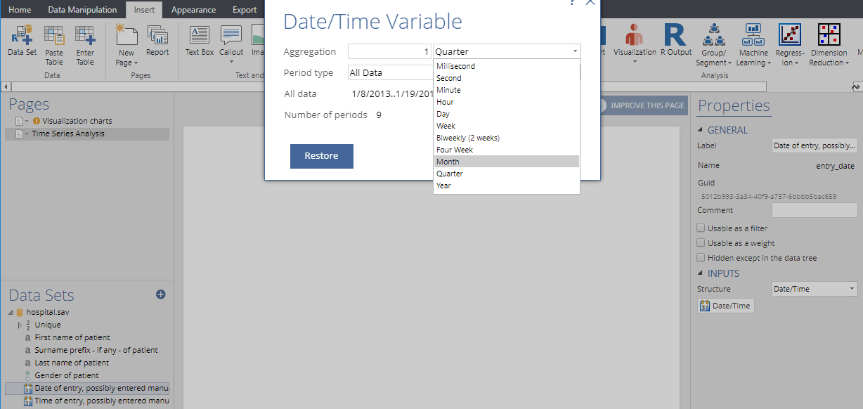
Click on the Date/Time button under the Inputs section to control the aggregation unit of the date variable. For example, if you want to compute five-month moving averages, then the aggregation unit should be in months.
1. Adding trend lines in Visualizations
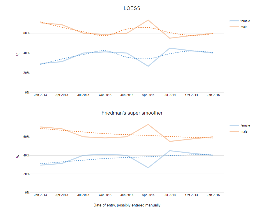
The charts shown below are created by clicking Insert > Visualization > Line Chart, but other chart types such as Area Chart, Bar Chart and Column Chart can also be used instead. We can add trend lines by selecting the Chart tab in the object inspector, and adjusting the options under Trend lines.
Trend lines can use four different methods: linear regression, LOESS, Friedman’s super smoother, or cubic splines. Each smoothing method uses the default parameters. Specifically, Friedman’s super smoother and cubic splines select their spans by cross-validation, while LOESS uses a default value of 0.75. As seen in the figure below, these values can have a strong effect on the shape of the trend line.
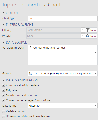
In Visualizations, data input options are more complicated to accommodate more types of charts. If you have already set up a table with dates as the row names or an R time-series object, then you can simply insert that into the Output in ‘Pages’ dropdown.
However, to plot the time series of a variable in Data Sets you need to 1) select the variable of interest in the Variables in ‘Data’ dropdown; 2) select the date variable in the Groups dropdown; and 3) select the checkbox to swap rows and column.
2. Using Time Series charts
The second approach is to create a chart by clicking Insert > Chart > Time Series which will bring up the following dialog box. Drag the variable of interest (e.g., ‘Gender’) from Data Sets into the Y Axis 1 dropdown and date variable to the Date Axis. You can leave Y Axis 2 empty.
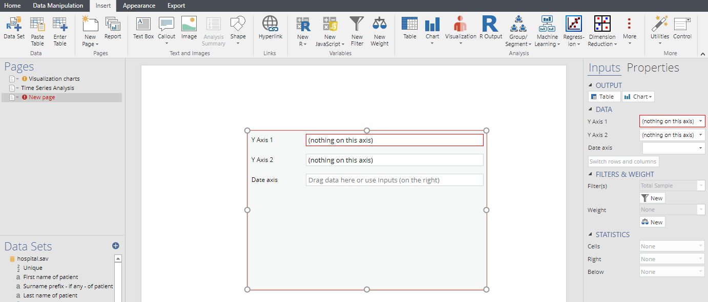
The input data of a time series chart must always be a variable or question in Data Sets. If you want to plot a table or R output, you should use one of the Visualization charts instead. There are also no options to control the values in the y-axis. The structure of the variable selected will automatically determine these values.
We have chosen to use a categorical variable, so it shows the column percentage. If you choose to use a numeric variable, it would show the mean.
Customizing your chart
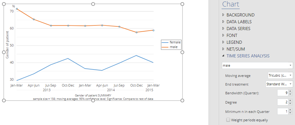
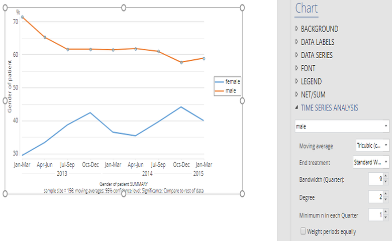
The Time Series chart has more options for controlling the smoothing of the trend lines. If you click on the Time Series chart, then the object inspector on the right of screen will show options to customize the chart. The options to control the time-series analysis are under the Chart tab. For each series in the chart, we can also use different smoothing parameters.
The default option for Moving average is None so no smoothing is performed on the time series; alternatives can alter both the positioning of the windows (lagging or centered) and the shape (lagging and uniform weight data points in the window equally, whereas the tri-cubic places more weight on data points close to the target). The Bandwidth option controls the size of the window.
The Degree option controls the type of regression used within each window. Setting degree = 0 is equivalent to using the mean or weighted mean in each window. Using linear (degree = 1) or quadratic (degree = 2) regression reduces the bias. For larger windows, quadratic regression gives smooths that follow the original data points more closely. But they will also be more sensitive to outliers.
Create your own time series chart
Want to find more visualization techniques? Check out our Visualizations section on the blog.